Page History
| Table of Contents | ||||||
|---|---|---|---|---|---|---|
|
In contrast to the dot plot which shows one probe(set)/gene per plot, the profile plot is used to visualize how the intensity values from multiple genes compare across all samples.
We will invoke a Profile Plot from a gene list child spreadsheet with genes on rows.
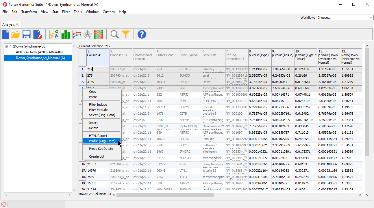
- Select the rows to be visualized
- Right-click on a row header of one of the selected rows
- Select Profile Plot (Orig. Data) from the pop-up menu (Figure 1)
| Numbered figure captions | ||||
|---|---|---|---|---|
| ||||
|
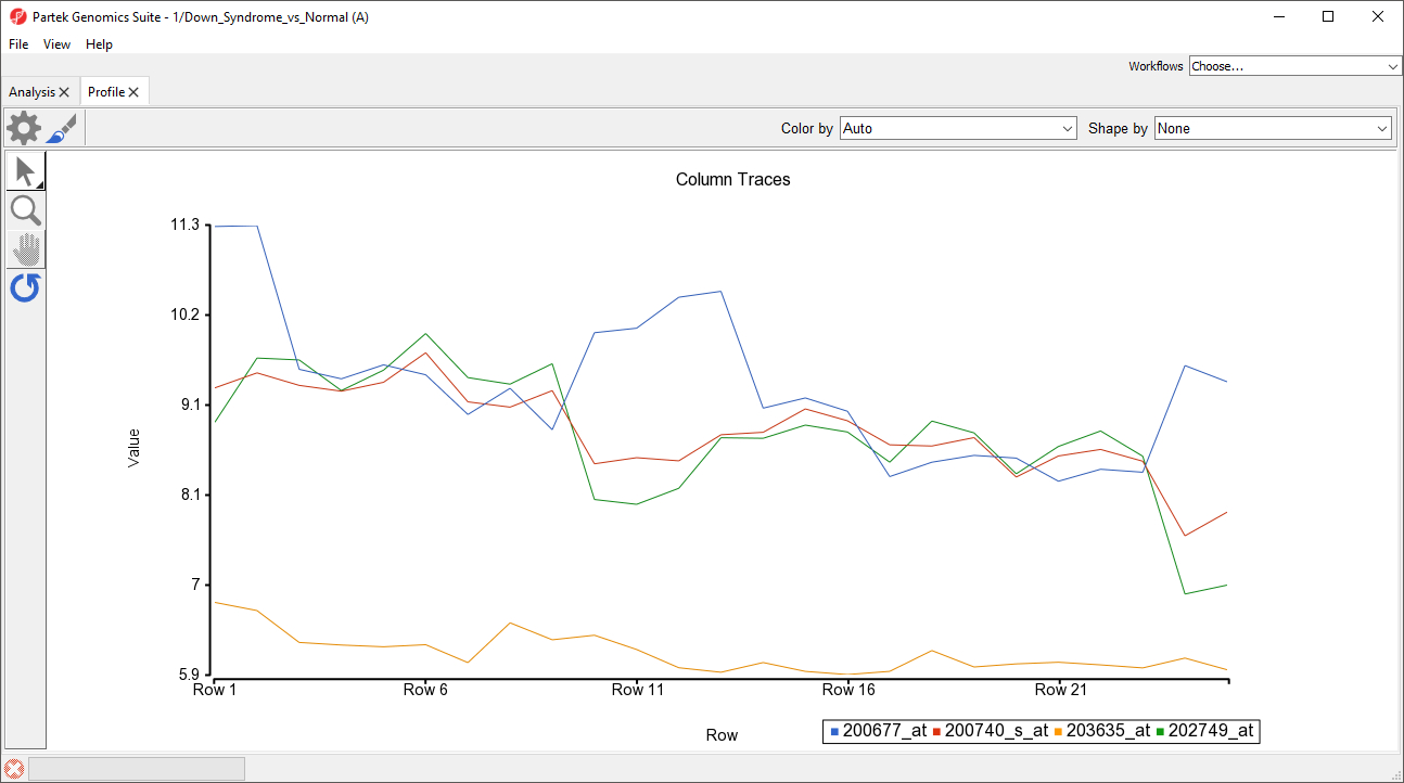
The profile plot will be displayed in a new tab (Figure 2). Lines are probe(sets)/genes and columns are rows/samples from the parent spreadsheet.
| Numbered figure captions | ||||
|---|---|---|---|---|
| ||||
|
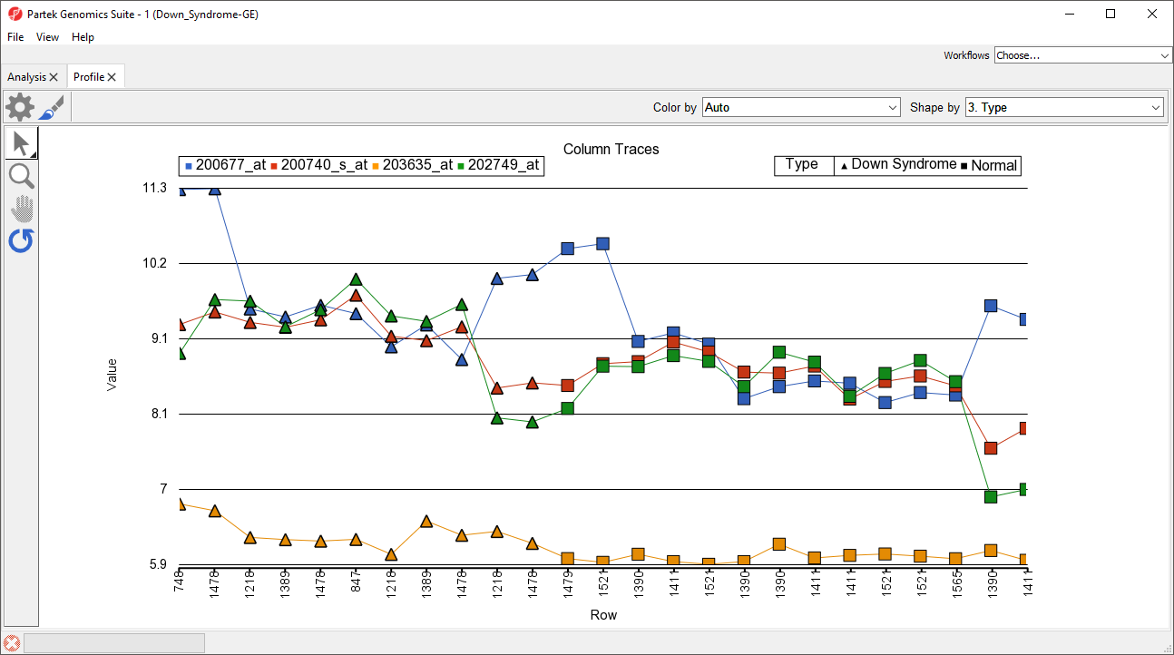
A basic profile plot will likely need customization. The plot configuration, properties, and control options are the same as in Dot Plot. We will illustrate a few modifications here.
We can change the row labels to show each sample ID.
- Select (
 )
) - Select the Axes tab
- Set Grid to 1
- Select Rotate X-Axis Labels and set to 90 degrees (rotates counter-clockwise)
- Set Label Format to Column and select 5. Subject
We can add symbols to show which group each sample belongs to.
- From the Shape by drop-down menu, select 3.Type
- Select OK
Symbols have now been added to each profile line plot (Figure 3).
| Numbered figure captions | ||||
|---|---|---|---|---|
| ||||
|
| Page Turner | ||
|---|---|---|
|
| Additional assistance |
|---|
|
| Rate Macro | ||
|---|---|---|
|
Overview
Content Tools