...
| Numbered figure captions |
|---|
| SubtitleText | Principal components analysis (PCA) showing methylation profiles of the study samples. Each sample is represented by a dot, the axes are first three PCs, the number in parenthesis indicate the fraction of variance explained by each PC. The number at the top is the variance explained by the first three PCs. The samples are colored by levels of an attribute (HPSC in this example) |
|---|
| AnchorName | annotated PCA plot |
|---|
|
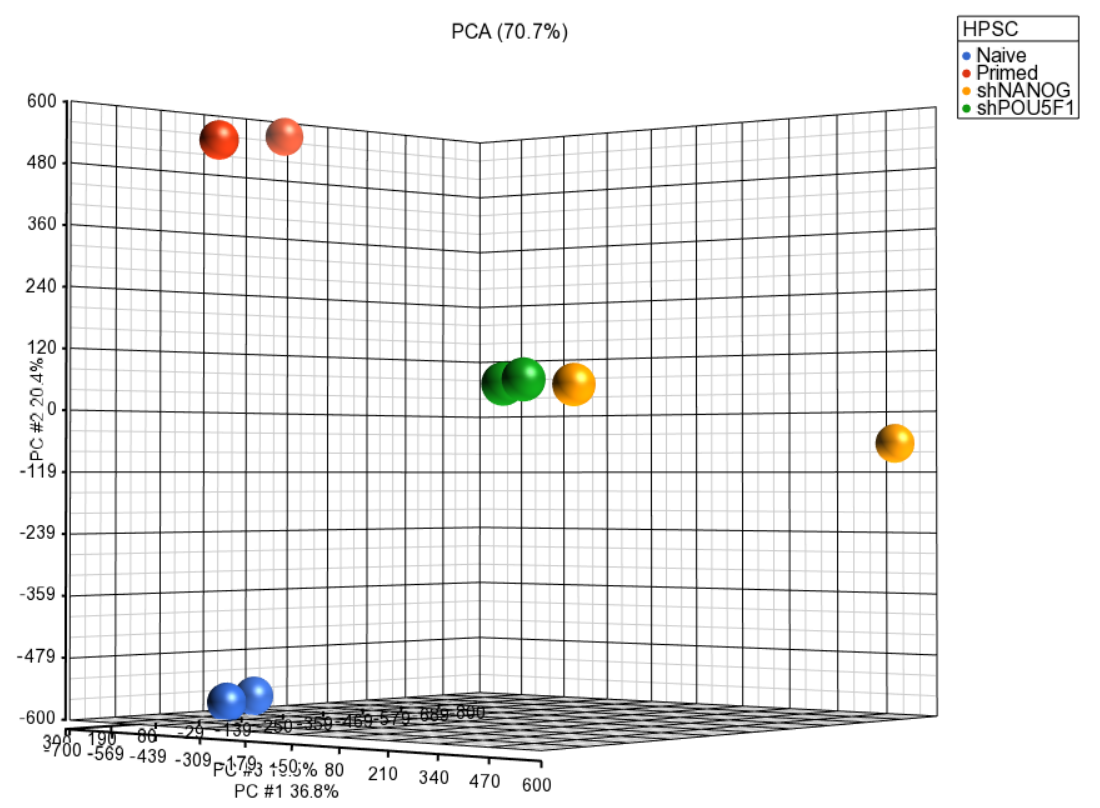 Image Modified Image Modified
|
Next, distribution of M-values across the samples can also be inspected by a box-and-whiskers plot: QA/QC > Plot Sample Box & Whiskers Chart. Each box-and-whisker is a sample and the y-axis shows M-values. Samples in this set seem reasonably uniform and no outliers can be detected (Figure 2).
| Numbered figure captions |
|---|
| SubtitleText | Box and whiskers plot showing distribution of M-values (y-axis) across the study samples (x-axis). Samples are colored by a categorical attribute (HPSC). The middle line is the median, box represents the upper and the lower quartile, while the whiskers correspond to the 90th and 10th percentile of the data |
|---|
| AnchorName | box whiskers plot |
|---|
|
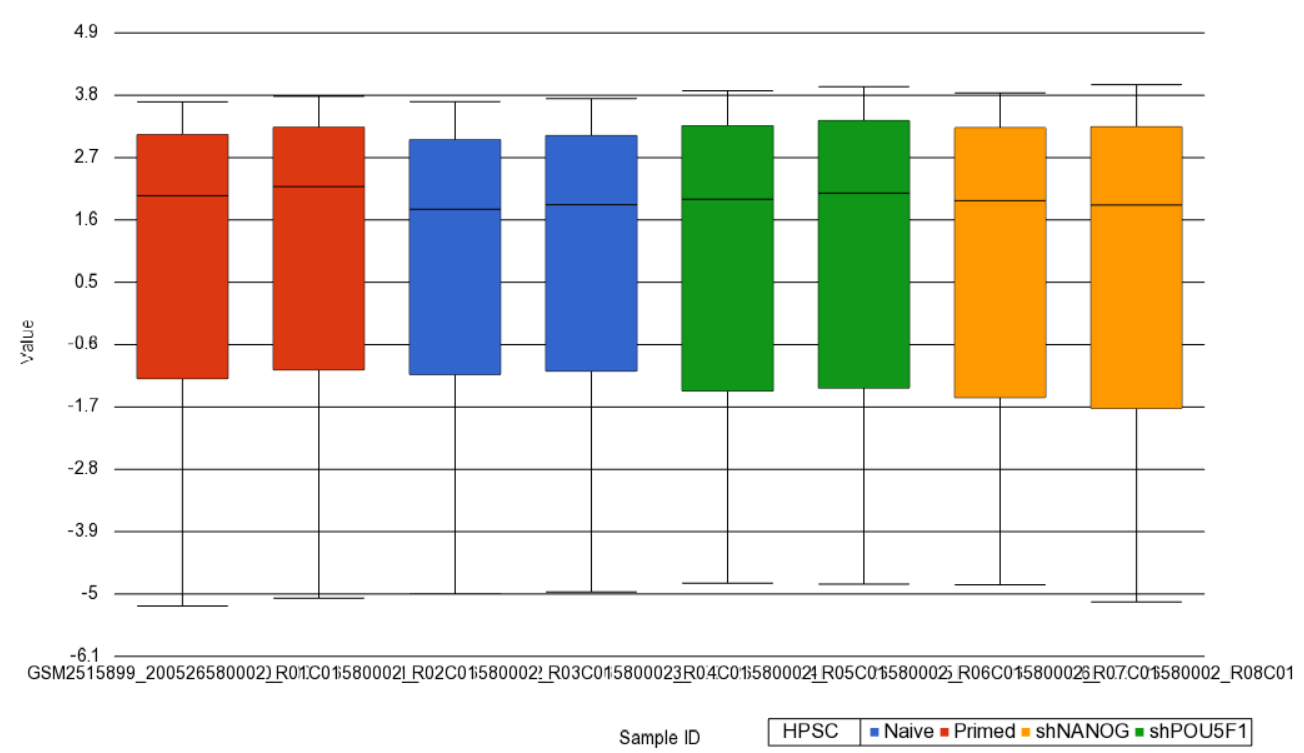 Image Modified Image Modified
|
An alternative way to take a look at the distribution of M-values is a histogram (QA/QC > Plot Sample Histogram). Again, no sample in the tutorial data set stands out (Figure 3).
| Numbered figure captions |
|---|
| SubtitleText | Sample histogram. Each sample is a line, M-values are on the horizontal axis and their frequencies on the vertical axis. Two peaks correspond to two probe types (I and II) present on the MethylationEPIC array. Sample colors correspond to a categorical attribute (i.e. HPSC) |
|---|
| AnchorName | sample histogram |
|---|
|
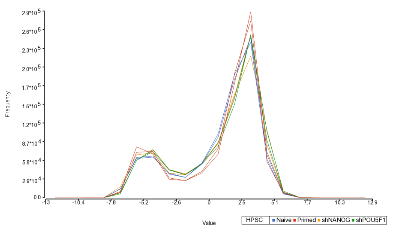 Image Modified Image Modified
|
Section Heading
...