Page History
| Table of Contents | ||||||
|---|---|---|---|---|---|---|
|
Hierarchical Clustering
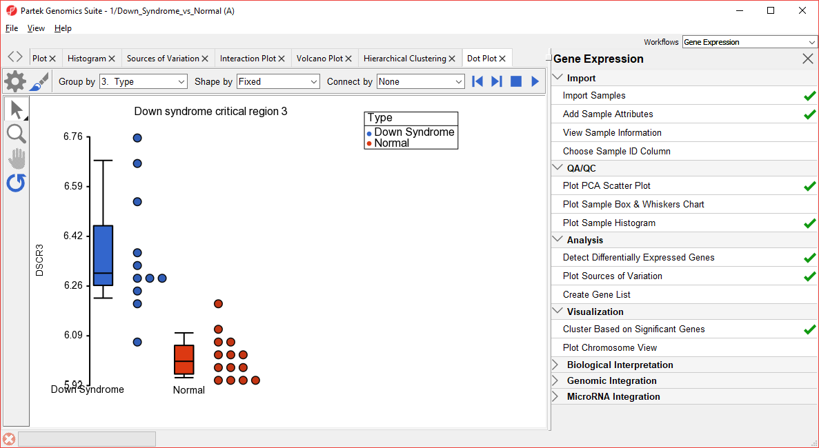
The gene list in spreadsheet Down_Syndrome_vs_Normal (A) can be used for hierarchical clustering to visualize patterns in the data.
...
For more information on the methods used for clustering, you can refer to Chapter 8: Hierarchical & Partitioning Clustering in Help > User’s Manual. For a tutorial on configuring the clustering plot, please refer to the user guide that can be downloaded from: here or from Help >On-line Tutorials > User Guides.
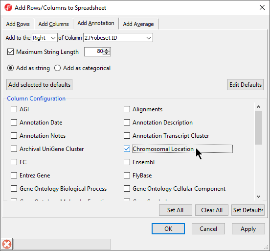
Adding Gene Annotation
During data importation, the GeneChip annotation file was linked to the imported data. This linked annotation information can be added as new columns to the ANOVA or gene list spreadsheets. For example, we can add additional annotation to the gene list we created from the ANOVA results as follows:
...
| Numbered figure captions | ||||
|---|---|---|---|---|
| ||||
|
To save changes to the spreadsheet, select the Save Active Spreadsheet icon (![]() ).
).
...
| Numbered figure captions | ||||
|---|---|---|---|---|
| ||||
|
| Additional assistance |
|---|
|
| Rate Macro | ||
|---|---|---|
|
Overview
Content Tools