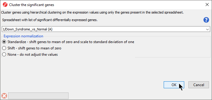
The gene list in spreadsheet Down_Syndrome_vs_Normal (A) can be used for hierarchical clustering to visualize patterns in the data.
The Cluster Significant Genes dialog asks you to specify the type of clustering you want to perform.
This option will adjust all the gene intensities such that the mean is zero and the standard deviation is 1.
|
|
The graph (Figure 2) illustrates the standardized gene expression level of each gene in each sample. Each gene is represented in one column, and each sample is represented in one row. Genes with no difference in expression have a value of zero and are colored black. Genes with increased expression in Down syndrome samples have positive values and are colored red. Genes with reduced expression in Down syndrome samples have negative values and are colored green. Down syndrome samples are colored red and normal samples are colored orange. On the left-hand side of the graph, we can see that the Down syndrome samples cluster together.
For more information on the methods used for clustering, you can refer to Chapter 8: Hierarchical & Partitioning Clustering in Help > User’s Manual. For a tutorial on configuring the clustering plot, please refer to Hierarchical Clustering Analysis.
|