Page History
...
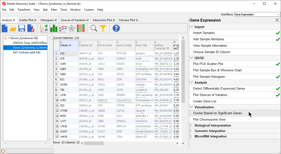
- Under the Visualization section in the Gene Expression workflow, select Cluster Based on Significant Genes (Figure 1)
| Numbered figure captions | ||||
|---|---|---|---|---|
| ||||
|
...
- The Cluster Significant Genes dialog asks you to specify the type of clustering you want to perform. Select Hierarchical Clustering and select OK
- Choose the Down_Syndrome_vs_Normal (A) spreadsheet under the Spreadsheet with differentially expressed genes
- Choose the Standardize – shift genes to mean of zero and scale to standard deviation of one under the Expression normalization panel. This option will adjust all the gene intensities such that the mean is zero and the standard deviation is 1
- Select OK to generate a Hierarchical Clustering tab (Figure 222)
| Numbered figure captions | ||||
|---|---|---|---|---|
| ||||
|
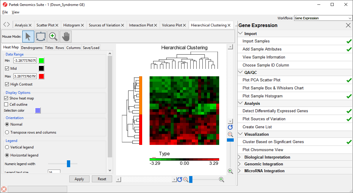
The graph (Figure 222) illustrates the standardized gene expression level of each gene in each sample. Each gene is represented in one column, and each sample is represented in one row. Genes which are unchanged are have a value of zero and are colored black. Genes with increased expression have positive values and are colored red. Genes with reduced expression have negative values and are colored green. Down syndrome samples are colored red and normal samples are colored orange. On the left-hand side of the graph, we can see that the Down syndrome samples cluster together.
...
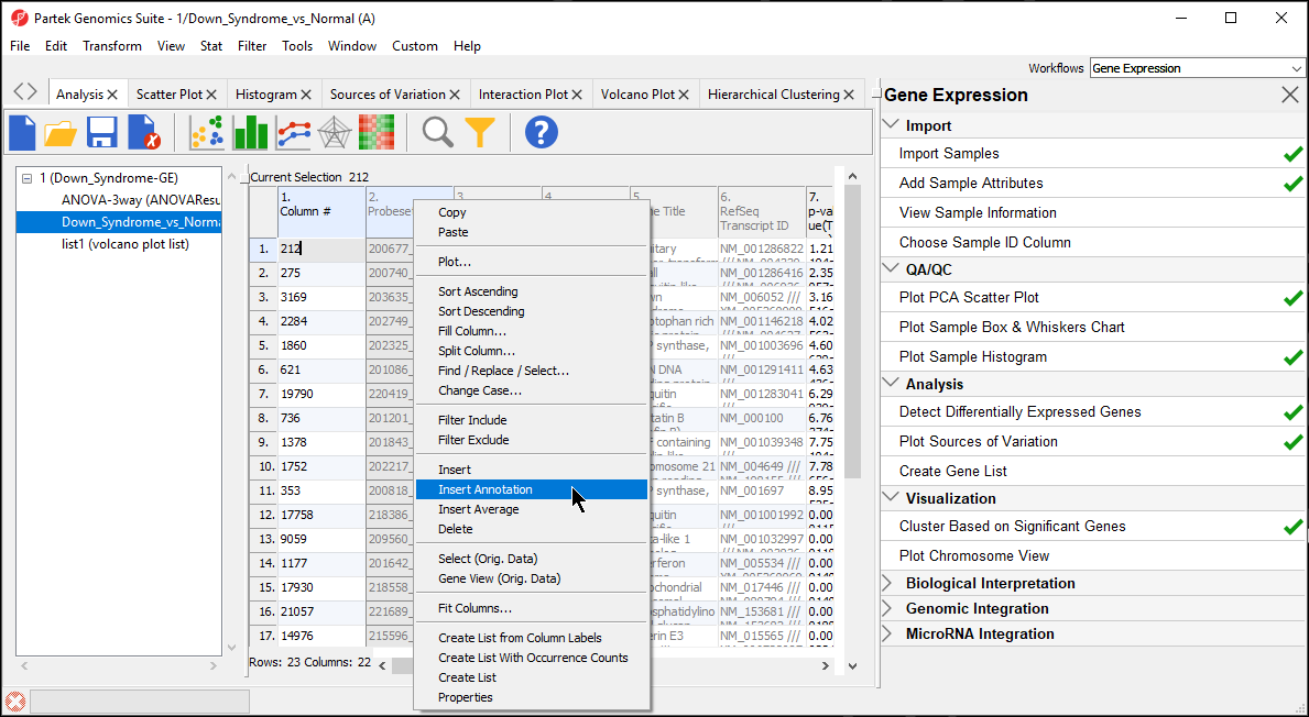
- In the Down_Syndrome_vs_Normal (A) spreadsheet, right click on the second column header 2. ProbesetID and select Insert Annotation from the pop-up menu (Figure 233)
| Numbered figure captions | ||||
|---|---|---|---|---|
| ||||
|
- Select Chromosomal Location under the Column Configuration panel (Figure 4). Leave everything else as default and select OK
| Numbered figure captions | ||||
|---|---|---|---|---|
| ||||
|
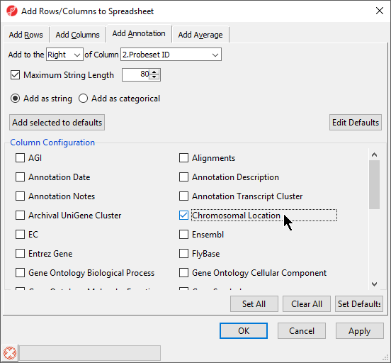
Interestingly, of the 23 genes of the Down_Syndrome_vs_Normal (A) spreadsheet, 20 genes are located on chromosome 21. To save changes to the spreadsheet, select the Save Active Spreadsheet icon (![]() ).
).
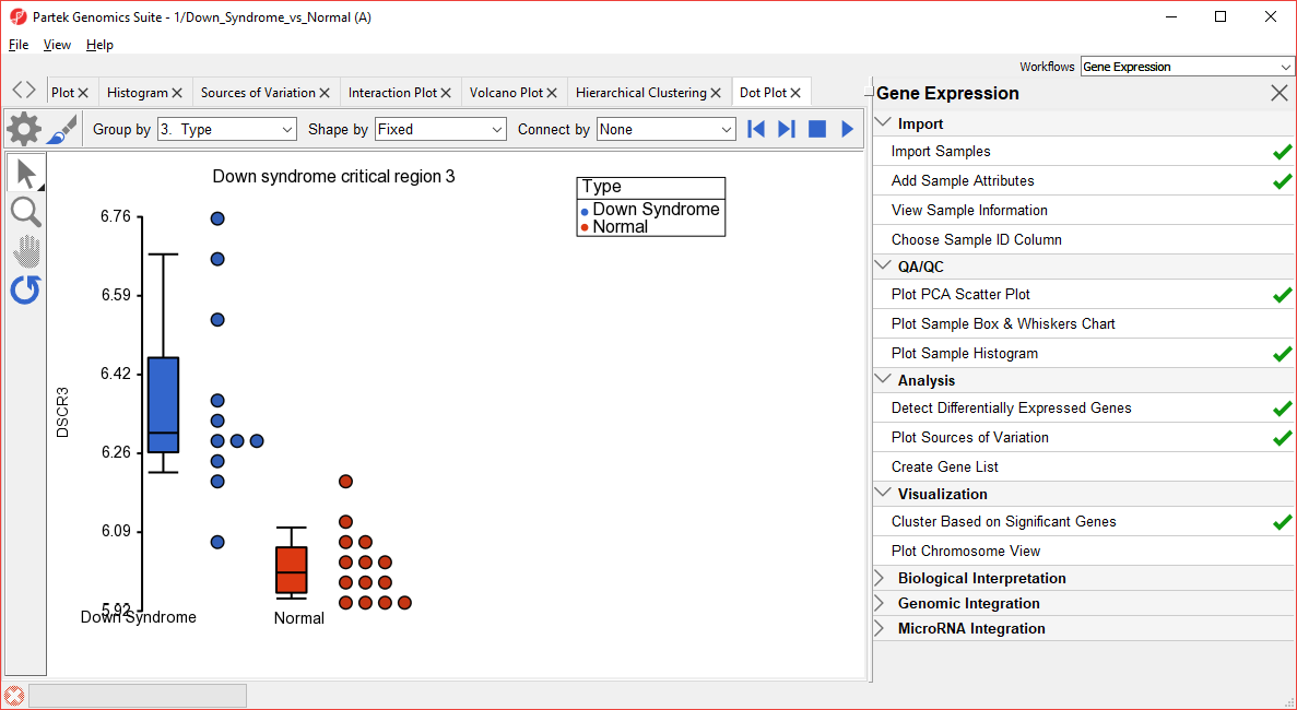
- To create a dot plot showing expression levels of a specific gene for each sample, right click on the row header and select Dot Plot (Orig. Data) from the pop-up menu. This generates a Dot Plot tab for the selected gene (Figure 5)
| Numbered figure captions | ||||
|---|---|---|---|---|
| ||||
|
| Additional assistance |
|---|
|
| Rate Macro | ||
|---|---|---|
|
Overview
Content Tools