Page History
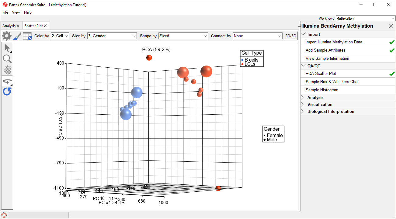
Principal component analysis (PCA) can be performed to visualize clusters in the methylation data, but also serves as a quality control procedure; outliers within a group could suggest poor data quality, batch effects, mislabeled samples, or uninformative groupings.
- Select Plot PCA Scatter Plot from the QA/QC section of the Illumina BeadArray Methylation workflow to bring up a Scatter Plot tab
- Select 32. shRNA Cell Type for Color by and 2. State
- Select 3. Gender for Size by by
- Select (
 ) to enable Rotate Mode
 - Left click and drag to rotate the plot and view different angles (Figure 1)
Each dot of the plot is a single sample and represents the average methylation status across all CpG loci. We can see clear separation of naive and primed hPSCs from the naive hPSCs transduced with shRNA lentiviruses (shNANOG and shPOU5F1). One shNANOG sample might be an outlierTwo of the LCLs samples do not cluster with the others, but we will not exclude it them for this tutorial.
| Numbered figure captions | ||||
|---|---|---|---|---|
| ||||
|
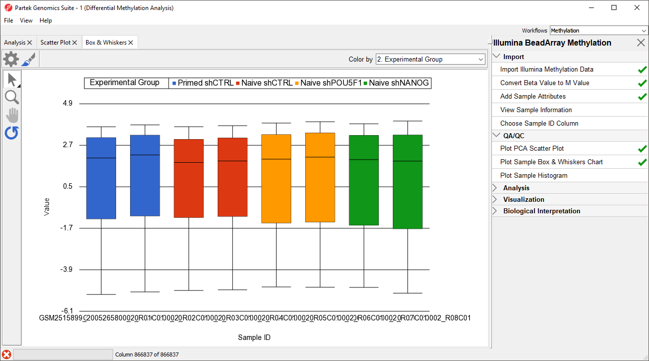
Next, distribution of M-beta values across the samples can also be inspected by a box-and-whiskers plot.
- Select Plot Sample Box and Whiskers Chart from the QA/QC section of the Illumina BeadArray Methylation workflow to bring up a Scatter Plot a Box and Whiskers tab
Each box-and-whisker is a sample and the y-axis shows Mbeta-value ranges. Samples in this data set seem reasonably uniform (Figure 2).
...
| Numbered figure captions | ||||
|---|---|---|---|---|
| ||||
|
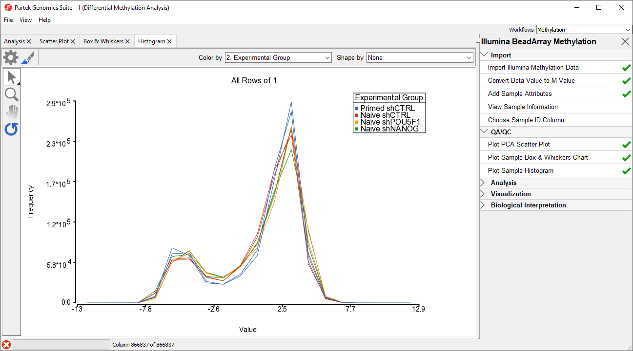
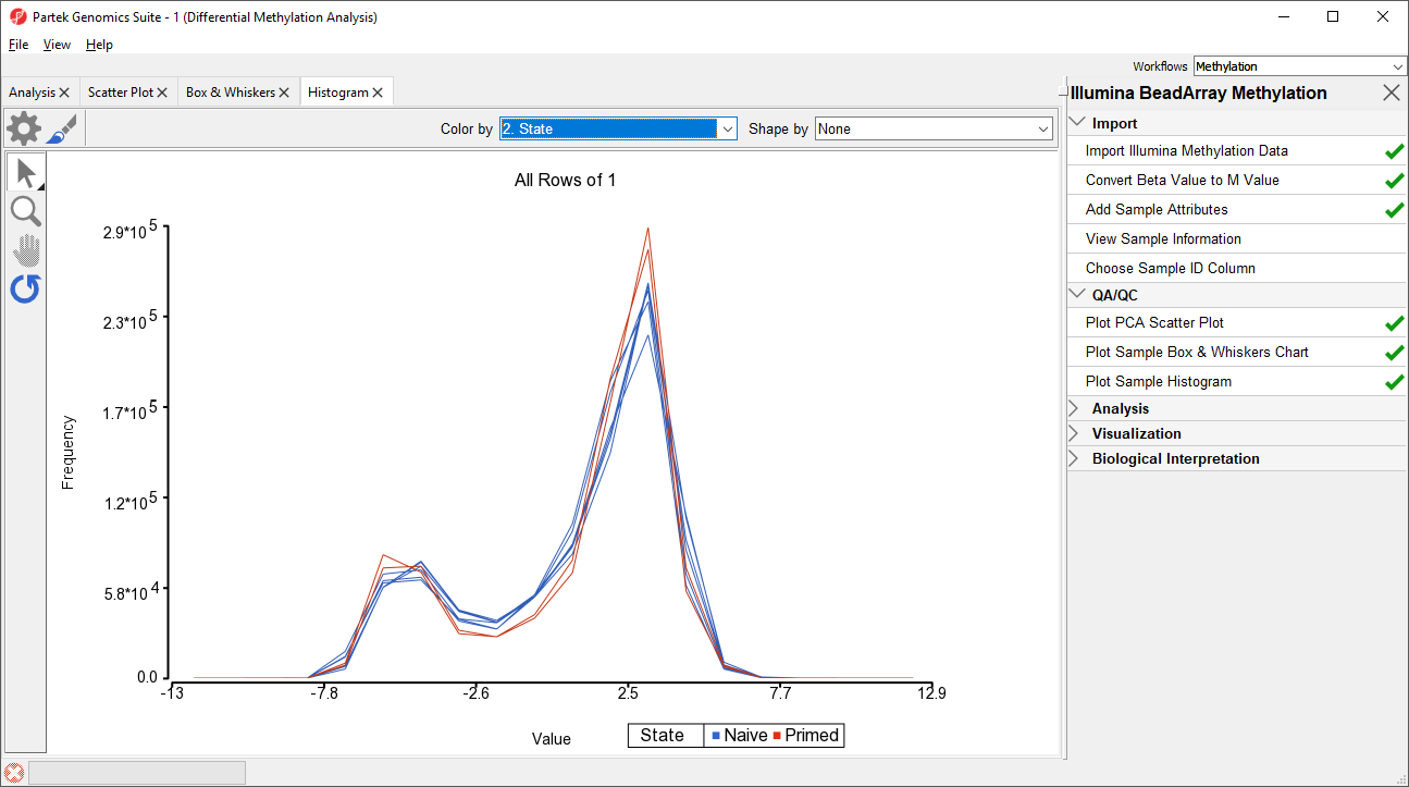
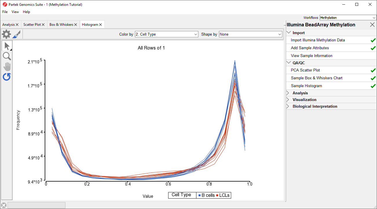
An alternative way to take a look at the distribution of Mbeta-values is a histogram.
- Select Plot Sample Histogram from the QA/QC section of the Illumina BeadArray Methylation workflow to bring up a Histogram tab
Again, no sample in the tutorial data set stands out (Figure 43).
| Numbered figure captions | ||||
|---|---|---|---|---|
| ||||
|
| Page Turner | ||
|---|---|---|
|
...
Overview
Content Tools