Page History
...
| Table of Contents | ||||||
|---|---|---|---|---|---|---|
|
GSA dialog
The first step of GSA is to choose which attributes to include in the test (Figure 1). All sample attributes including numeric and categorical attributes are displayed in the dialog, so use the check button to select between them. An experiment with two attributes Cell type (with groups A and B)and Time (time points 0, 5, 10) is used as an example in this section.
...
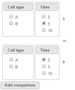
To compare Time point 5 vs. 0, select 5 for Time on the top, 0 for Time on the bottom, and click Add comparison (Figure 3).
| Numbered figure captions | ||||
|---|---|---|---|---|
| ||||
|
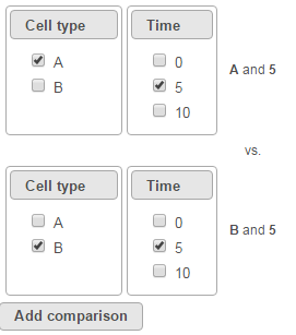
To compare cell types at a certain time point, e.g. time point 5, select A and 5 on the top, and B and 5 on the bottom. Thereafter click Add comparison (Figure 4).
| Numbered figure captions | ||||
|---|---|---|---|---|
| ||||
|
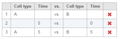
Multiple comparisons can be computed in one GSA run; Figure 5 shows the above three comparisons are added in the computation.
| Numbered figure captions | ||||
|---|---|---|---|---|
| ||||
|
...
- If invoked from a Partek E/M method output, the data node contains raw read counts and the default normalization is:
- Normalize to total count (RPM)
- Add 0.0001 (offset)
- If invoked from a Cufflinks method output, the data node contains FPKM and the default normalization is:
- Add 0.0001 (offset)
| Numbered figure captions | ||||
|---|---|---|---|---|
| ||||
|
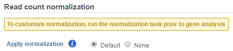
If advanced normalization needs to be applied, perform the Normalize counts task on a quantification data node before doing differential expression detection (GSA or ANOVA).
GSA advanced options
Click on Configure to customize Advanced options (Figure 7).
| Numbered figure captions | ||||
|---|---|---|---|---|
| ||||
|
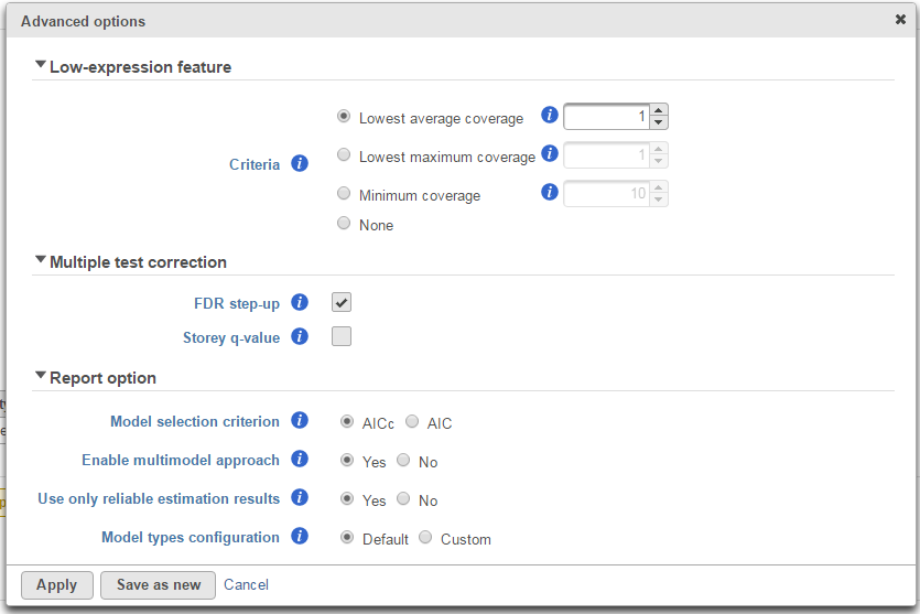
Low-expression feature
Low -expression feature section allows you to specify criteria to exclude features that do not meet requirements for the calculation. If there is filter feature task performed in the upstream analysis, the default of this filter is set to "None", otherwise, the default is Lowest average coverage is set to 1.
- Lowest average coverage: the computation will exclude a feature if its geometric mean across all samples is below than the specified value
- Lowest maximum coverage: the computation will exclude a feature if its maximum across all samples is below the specified value
- Minimum coverage: the computation will exclude a feature if its sum across all samples is below than the specified value
- None: include all features in the computation
Multiple test correction
Multiple test correction can be performed on the p-values of each comparison, with FDR step-up being the default (1). If you check the Other options like Storey q-value (2), an extra column with q-values will be added to the report. and Bonferroni are provided, select one method at a time; None means no multiple test correct will be performed.
FDR step-up:
Suppose there are n p-values (n is the number of features). The p-values are sorted by ascending order and m represents the rank of a p-value. The calculation compares p-value*(n/m) with the specified alpha level, and the cut-off p-value is the one that generates the last product that is less than the alpha level. The goal of step up method is to find:
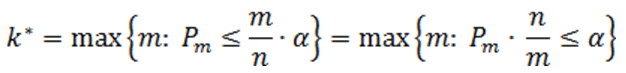
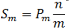
Define the step-up value as:
Then an equivalent definition for K* is :

So when
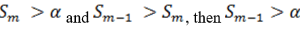
the step up value is
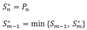
In order to find K* , start with Sn* and then go up the list until you find the first step up value that is less or equal to alpha.
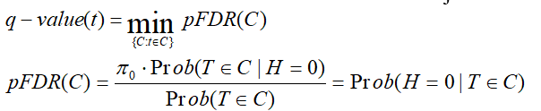
Storey q-value:
q-value is the minimum "positive false discovery rate" (pFDR) that can occur when rejecting a statistic.
For an observed statistic T=t and nested set of rejection area {C},
Bonferroni:
Suppose there are n p-values (n is the number of features), the expected number of Type I errors would be given by ![]() , thus the significance level of each individual test should be adjusted to
, thus the significance level of each individual test should be adjusted to ![]() . Alternatively the p-values should be adjusted as pB=p*n, pB is Bonferroni corrected p-value. If pB is greater than 1, it is set to 1
. Alternatively the p-values should be adjusted as pB=p*n, pB is Bonferroni corrected p-value. If pB is greater than 1, it is set to 1
Report option
This section configures how to select the best model for a feature. There are two options for Model selection criterion: AICc (Akaike Information Criterion corrected) and AIC (Akaike Information Criterion). AICc is recommended for small sample size, while AIC is recommended for medium and large sample size What about large samples?(3). Note that when sample size grows from small to medium, AICc converges to AIC. Taking the AICc/AIC value into account, GSA considers the model with the lowest information criterion as the best choice.
In the results, the best model's Akaike weight is also generated. The model's weight is interpreted as the probability that the model would be picked as the best if the study were reproduced. The range of Akaike weight is between 0 to 1, where 1 means the best model is very superior to the other candidates from the model pool; if the best model's Akaike weight is close to 0.5 on the other hand, it means the best model is likely to be replaced by other candidates if the study were reproduced. One still uses the best shot model, however, the accuracy of the best shot is fairly low.
...
There are situations when a model estimation procedure does not outright fail, but still encounters some difficulties. In this case, it can even generate p-value and fold change for the comparisons, but those values are not reliable, and can be misleading. It is recommended to use only reliable estimation results, so the default option for Use only reliable estimation results is set Yes.
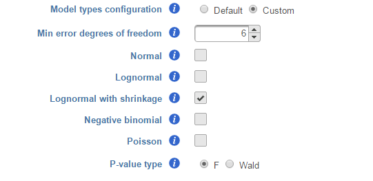
Model types configuration
Partek® Flow® provides five response distribution types for each design model in the pool, namely:
...
We recommend to use lognormal with shrinkage distribution (the default), and an experienced user may want to click on Custom to configure the model type and p-value type (Figure 8).
| Numbered figure captions | ||||
|---|---|---|---|---|
| ||||
|
...
The design pool can also be restricted by Min error degrees of freedom. The minimal When "Model types configuration" is set to Default , this is automated as follows: it is desirable to keep the error degrees of freedom is at or above six. Therefore, we automatically set to the largest k (k represents the error degree of freedom of the model) in the design model pool, with 0 <= k <=6 for which admissible models exist. Admissible model is one that can be estimated given the specified contrastsPlease make sure that I got the meaning right. In contrasts. In the above example, when we compare A vs B in Cell type, there are three possible design models. The error degree of freedom of model Cell type is largest and the error degree of freedom of model Cell type, Time, Cell type * Time is the smallest:
...
If the sample size is big, k >=6 in all three models, all the models will be evaluated and the best model will be selected for each feature. However, if the sample size is too small, none of the models will have k >=6, then only the model with maximal k will be used in the calculation. If the maximal k happens to be zero, we are forced to use Poisson response distribution only.
There are two types of p-value, F and Wald., Poisson, negative binomial and normal models can generate p-value using either Wald or F statistics. Lognormal models always employ the F statistics; the more replicates in the study, the less the difference between the two options. When there are no replicates, only Poisson can be used to generate p-value using Wald.
Note: Partek Flow keeps tracking the log status of the data, and no matter whether GSA is performed on logged data or not, the LSMeans, ratio and fold change calculation is are always in linear scale. Ratio is the ratio of the two LSMeans from the two groups in the comparison (left is the numerator, right is the denominator); Fold change is converted from ratio: when ratio is greater than 1, fold change is same as ratio; when ratio is less than one, fold change is -1/ratio. In other words - fold change value is always >=1 or <=-1, there is no fold change value between -1 and 1. When the LSmean of numerator group is greater than that of denominator group, fold change is greater than 1; when LSmean of numerator group is less than denominator group, fold change is less than 1; when the group groups are the same, fold change is 1. Logratio is ratio is log2 transformed, which is equivalent to logfoldchange is some other software.
GSA report
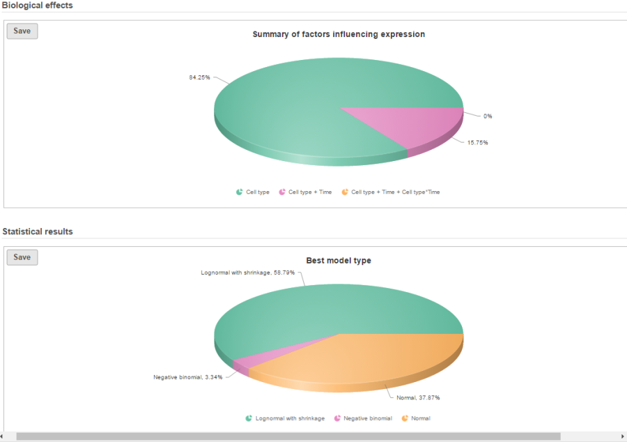
If there are multiple design models and multiple distribution types included in the calculation, the fraction of genes using each model and type will be displayed as pie charts in the task result (Figure 9).
| Numbered figure captions | ||||
|---|---|---|---|---|
| ||||
|
Feature list with p-value and fold change generated from the best model selected is displayed in a table with other statistical information (Figure 10). By default, the gene list table is sorted by the first p-value column.
| Numbered figure captions | ||||
|---|---|---|---|---|
| ||||
|
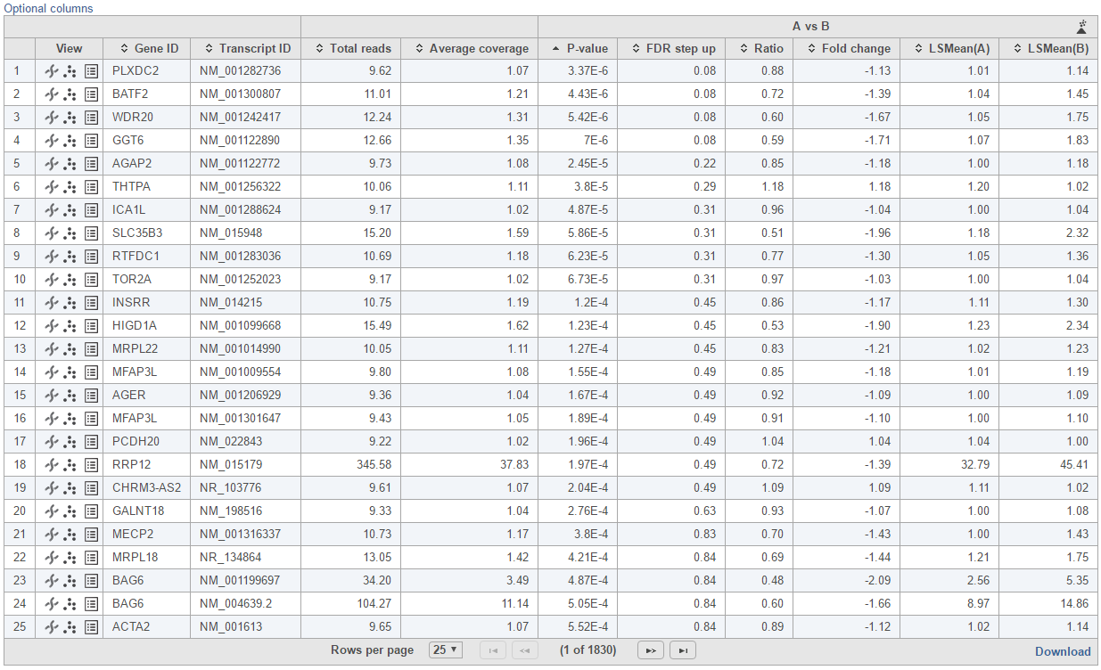
The following information is included in the table by default:
- Feature ID information: if transcript level analysis was performed, and the annotation file has both transcript and gene level information, both gene ID and transcript ID are displayed. Otherwise, the table shows only the available information.
- Total readscounts: total number of raw read counts across all the samples. Raw reads are retrieved from quantification data nodeobservations from the input data.
- Each contrast outputs p-value, FDR step up p-value, ratio and fold change in linear scale, LSmean of each group comparison in linear scale
When you click on the Optional columns link on the top-left corner of the table, extra information will be displayed in the table when select:
- Maximum count: maximum number of reads counts across all the observations from the input data.
- Geometric mean: geometric mean value of the input counts across all observations.
- Arithmetic mean: arithmetic mean value of input counts across all observations.
Click on View extra details report (![]() ) icon under View section to get more statistical information about the feature. In a case that the task doesn't fail, but certain statistical information is not generated, e.g. p-value and/or fold change of a certain comparison are not generated for some or all feature, click on this icon to get more information by mousing over the read exclamation icon
) icon under View section to get more statistical information about the feature. In a case that the task doesn't fail, but certain statistical information is not generated, e.g. p-value and/or fold change of a certain comparison are not generated for some or all feature, click on this icon to get more information by mousing over the read exclamation icon
By clicking on Optional columns, you can retrieve more statistics result information, e.g. Average coverage which is the geometric mean of normalized reads in linear scale across all the samples; fold change lower/upper limits generated from 95% confidence interval; feature annotation information if there are any more annotation information fields in the annotation model you specified for quantification, like genomic location, strand information etc.
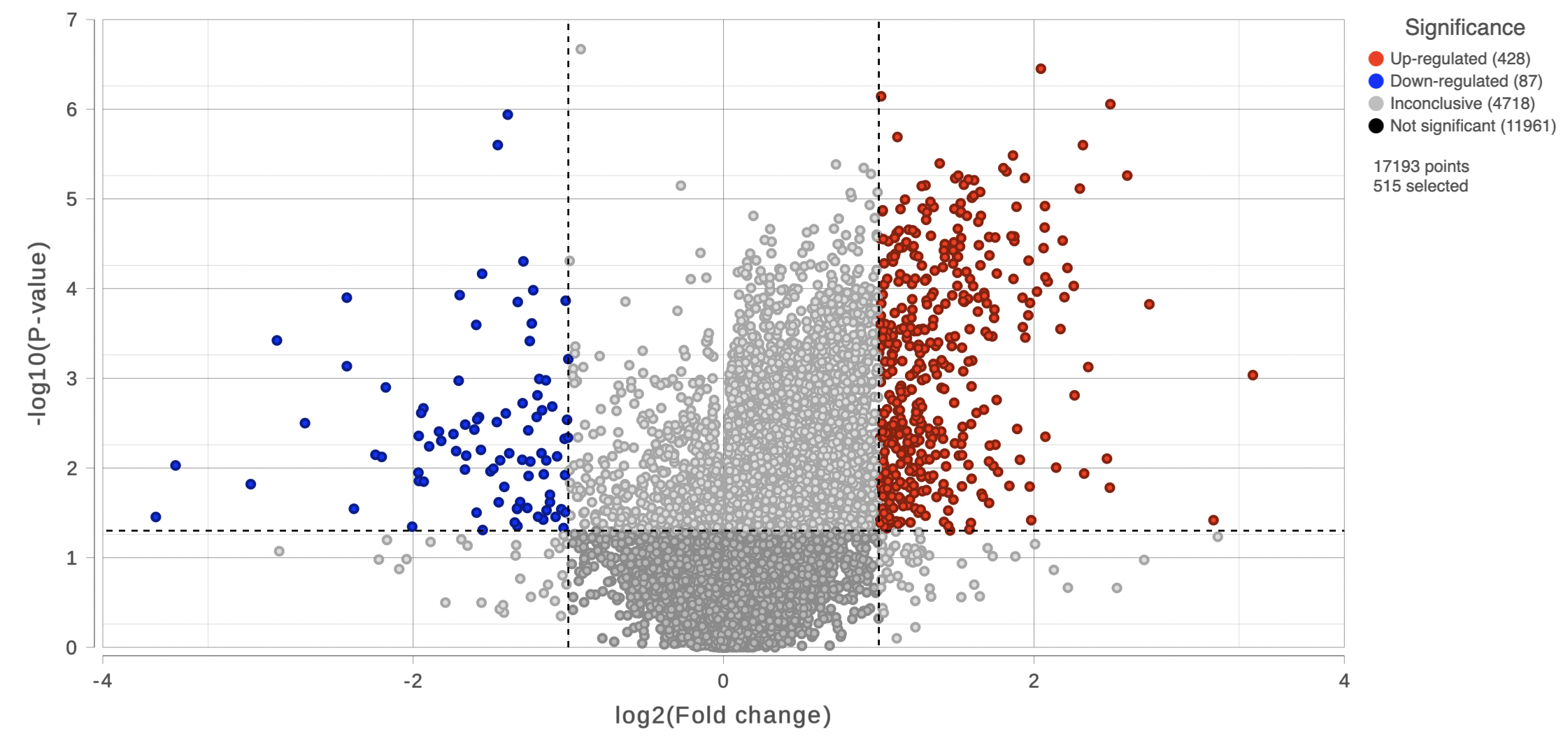
On the right of each contrast header, there is volcano plot icon ( ![]() ). Select it to display the volcano plot on the chosen contrast (Figure 11).
). Select it to display the volcano plot on the chosen contrast (Figure 11).
| Numbered figure captions | ||||
|---|---|---|---|---|
| ||||
|
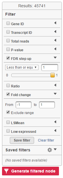
Feature list filter panel is on the left of the table (Figure 12). Click on the black triangle ( ) to collapse and expand the panel.
Select the check box of the field and specify the cutoff , and press by typing directly or using the slider. Press Enter to apply. After After the filter has been applied, the total number of included features will be updated on the top of the panel (Result).
Note that for the LSMean, there are two columns corresponding to the two factors in the contrast. The cutoffs can be specified for the left and right columns separately. For example, in Figure 6, the LSMean (left) corresponds to A while the LSMean(right) is for the B.
| Numbered figure captions | ||||
|---|---|---|---|---|
| ||||
|
The filtered result can be saved into a filtered data node by selecting the Generate list button at the lower-left corner of the table ( ). Selecting the Download button at the lower-right corner of the table downloads the table as a text file to the local computer.
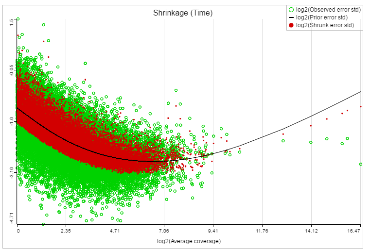
If lognormal with shrinkage method was selected for GSA, a shrinkage plot is generated in the report (Figure 13). X-axis shows the log2 value of average coverage. The plot helps to determine the threshold of low expression features. If there is an increase before a monotone decrease trend on the left side of the plot, you need to set a higher threshold on the low expression filter. Detailed information on how to set the threshold can be found in the GSA white paper.
| Numbered figure captions | ||||
|---|---|---|---|---|
| ||||
|
References
- Benjamini, Y., Hochberg, Y. (1995). Controlling the false discovery rate: a practical and powerful approach to multiple testing, JRSS, B, 57, 289-300.
- Storey JD. (2003) The positive false discovery rate: A Bayesian interpretation and the q-value. Annals of Statistics, 31: 2013-2035.
- Auer, 2011, A two-stage Poisson model for testing RNA-Seq
- Burnham, Anderson, 2010, Model selection and multimodel inference
- Law C, Voom: precision weights unlock linear model analysis tools for RNA-seq read counts. Genome Biology, 2014 15:R29.
- http://cole-trapnell-lab.github.io/cufflinks/cuffdiff/index.html#cuffdiff-output-files
- Anders S, Huber W: Differential expression analysis for sequence count data. Genome Biology, 2010
...
...
| Additional assistance |
|---|
| Rate Macro | ||
|---|---|---|
|
...
Overview
Content Tools