Page History
...
The Violin plot in Partek Genomics Suite is similar to the Profile Trellis plot in that it displays probe(set)/gene intensity values across samples and genes. However, the Violin plot has additional options not shared by the Profile Trellis plot. Here, we will explore one use cases case for the Violin plot.
Displaying intensity value ranges for multiple genes grouped by categorical variables
For this example, we will use the data set and lists created in the Gene Expression tutorial. We have a list of 23 genes that we have identified as are differentially regulated between in tissue samples from patients with Down Syndrome syndrome and normal controls. We want to display the mean intensity values for Down Syndrome syndrome and normal samples for each of the 23 genes on a single plot. To do this, we first need to filter the probe intensities spreadsheet to include only the intensity values for the 23 genes of interest.
With the probe intensities spreadsheet and the gene list open in the Analysis tab, follow these steps to filter the probe intensities spreadsheet.
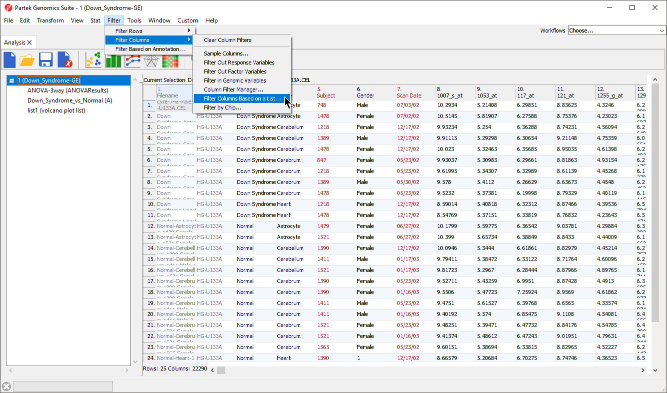
- Select the probe intensities spreadsheet in the spreadsheet tree; here, it is Down_Syndrome-GE
- Select Filter from the main task bar
- Select Filter Columns
- Select Filter Columns Base on a List... (Figure 1)
| Numbered figure captions | ||||
|---|---|---|---|---|
| ||||
|
...
- Select your gene list from the Filter base on spreadsheet drop-down menu; here, we selected Down_Syndrome_vs._Normal
- Select the column of your gene list that matches the column IDs you want to filter from your probe intensities spreadsheet; here, we selected 2. Probeset ID
- Select OK to apply the filter
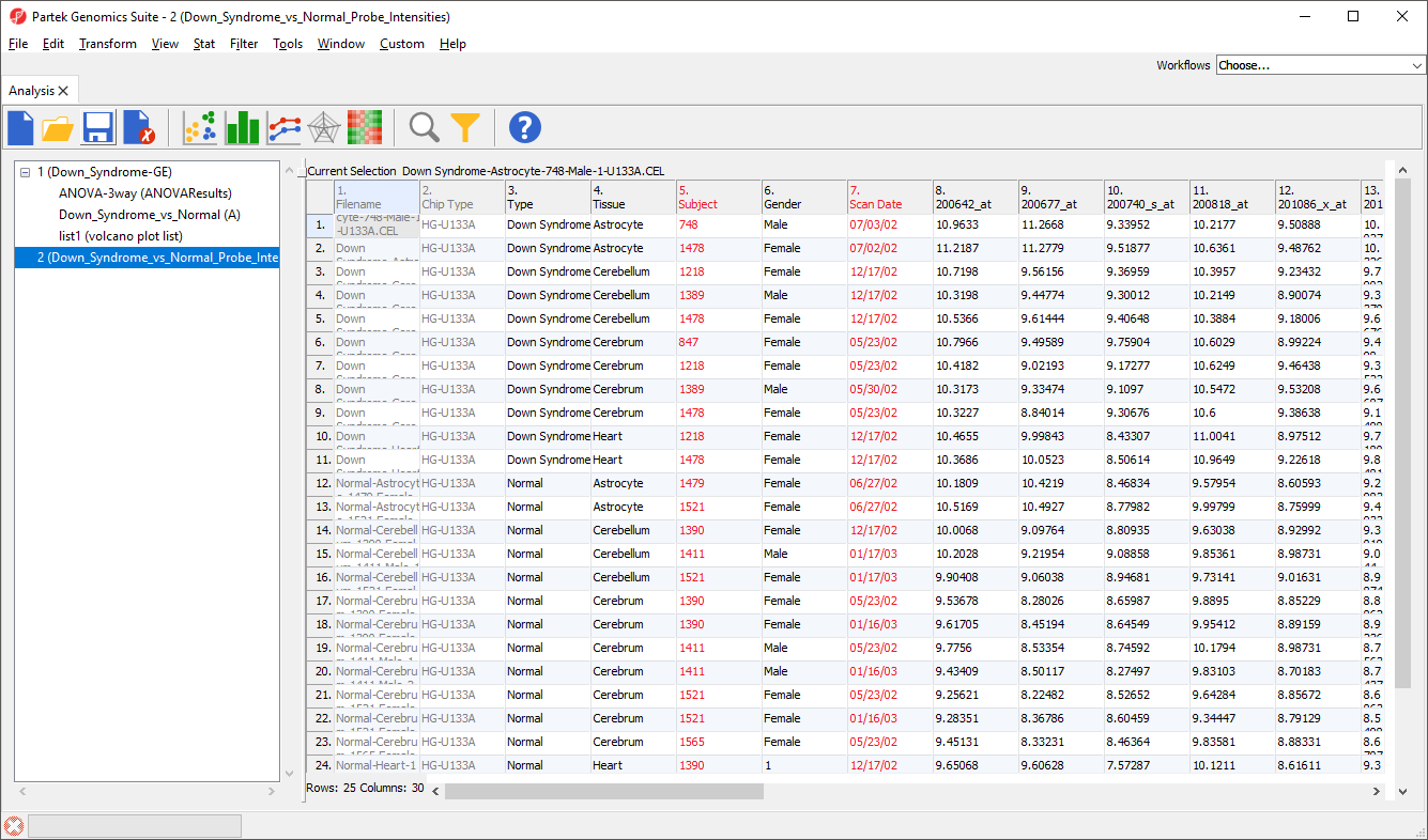
A black and yellow horizontal bar will appear at the bottom of the spreadsheet. This is the filter indicator showing the proportion of samples columns (genes/probesets) filtered out (black) and retained (yellow). To continue working with the filtered probe probeset intensities, we can clone the filtered spreadsheet.
...
- Select (
 )
) - Name the new file; we chose Down_Syndrome_vs_Normal_Probe_Intensities
Now we have a probe intensities spreadsheet containing only the probe intensity values for our 23 genes of interest (Figure 4).
| Numbered figure captions | ||||
|---|---|---|---|---|
| ||||
|
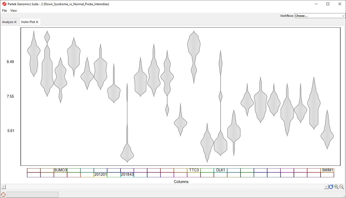
We can now invoke the Violin plot. Make sure to have the filtered probe intensities spreadsheet selected (in blue) in the spreadsheet tree as shown (Figure 4).
...
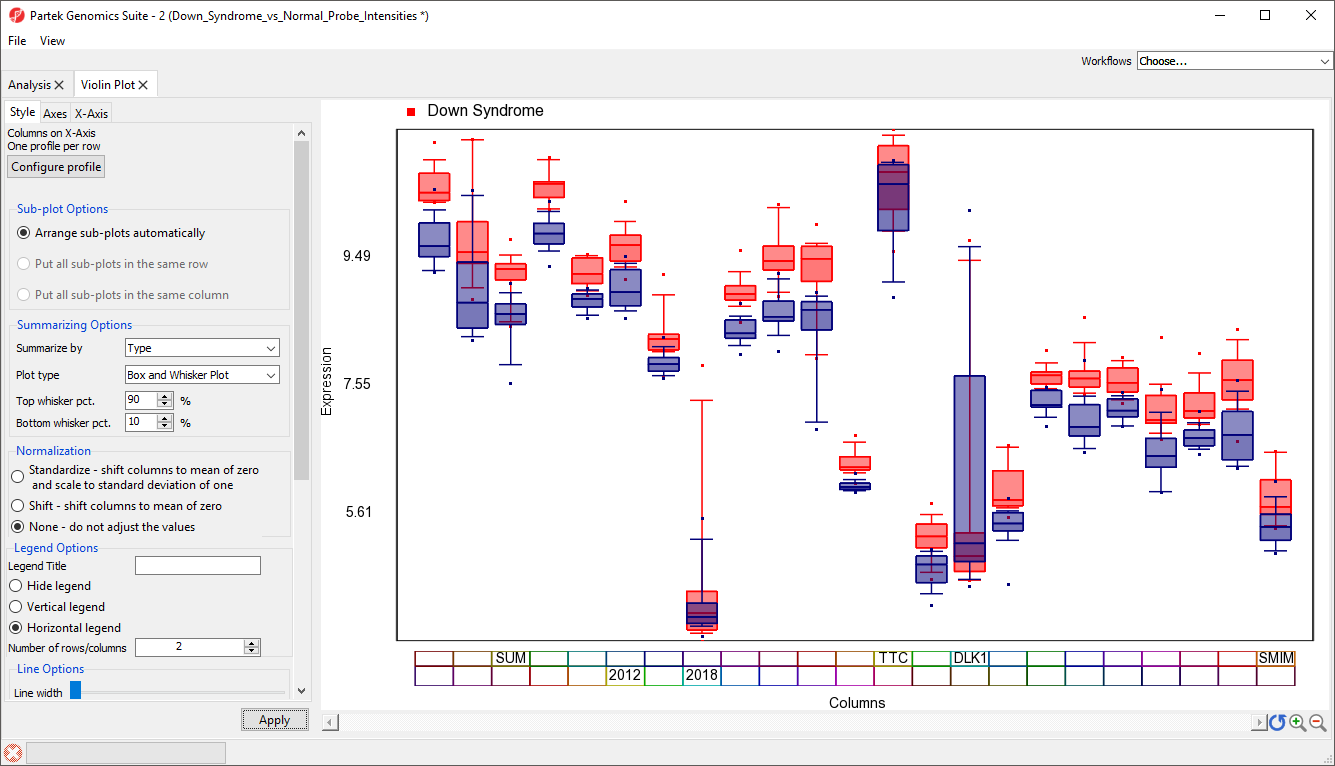
A Violin Plot tab will open (Figure 5). This plot shows the intensity value ranges of the 23 genes (probe sets) for all samples as violin plots.
| Numbered figure captions | ||||
|---|---|---|---|---|
| ||||
|
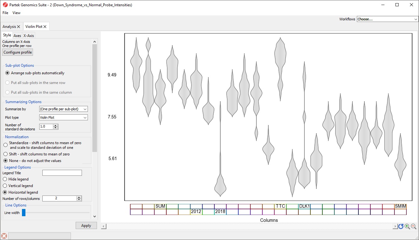
- Select View from the main taskbar
- Select Toggle Properties
We can now see the plot properties panel to the left of the violin plot (Figure 6).
| Numbered figure captions | ||||
|---|---|---|---|---|
| ||||
|
...
| Numbered figure captions | ||||
|---|---|---|---|---|
| ||||
|
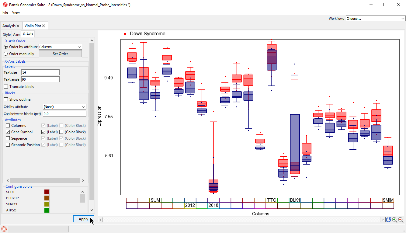
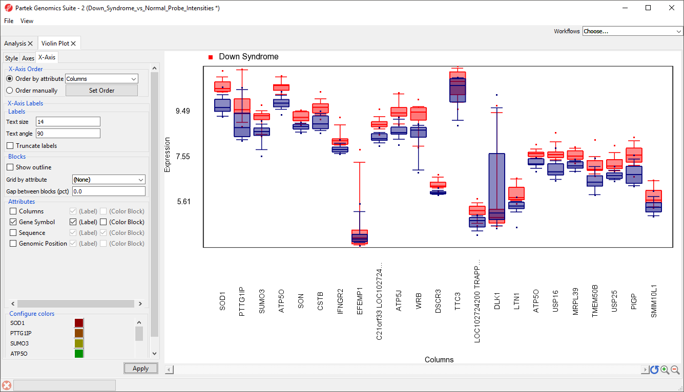
To improve our view of the gene symbols, we can modify the X-axis legend.
...
| Numbered figure captions | ||||
|---|---|---|---|---|
| ||||
|
| Numbered figure captions | ||||
|---|---|---|---|---|
| ||||
|
...
| Numbered figure captions | ||||
|---|---|---|---|---|
| ||||
|
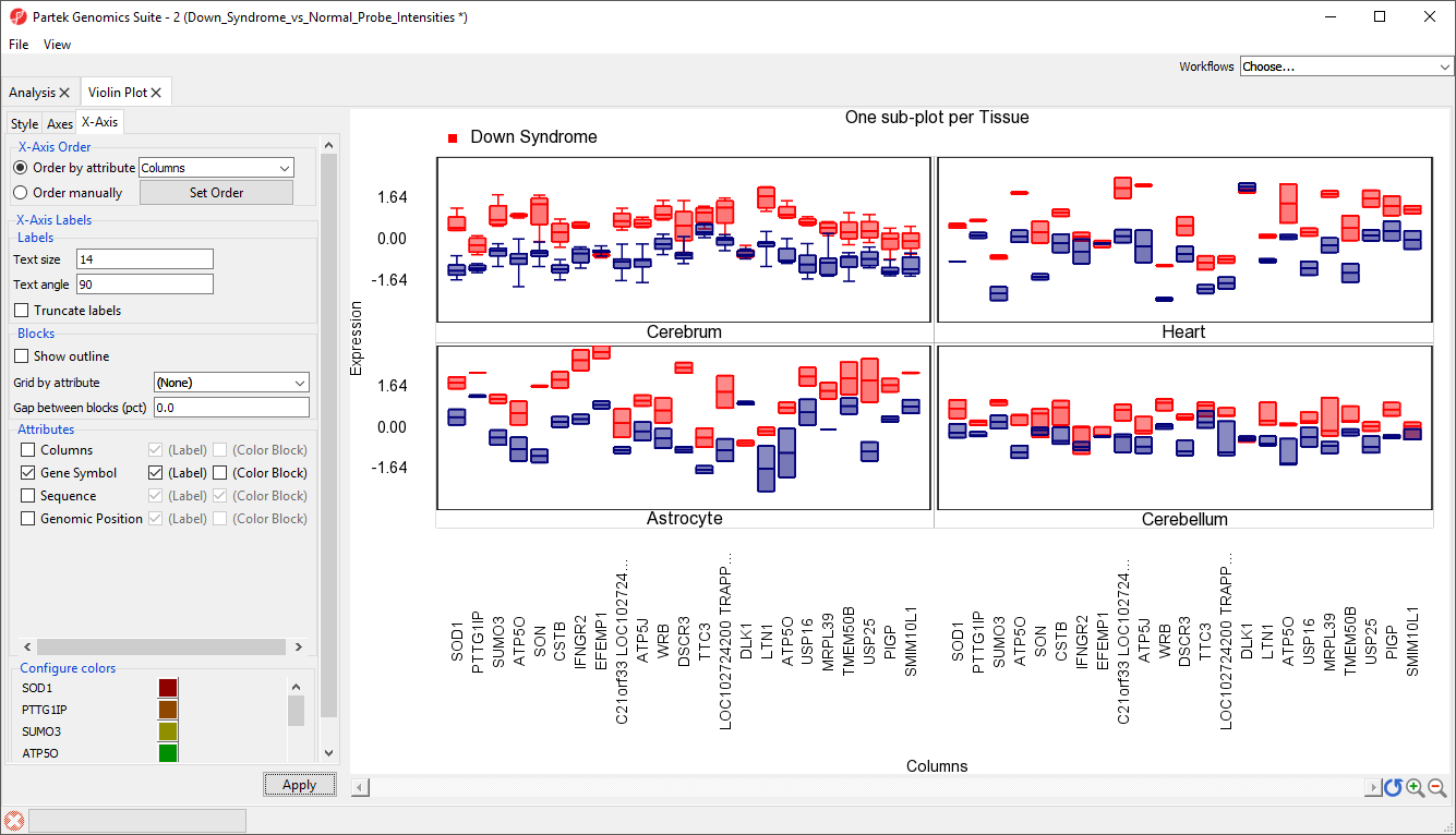
Plots can also be split by categorical variables. We can use this to visualize differential expression of genes between Down syndrom and normal patients in different tissue types.
...
There should now be a sub-plot for each category, in this case there are four sub-plots, one for each tissue (Figure 13). There are no error bars for several plots because there are not enough samples in those categories.
| Numbered figure captions | ||||
|---|---|---|---|---|
| ||||
|
...
Overview
Content Tools