The Violin plot in Partek Genomics Suite is similar to the Profile Trellis plot in that it displays probe(set)/gene intensity values across samples and genes. However, the Violin plot has additional options not shared by the Profile Trellis plot. Here, we will explore one use case for the Violin plot.
Displaying intensity value ranges for multiple genes grouped by categorical variables
For this example, we will use the data set and lists created in the Gene Expression tutorial. We have a list of 23 genes that are differentially regulated in tissue samples from patients with Down syndrome and normal controls. We want to display the mean intensity values for Down syndrome and normal samples for each of the 23 genes on a single plot. To do this, we first need to filter the probe intensities spreadsheet to include only the intensity values for the 23 genes of interest.
With the probe intensities spreadsheet and the gene list open in the Analysis tab, follow these steps to filter the probe intensities spreadsheet.
- Select the probe intensities spreadsheet in the spreadsheet tree; here, it is Down_Syndrome-GE
- Select Filter from the main task bar
- Select Filter Columns
- Select Filter Columns Base on a List... (Figure 1)
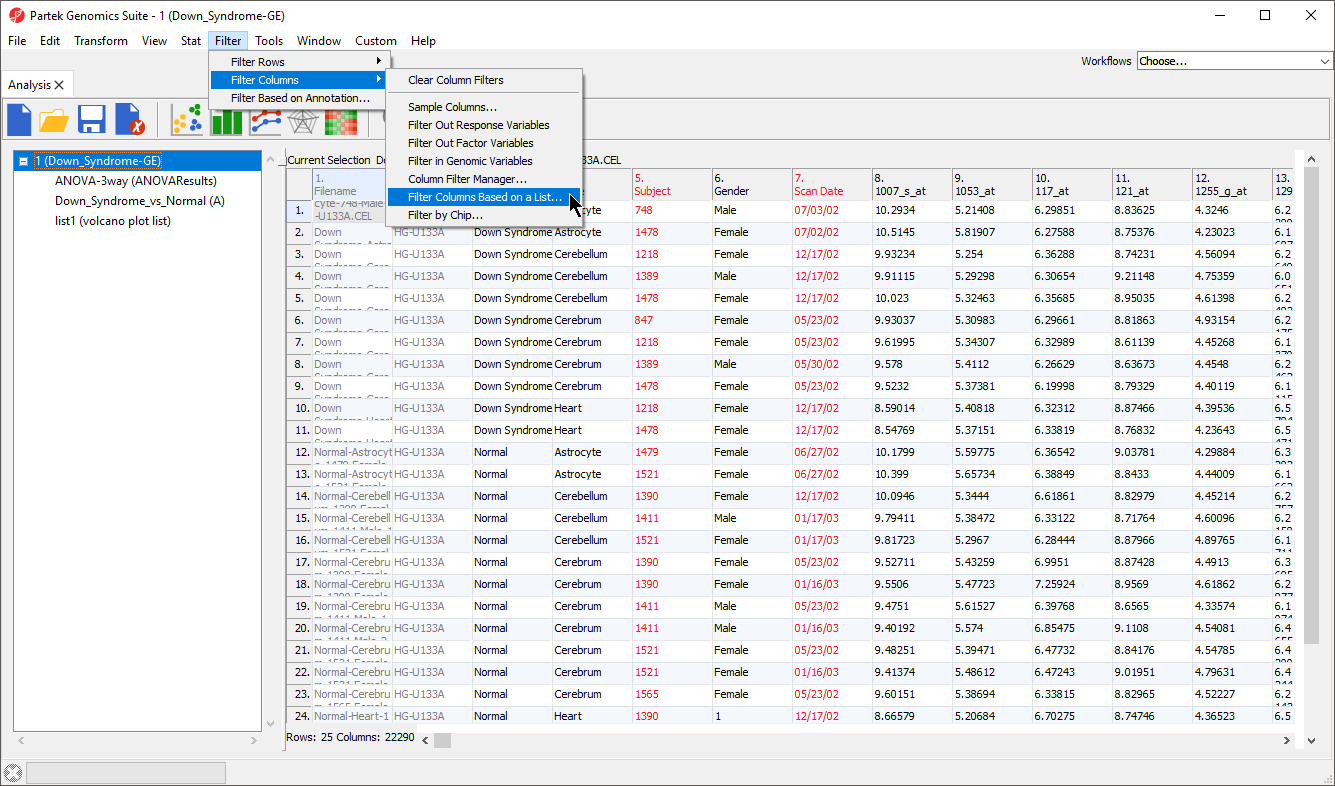
Figure 1. Invoking filter columns by a list
The Filter Columns dialog will open (Figure 2).
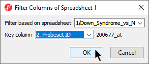
Figure 2. Configuring the Filter Columns dialog to filter by probe set ID
- Select your gene list from the Filter base on spreadsheet drop-down menu; here, we selected Down_Syndrome_vs._Normal
- Select the column of your gene list that matches the column IDs you want to filter from your probe intensities spreadsheet; here, we selected 2. Probeset ID
- Select OK to apply the filter
A black and yellow horizontal bar will appear at the bottom of the spreadsheet. This is the filter indicator showing the proportion of columns (genes/probesets) filtered out (black) and retained (yellow). To continue working with the filtered probeset intensities, we can clone the filtered spreadsheet.
- Right-click on the filtered probe intensities spreadsheet in the spreadsheet tree
- Select Clone... from the pop-up menu (Figure 3)
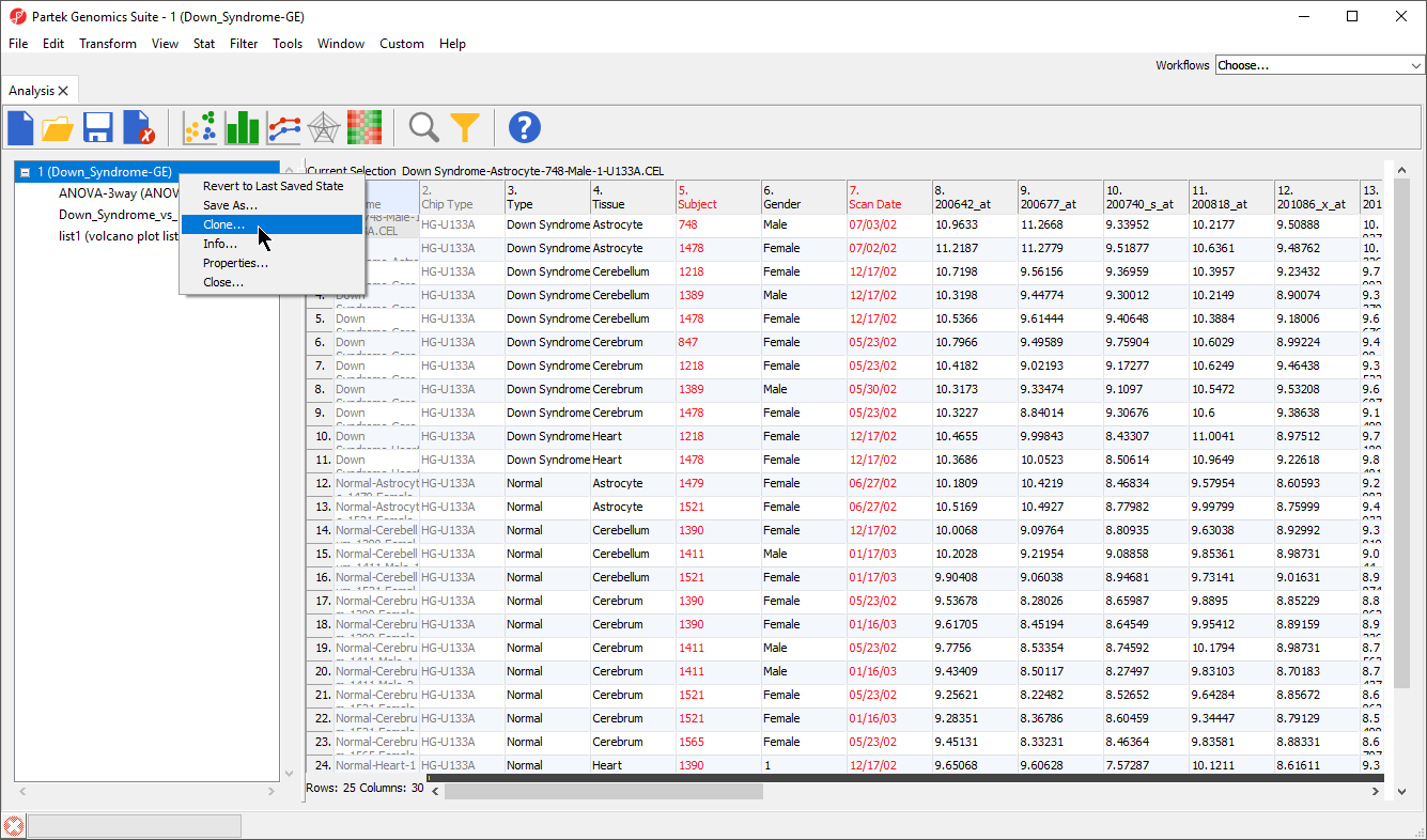
Figure 3. Cloning a spreadsheet with a filter applied will clone only the retained rows/columns
- Name the new spreadsheet; we chosen 2
- Select OK
The cloned spreadsheet is a temporary file. To ensure we can use it again if we close Partek Genomics Suite, we should save the filtered probe intensities spreadsheet.
- Select (
 )
) - Name the new file; we chose Down_Syndrome_vs_Normal_Probe_Intensities
Now we have a spreadsheet containing only the probe intensity values for our 23 genes of interest (Figure 4).
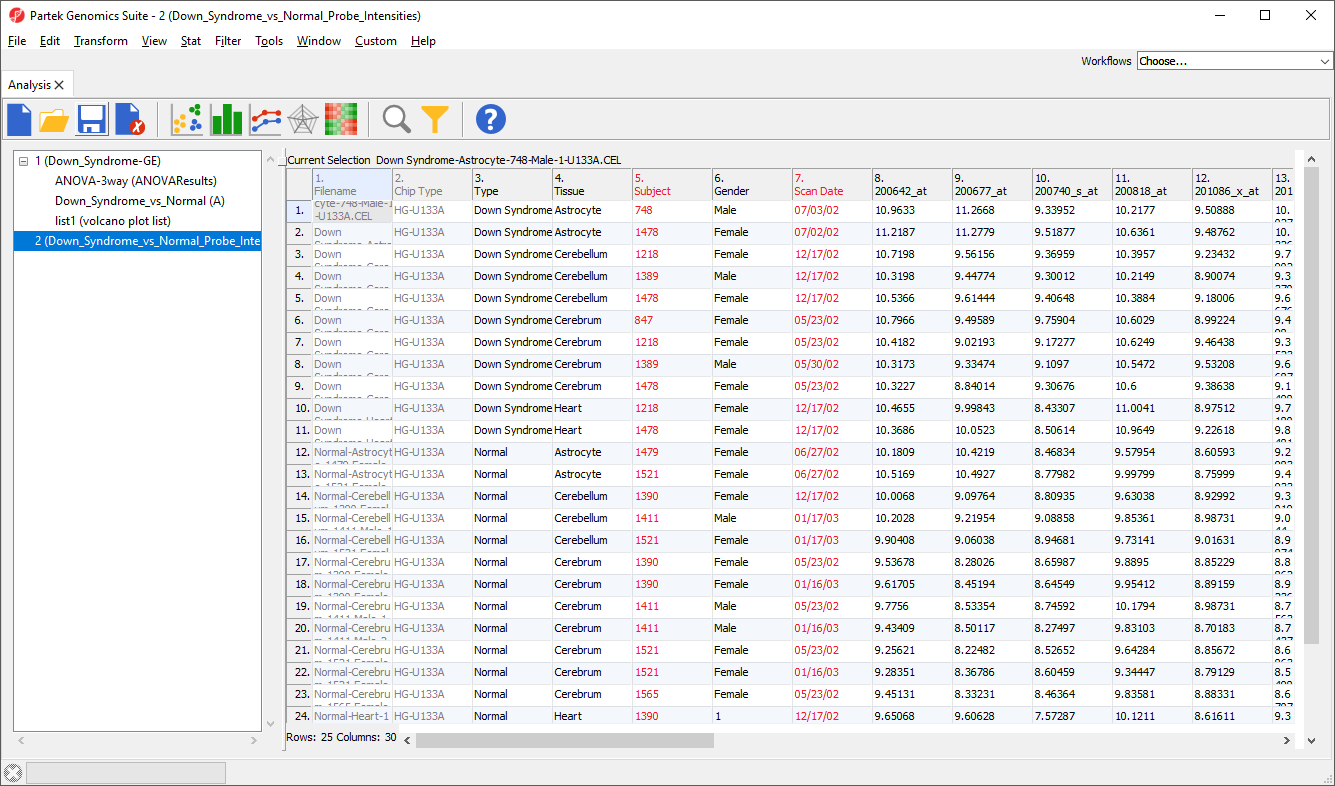
Figure 4. Filtered probe intensities spreadsheet
We can now invoke the Violin plot. Make sure to have the filtered probe intensities spreadsheet selected (in blue) in the spreadsheet tree as shown (Figure 4).
- Select View from the main taskbar
- Select Violin Plot from the menu
A Violin Plot tab will open (Figure 5). This plot shows the intensity value ranges of the 23 genes (probe sets) for all samples as violin plots.
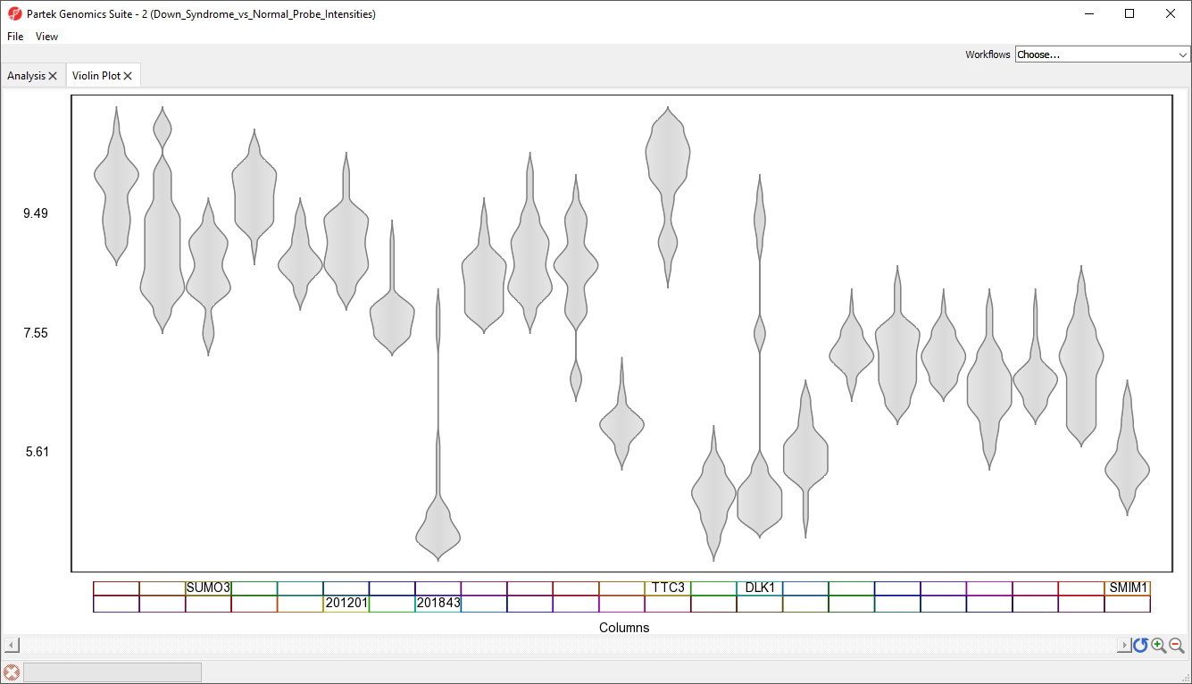
Figure 5. Viewing violin plots for 23 genes
- Select View from the main taskbar
- Select Toggle Properties
We can now see the plot properties panel to the left of the violin plot (Figure 6).
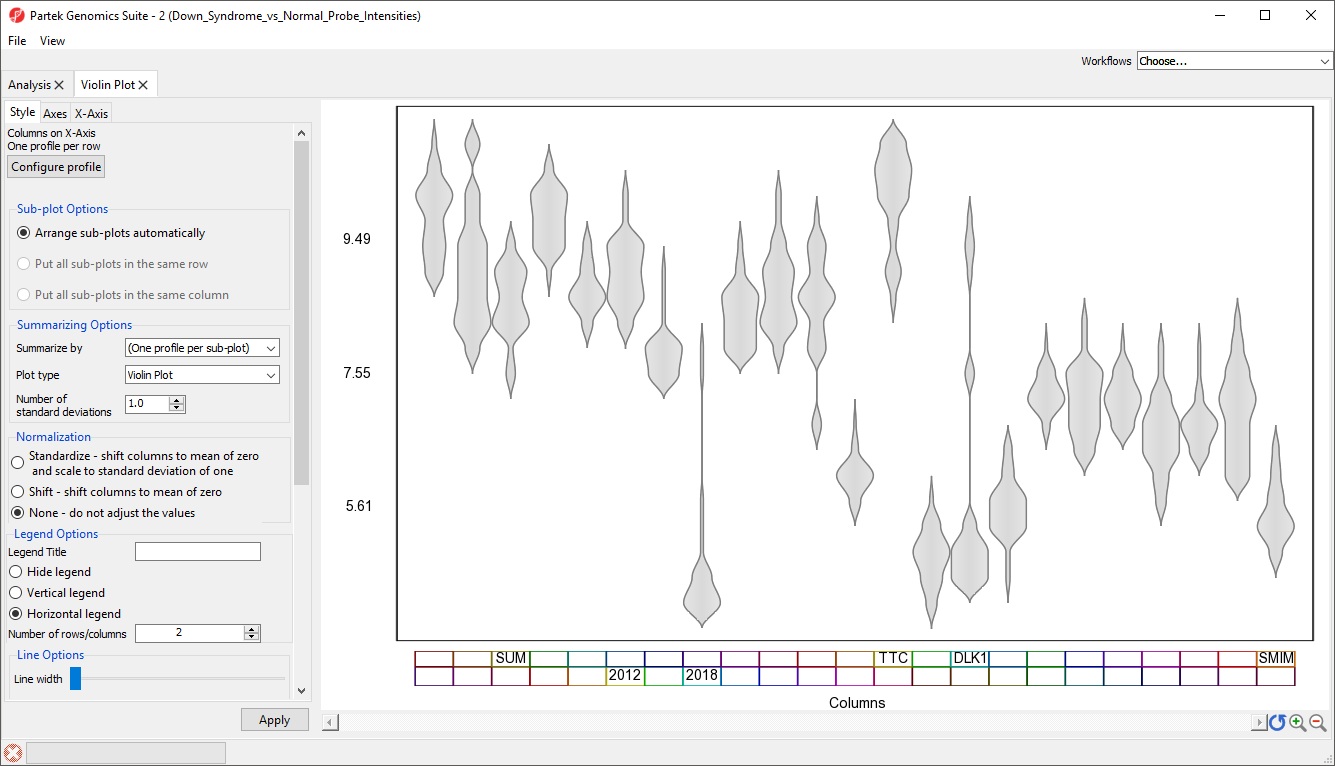
Figure 6. The violin plot can be configured using the plot properties panel
Although it is called the Violin plot, this visualization can also be used to display box and whisker plots, error bar plots, and gradiant plots. For this example, we will generate box and whisker plots, summarized by Type (Down syndrome and normal), for each gene.
- Select Box and Whisker Plot from the Plot type drop-down menu
- Select Type from the Summarize by drop-down menu; this can be any categorical variable
- Select Hide legend from Legend Options
- Select Apply to modify the plot
The modified plot shows box and whisker plots, Down syndrome samples in red and normal in blue, for each gene (Figure 7).
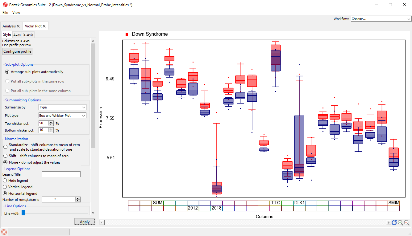
Figure 7. Viewing average probe intensity values for two groups across 23 genes as box and whisker plots
To improve our view of the gene symbols, we can modify the X-axis legend.
- Select X-Axis from the tabs in the plot properties panel
- Set Text angle to 90 under Labels
- Uncheck Trucate labels under Labels
- Uncheck Show Outline under Blocks
- Uncheck Columns under Attributes
- Select Apply (Figure 8)
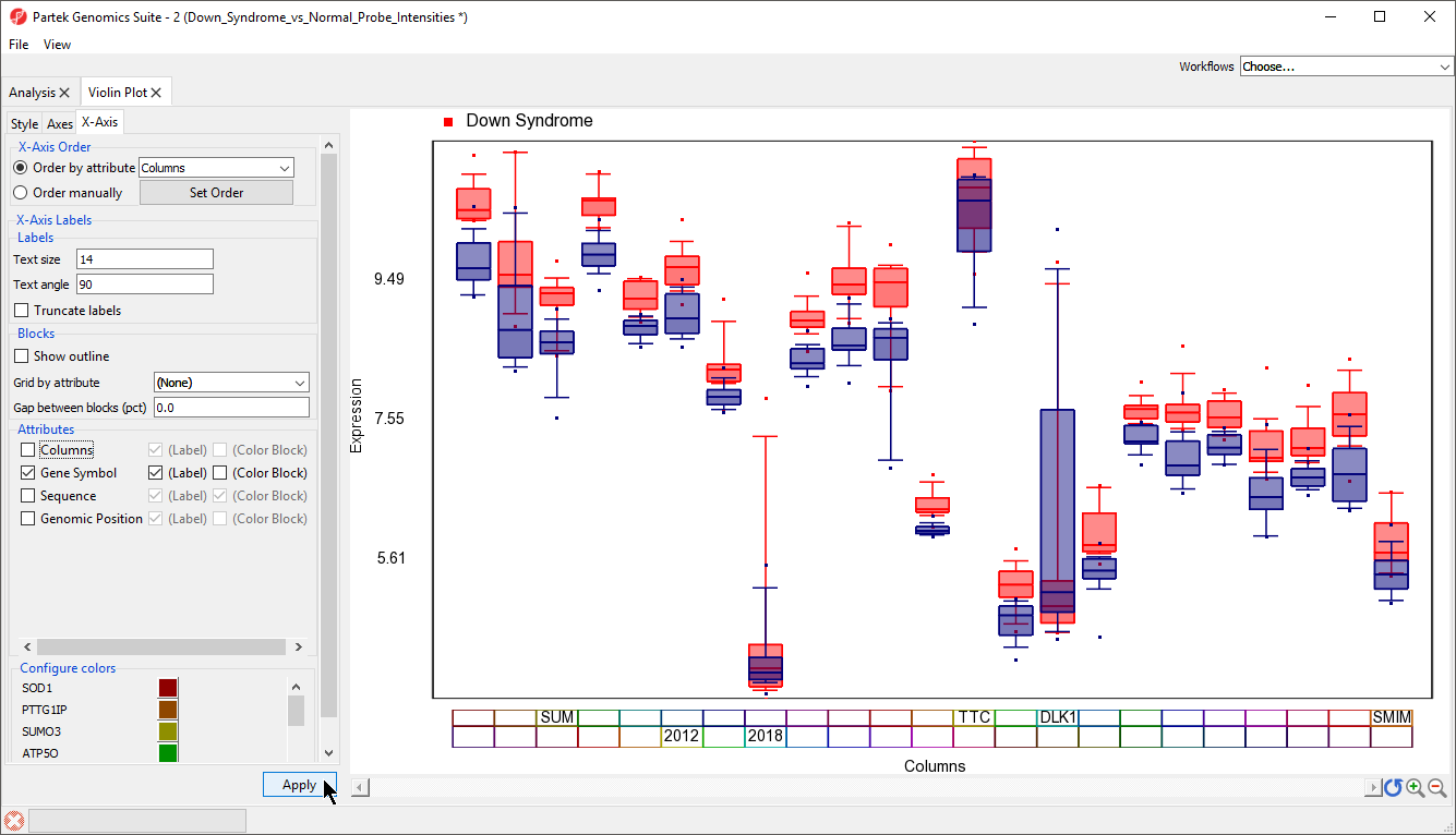 Figure 8. Configuring the X-axis label
The gene symbol for each column should now be visilble (Figure 9). In cases where probe intensities for your genes of interest fall across a wide range, it may be helpful to normalize the probe intensity distributions of each gene. This is equivalent to what is done to display a heat map of probe intensity values.
Figure 8. Configuring the X-axis label
The gene symbol for each column should now be visilble (Figure 9). In cases where probe intensities for your genes of interest fall across a wide range, it may be helpful to normalize the probe intensity distributions of each gene. This is equivalent to what is done to display a heat map of probe intensity values.
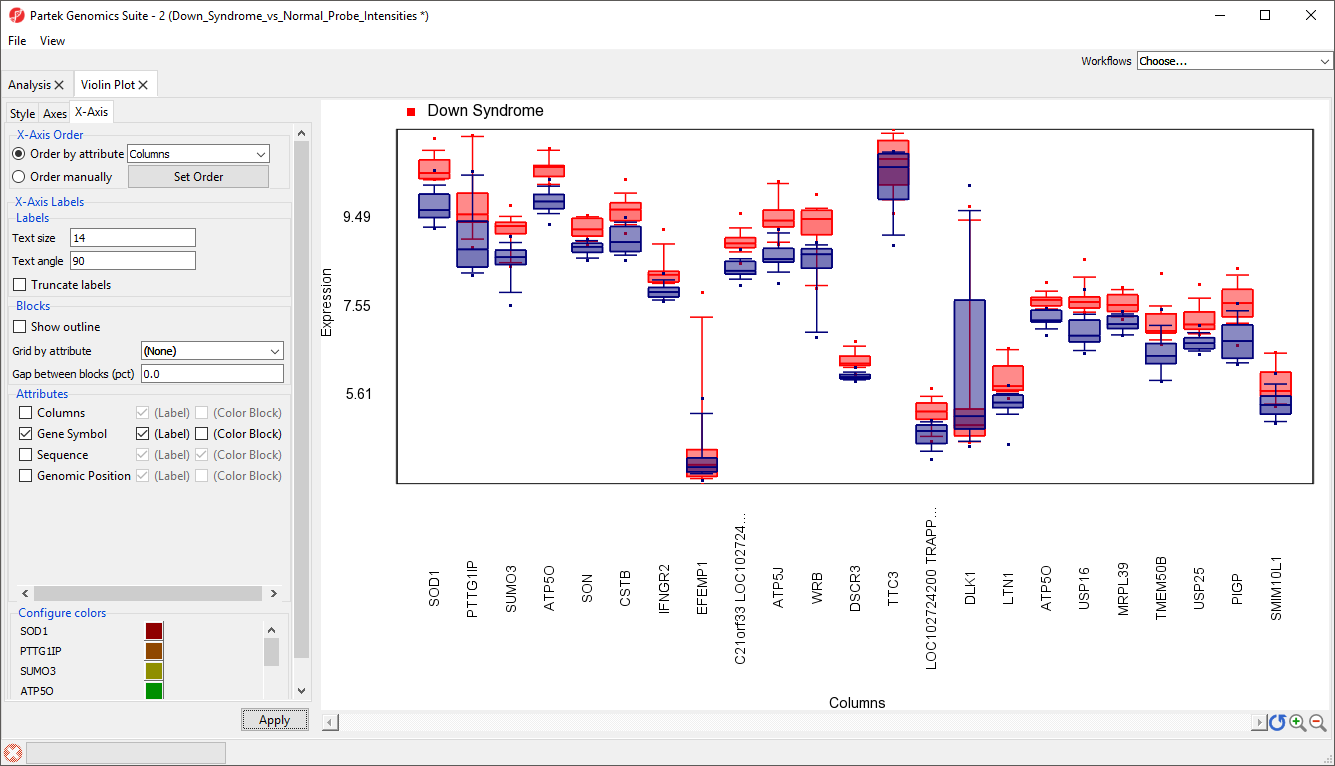
Figure 9. X-axis now labels with gene symbols for each gene
- Select the Style tab
- Select Standardize - shift column to mean of zero and scale to standard deviation of one from the Normalization options
- Select Apply
The box and whisker plots are now centered with a mean of zero and scaled to have a standard deviation of one (Figure 10). Similar to a heat map, this makes it easier to visualize which genes are upregulated and which are downregulated. Here, we can see that most of the 23 genes are expressed more highly in Down symdrome patients.
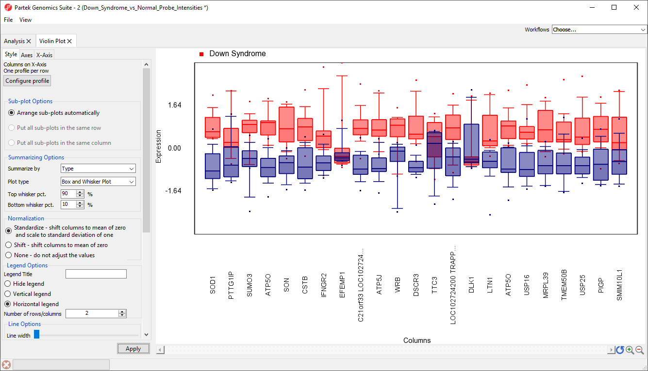
Figure 10. Viewing normalized box and whisker plots
Plots can also be split by categorical variables. We can use this to visualize differential expression of genes between Down syndrom and normal patients in different tissue types.
- Select Configure profile
- Select Switch to Advanced (Figure 11)
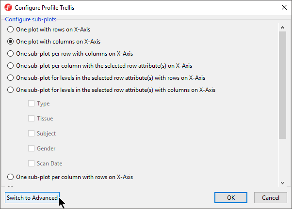
Figure 11. Simple options for configuring profiles in the plot
- Select Sub-Plot for Tissue (Figure 12)
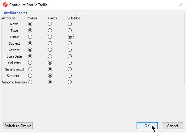
Figure 12. Configuring plot properties to split by Tissue
- Select OK
Several options will need to be reconfigured before we apply this change.
- Select Standardize - shift column to mean of zero and scale to standard deviation of one from the Normalization section
- Select the X-axis tab
- Set Text Angle to 90
- Deselect Truncate labels
- Deselect Show outline
- Deselect Columns
- Select Apply
There should now be a sub-plot for each category, in this case there are four sub-plots, one for each tissue (Figure 13). There are no error bars for several plots because there are not enough samples in those categories.
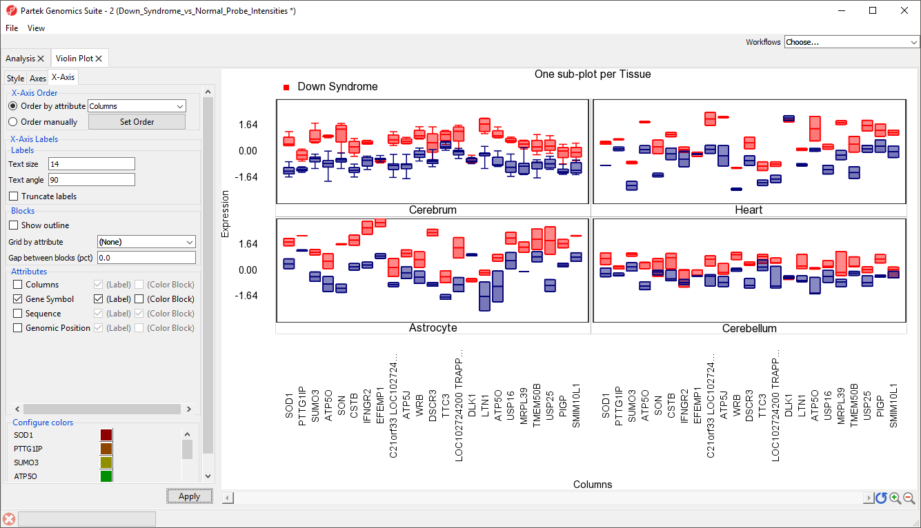
Figure 13. Splitting a plot by a categorical factor, Tissue, and grouping by another categorical variable, Type
These sub-plots can be displayed all together, or individually.
- Select 1 from the Items/Page drop-down menu
You can now move through the sub-plots by selecting Next >.
- Select All from the Items/Page drop-down menu to return to the 2x2 view
This data can also be displayed as a gradient plot (Figure 14) or error bar plot (Figure 15) by changing the Plot type using the drop-down menu in the Style tab. By default, the shading range in the gradiant plot and the error bars show +/-1 standard deviation from the mean.
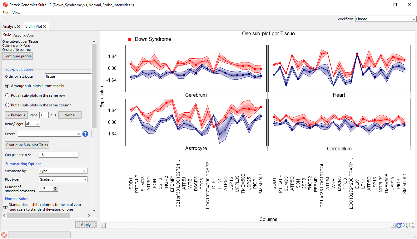
Figure 14. Gradient plot
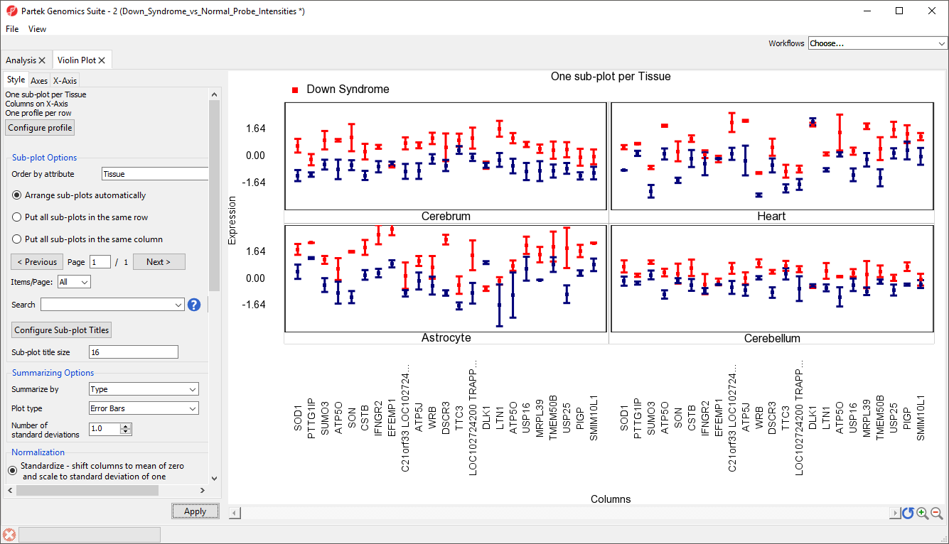
Figure 15. Error bar plot
The final option, violin plot, cannot be used to display samples grouped by a categorical variable. To view a violin plot, we must remove the Summarize by selection.
- Select (One profile per sub-plot) from the Summarize by drop-down menu
- Select Violin plot from the Plot type drop-down menu
- Select None - do not adjust values for Normalization
- Select Apply
The plot now displays violin plots for each gene showing the distribution of probe intensity values for each tissue in a separate sub-plot (Figure 16).
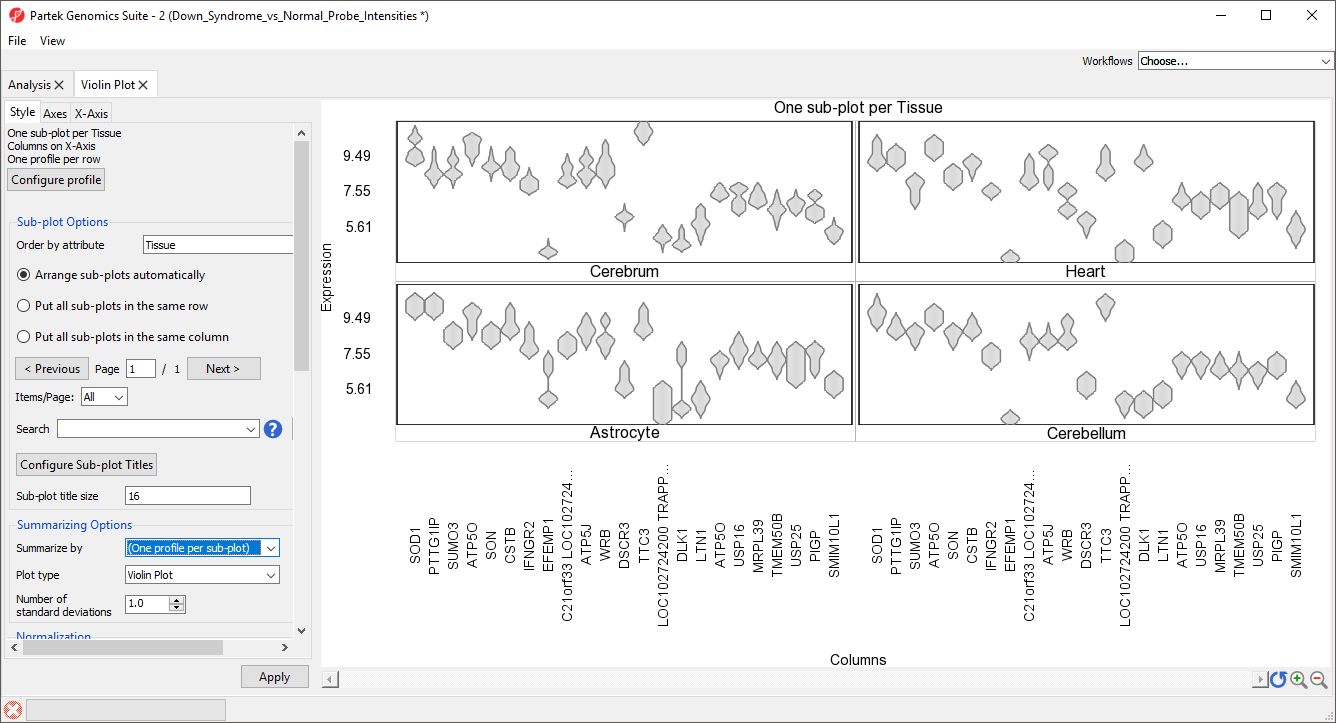 Figure 16. Violin plots for each gene, sub-plots for each tissue
Additional Assistance
If you need additional assistance, please visit our support page to submit a help ticket or find phone numbers for regional support.


| Your Rating: |
|
Results: |

|
36 | rates |
Overview
Content Tools