Page History
| Table of Contents | ||||||
|---|---|---|---|---|---|---|
|
Hierarchical Clustering
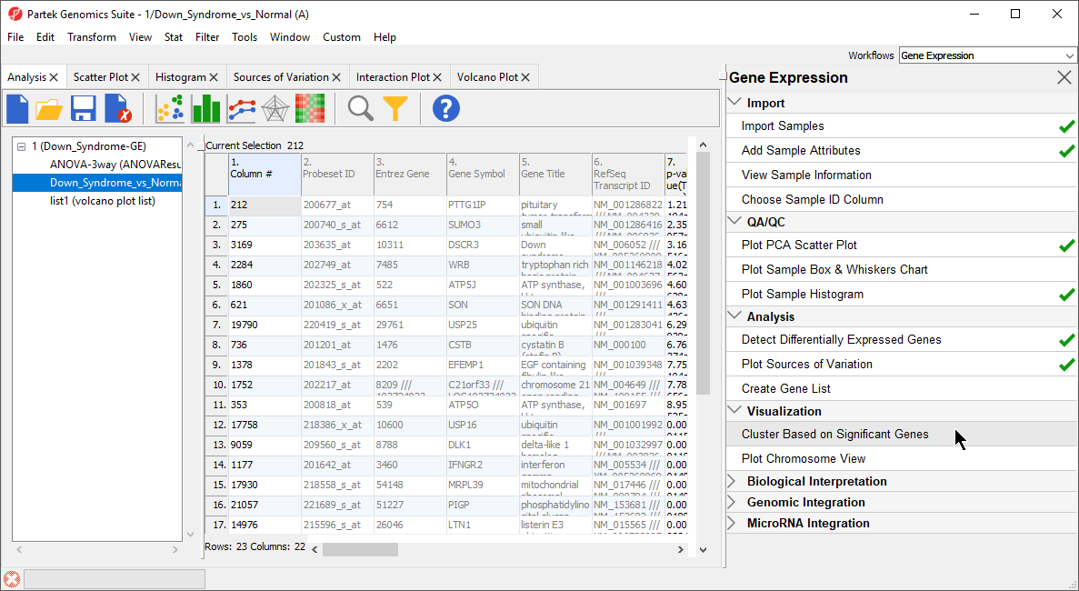
The gene list in spreadsheet Down_Syndrome_vs_Normal (A) can be used for hierarchical clustering to visualize patterns in the data.
- Under the Visualization section in the Gene Expression workflow, select Cluster Based on Significant Genes(Figure 1)
| Numbered figure captions | ||||
|---|---|---|---|---|
| ||||
|
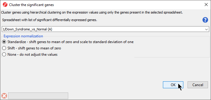
The Cluster Significant Genes dialog asks you to specify the type of clustering you want to perform.
...
- Choose Hierarchical Clustering and select OKselect OK
- Choose the Down_Syndrome_vs_Normal (A) spreadsheet under the Spreadsheet with differentially expressed genes
- Choose the Standardize – shift genes to mean of zero and scale to standard deviation of one under the Expression normalization panel . (Figure 1)
This option will adjust all the gene intensities such that the mean is zero and the standard deviation is 1.
| Numbered figure captions | ||||
|---|---|---|---|---|
| ||||
|
- Select OK to generate a Hierarchical Clustering tab (Figure 2)
| Numbered figure captions | ||||
|---|---|---|---|---|
|
...
|
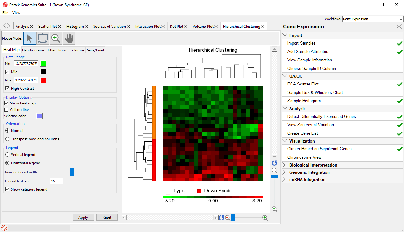
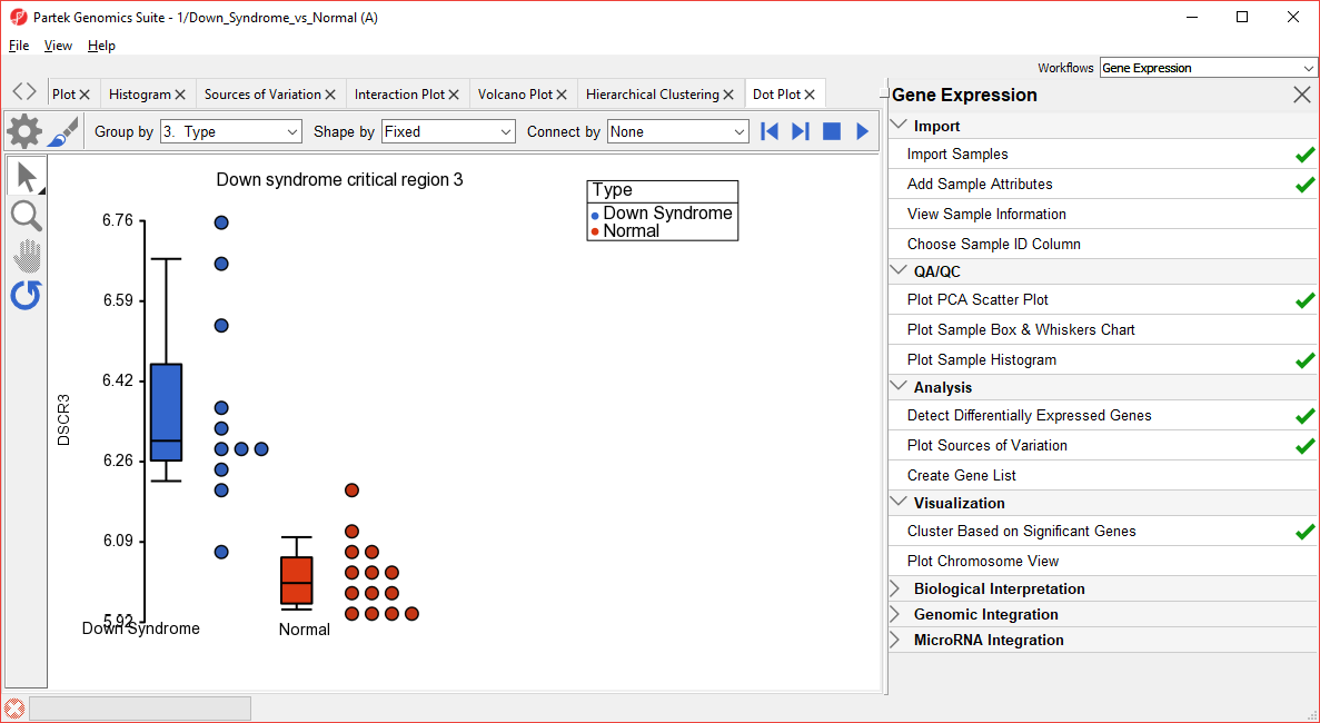
The graph (Figure 2) illustrates the standardized gene expression level of each gene in each sample. Each gene is represented in one column, and each sample is represented in one row. Genes which are unchanged are with no difference in expression have a value of zero and are colored black. Genes with increased expression in Down syndrome samples have positive values and are colored red. Genes with reduced expression in Down syndrome samples have negative values and are colored green. Down syndrome samples are colored red and normal samples are colored orange. On the left-hand side of the graph, we can see that the Down syndrome samples cluster together.
For more information on the methods used for clustering, you can refer to Chapter 8: Hierarchical & Partitioning Clustering in in Help > User’s Manual. For a tutorial on configuring the clustering plot, please refer to the user guide that can be downloaded from: here or from Help >On-line Tutorials > User Guides.
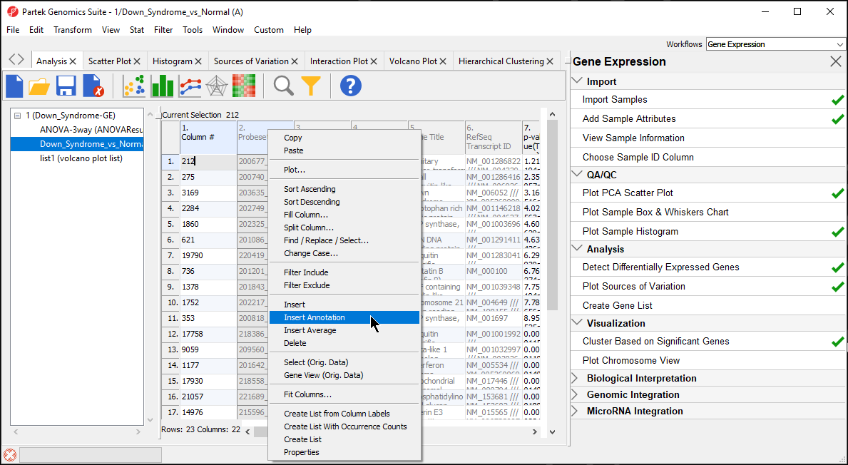
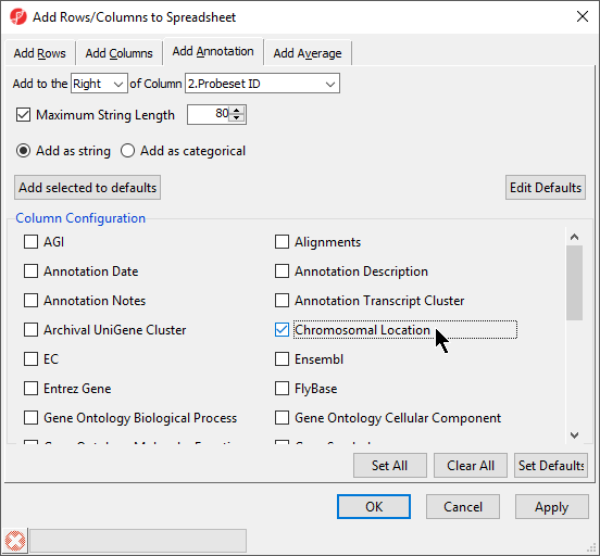
Adding Gene Annotation
During data importation, the GeneChip annotation file was linked to the imported data. This linked annotation information can be added as new columns to the ANOVA or gene list spreadsheets. For example, we can add additional annotation to the gene list we created from the ANOVA results as follows:
...
| Numbered figure captions | ||||
|---|---|---|---|---|
| ||||
|
...
| Numbered figure captions | ||||
|---|---|---|---|---|
| ||||
|
...
| Numbered figure captions | ||||
|---|---|---|---|---|
| ||||
|
Hierarchical Clustering Analysis.
| Page Turner | ||
|---|---|---|
|
| Additional assistance |
|---|
|
| Rate Macro | ||
|---|---|---|
|
Overview
Content Tools