Page History
...
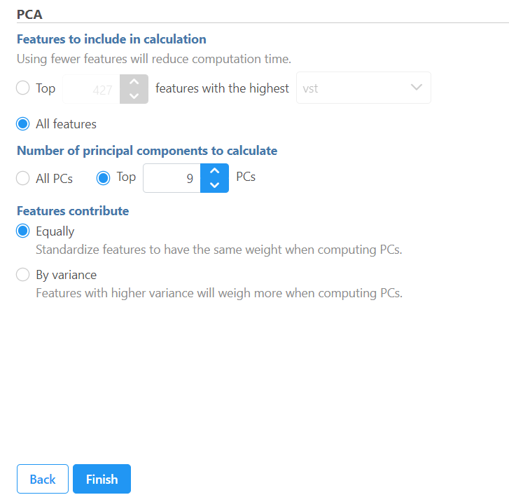
If read quantification (i.e. mapping to a transcript model) was performed by Partek® EPartek E/M algorithm, PCA can be invoked on a quantification output data node (Gene counts or Transcript counts) or, after normalization, on a Normalized counts data node. Select a node on the canvas and then PCA in the Exploratory analysis section of the context sensitive menu.
...
| Numbered figure captions | ||||
|---|---|---|---|---|
| ||||
  |
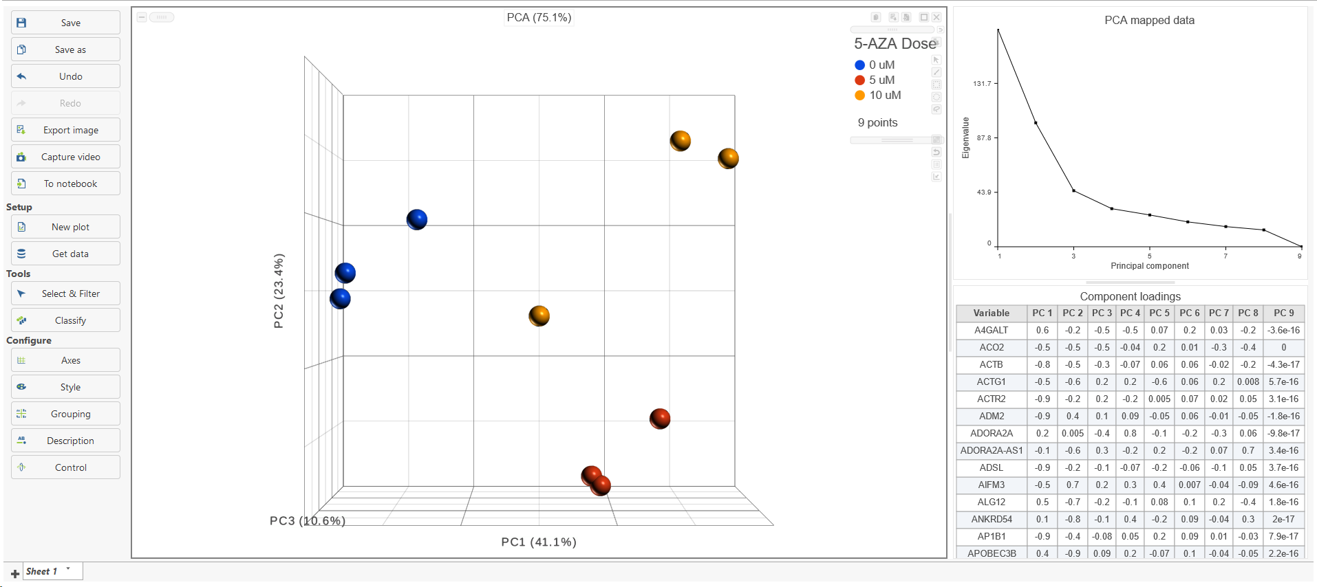
The PCA task creates a new task node, and to open it and see the result, do one of the following: select the PCA task node, proceed to the context sensitive menu and go to the Task result; or double-click on the PCA task node. The report containing eigenvalues, PC projections, component loadings, and mapping error information for the first three PCs.
When open the PCA node is opened in Data viewer, by default, it is the 3D scatterplot , Scree plot with Eigenvalues, and Component loadings table (Figure 2), each . Each dot on the 3D scatter plot represents an observation, while the first three PCs are shown on the X-, Y-, and Z-axis respectively, with the information content of an individual PC is in the parenthesis.
As an exploratory tool, the the PCA scatterplot is applied to view any groupings in the data set and generate hypotheses based on the outcome, or to spot possible outliers.
| Numbered figure captions | ||||
|---|---|---|---|---|
| ||||
|

To rotate the 3D scatter plot left click & drag. To zoom in or out, use the mouse wheel. Click and drag the legend can move the legend to different location on the viewer.
Detailed configuration on PCA plot can be found by clicking Help>How-to videos>Data viewer section.
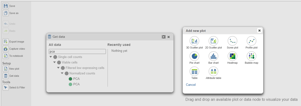
In the Data viewer, when select a PCA data node is the Data section on the control panel selected from Get Data under Setup (left panel), when drag the node can be dragged and dropped to the plot section screen (Figure 3), then you will have the option to plot select a scree plot and tables.
| Numbered figure captions | ||||
|---|---|---|---|---|
| ||||
  |
When choose Scree plot icon ![]() , it will plot a 2D viewer, X-axis represents PCs, Y-axis represents eigenvalues (Figure 4)
, it will plot a 2D viewer, X-axis represents PCs, Y-axis represents eigenvalues (Figure 4)
...
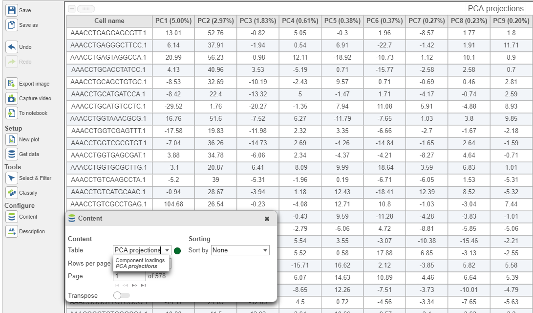
PCA data node can also be draw as tables, when choose Table icon (![]() ), it will display the component loadings matrix in the viewer (Figure 5). The Content can be modified using the Content configuration option; the table can be paged through here or from the lower right corner.
), it will display the component loadings matrix in the viewer (Figure 5). The Content can be modified using the Content configuration option; the table can be paged through here or from the lower right corner.
| Numbered figure captions | ||||
|---|---|---|---|---|
| ||||
 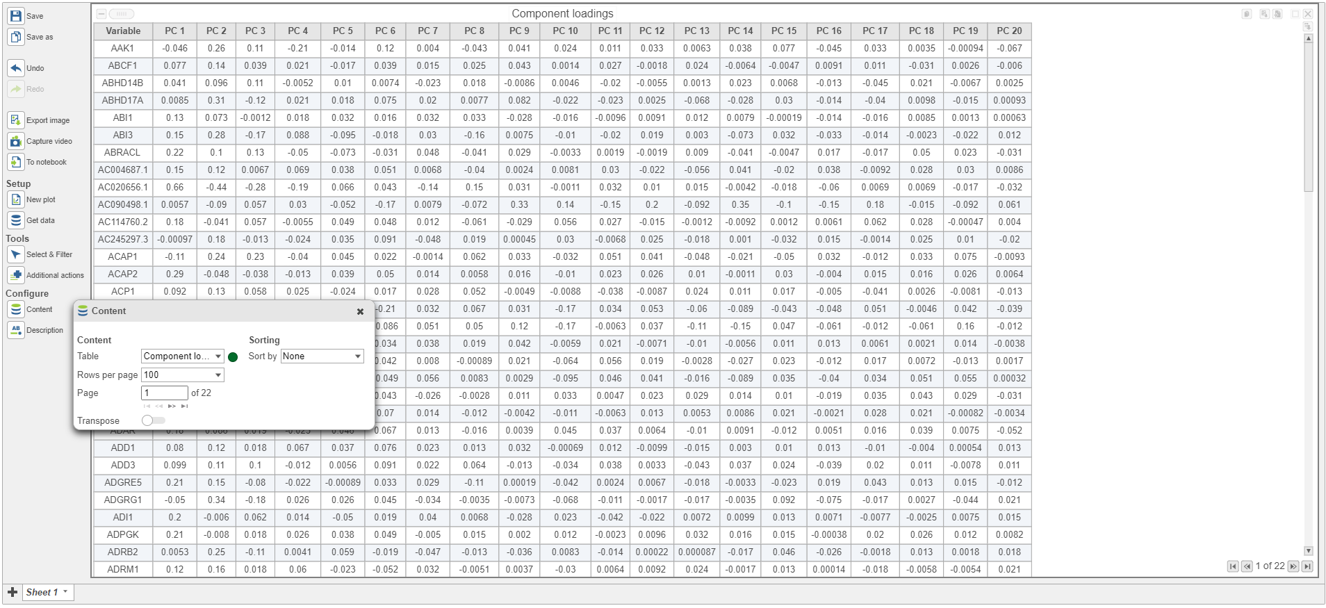 |
In the table, each row is a feature, the column represent PCs, the value is the correlation coefficient. The table can be downloaded as text file. In the configuration panel, the data table drop-down list in the content section, there is PCA projects Under Content, there is a PCA projections option, change to this option to display the projection table (Figure 6).
| Numbered figure captions | ||||
|---|---|---|---|---|
| ||||
|

In this table, each row is an observation, each column is a PC, the values are the PC scores. The table can be downloaded as text file.
| Numbered figure captions | ||||
|---|---|---|---|---|
| ||||
|
| Additional assistance |
|---|
| Rate Macro | ||
|---|---|---|
|
...
Overview
Content Tools