Page History
...
If read quantification (i.e. mapping to a transcript model) was performed by Partek® EPartek E/M algorithm, PCA can be invoked on a quantification output data node (Gene counts or Transcript counts) or, after normalization, on a Normalized counts data node. Select a node on the canvas and then PCA in the Exploratory analysis section of the context sensitive menu.
...
by variance: the analysis will give more emphasis to the features with higher variances. This is the default option for e.g. single cell RNA-seq data
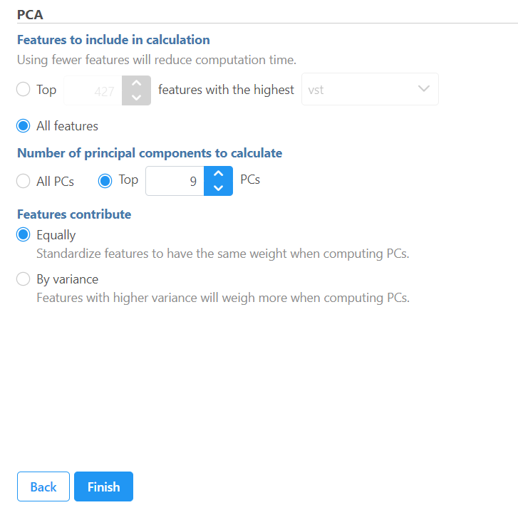
In the advanced options settings, more detailed information generated from the analysis can be reported:
Generate PCA table: checking this option will output PC projections in a data node.
Generate PC quality measures: checking this option will output eigenvalues, PC projections, and component loadings. Component loadings are the correlation coefficients between the features and PCs.
Generate mapping error statistics: checking this option will output the mapping error information for the first three PCs.
If the input data node is in linear scale, you can perform log transformation on PCA calculation.
| Numbered figure captions | ||||
|---|---|---|---|---|
| ||||
  |
The PCA task creates a new task node, and to open it and see the result, do one of the following: select the PCA task node, proceed to the context sensitive menu and go to the Task result; or double-click on the PCA task node.
| Numbered figure captions | ||||
|---|---|---|---|---|
| ||||
|
Also note that PCA is available for ERCC assessment; open the QA/QC on ERCC controls task node and push View PCA in the lower left corner.
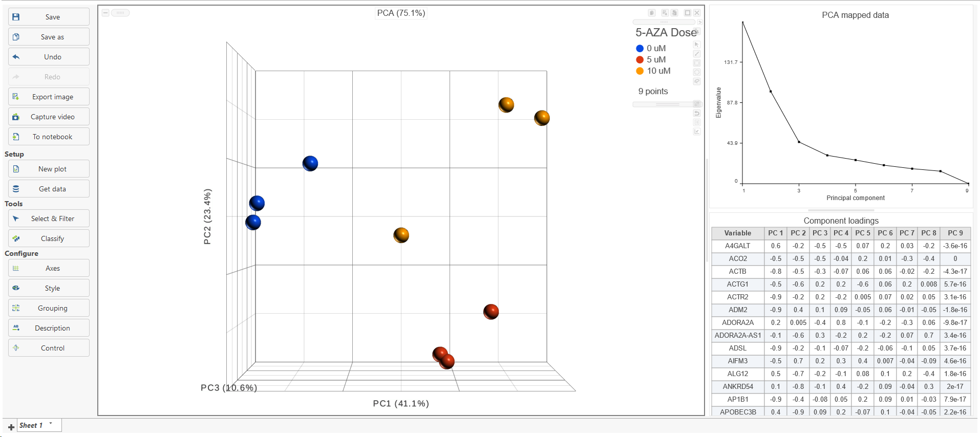
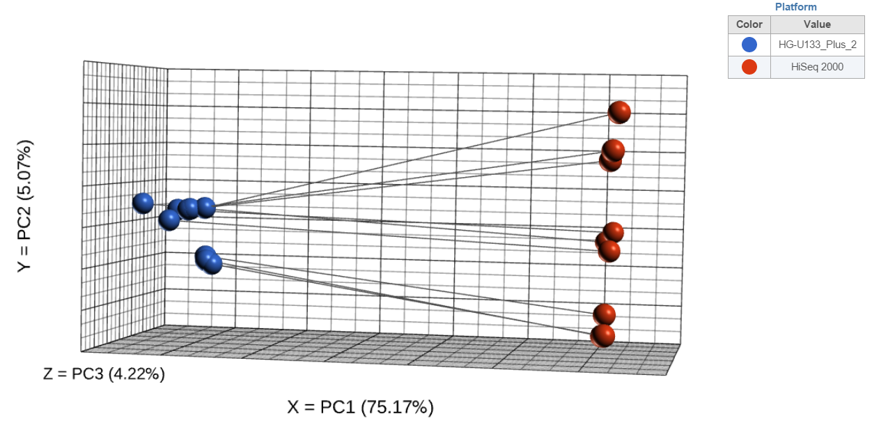
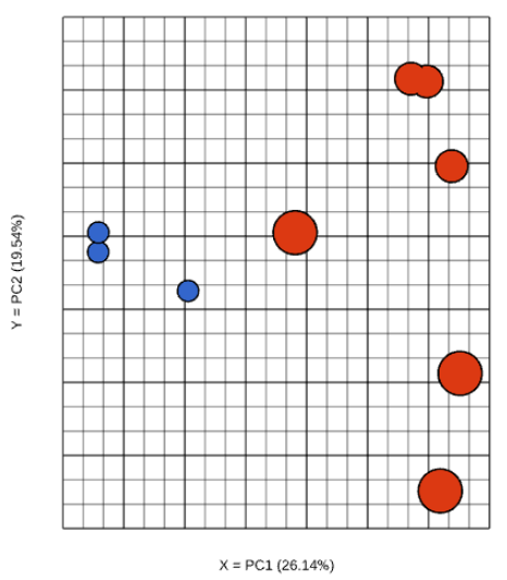
The results are presented as scatterplot (Figure 3), with each dot on the plot being a sample, while the axes represent the PCs and the axes values correspond to the respective PC values. By default, The report containing eigenvalues, PC projections, component loadings, and mapping error information for the first three PCs.
When the PCA node is opened in Data viewer, by default, it is the 3D scatterplot, Scree plot with Eigenvalues, and Component loadings table (Figure 2). Each dot on the 3D scatter plot represents an observation, while the first three PCs are shown on the X-, Y-, and Z-axis respectively, with the information content of an individual PC is in the parenthesis.
As an exploratory tool, the the PCA scatterplot is applied to view any groupings in the data set and generate hypotheses based on the outcome, or to spot possible outliers.
| Numbered figure captions | ||||
|---|---|---|---|---|
| ||||
|
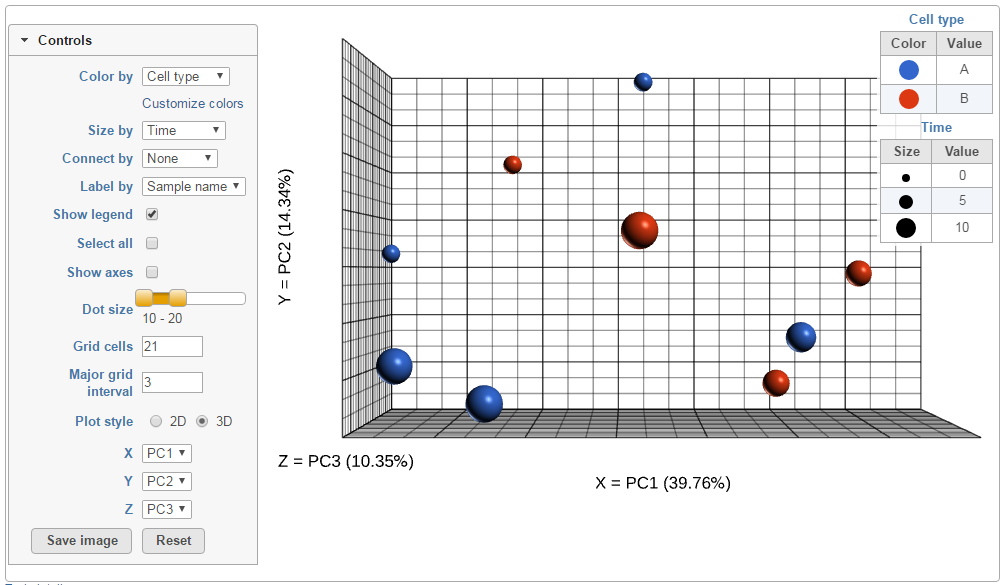
To rotate the 3D scatter plot left click & drag. To zoom in or out, use the mouse wheel. Click and drag the legend can move the legend to different location on the viewer.
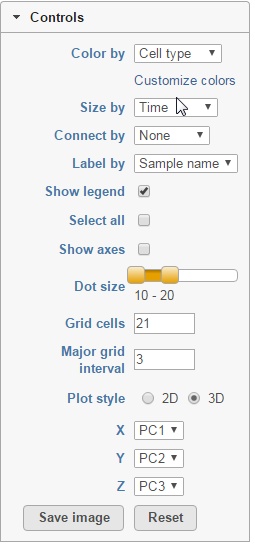
The Detailed configuration on PCA plot can be customised by using the controls on the left (Figure 4). Color by shows the sample attributes as listed in the Data tab or you can set it to Fixed to have all the dots of the same color. Size by option works in the same way, but affects the dot sizes.found by clicking Help>How-to videos>Data viewer section.
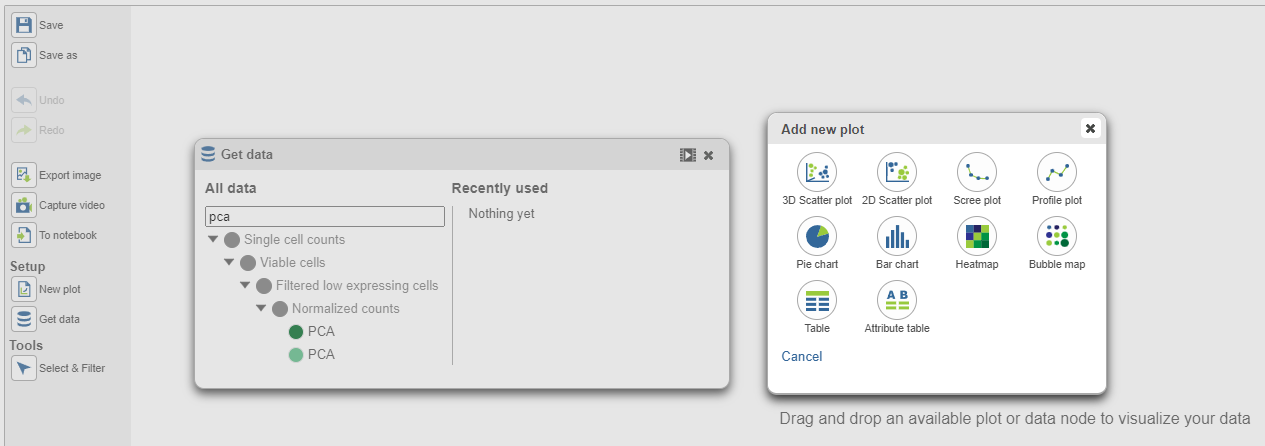
In the Data viewer, when a PCA data node is selected from Get Data under Setup (left panel), the node can be dragged and dropped to the screen (Figure 3), then you will have the option to select a scree plot and tables.
| Numbered figure captions | ||||
|---|---|---|---|---|
| ||||
|
Connect by option is particularly useful for dependent study designs, where you can highlight the samples based on the same biological source by the connecting lines. Example on Figure 5 depicts results of a study where each RNA sample was processed by both RNA-seq and gene expression array; the lines connect the same samples.
| Numbered figure captions | ||||
|---|---|---|---|---|
| ||||
|
...
 |
When choose Scree plot icon ![]() , it will plot a 2D viewer, X-axis represents PCs, Y-axis represents eigenvalues (Figure 4)
, it will plot a 2D viewer, X-axis represents PCs, Y-axis represents eigenvalues (Figure 4)
| Numbered figure captions | ||||
|---|---|---|---|---|
| ||||
When click on a dot (sample), it will be selected and a label of the sample will be displayed, from the Label by drop-down list to select how to label the selected sample. To select more than one samples, press Ctrl & click.
Next, Show legend turns the legend on or off. Select all selects all the dots, while Show axis turns the coordinate axis on or off. To change the size of the dots, use the Dot size slider. Grid cells increases or decreases the size of the cells in the plot grid and the Major grid interval specifies the frequency of major grid lines (fat lines). E.g. setting the Major grid interval to 4 highlights every 4th grid line.
...
| |||
|
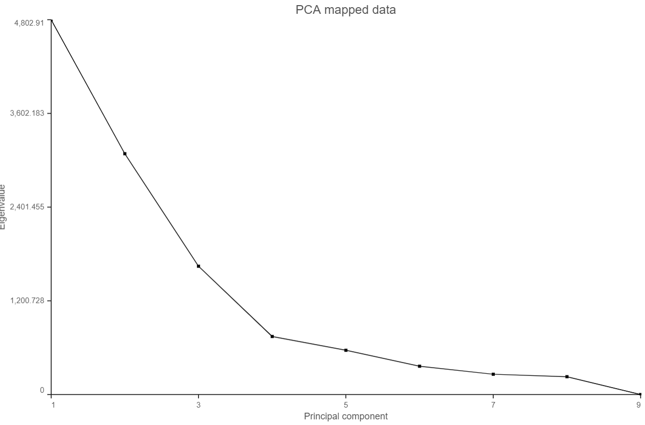
When mouse over on a point on the line, it will display detailed information of the PC. The scree plot shows how much variation each PC represents, so it is often used to determine the number of principal components to keep for downstream analysis (e.g. tSNE, UMAP, graph-base clustering). The "elbow" point of the graph where the eigenvalues seem to level off should be considered as a cutoff point for downstream analysis.
PCA data node can also be draw as tables, when choose Table icon (![]() ), it will display the component loadings matrix in the viewer (Figure 5). The Content can be modified using the Content configuration option; the table can be paged through here or from the lower right corner.
), it will display the component loadings matrix in the viewer (Figure 5). The Content can be modified using the Content configuration option; the table can be paged through here or from the lower right corner.
| Numbered figure captions | ||||
|---|---|---|---|---|
| ||||
|
Although first three PCs are shown by default, you can plot any of the first nine PCs, by using the X, Y, and Z drop-down lists.
...
| |||
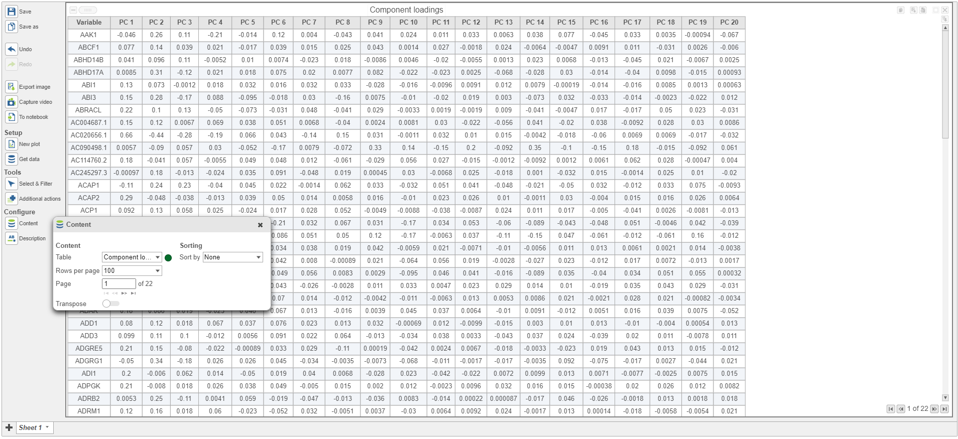 |
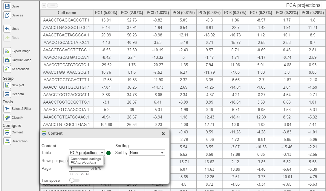
In the table, each row is a feature, the column represent PCs, the value is the correlation coefficient. Under Content, there is a PCA projections option, change to this option to display the projection table (Figure 6). In this table, each row is an observation, each column is a PC, the values are the PC scores.
| Numbered figure captions | ||||
|---|---|---|---|---|
| ||||
|
| Additional assistance |
|---|
...
Overview
Content Tools