Page History
Sample correlation plot is a data visualization used to compare a number of variables across two samples. A hypothesis underlying many gene expression experiments (next generation sequencing or microarray) is that most genes/transcripts are not differentially regulated between the conditions, causing most of the data points to fall on the diagonal (i.e. regression line with slope of 1). If that is not the case, a normalization method should be applied before the statistical analysis. Therefore, you may want to run sample correlation plots and your data set before and after the normalization.
Sample correlation in Partek® Flow® can be performed after quantification by selecting a Gene counts or Transcript counts data node, or on a Normalized counts node in case that you want to assess its effect on the data. The Sample correlation option is visible in the Visualizations section of the tool box (Figure 1). The task has no particular setup dialog (and creates no task node), but launches immediately.Similarity matrix task is only available on bulk RNA-seq count matrix data node. It is used to compute the correlation of every sample/or feature vs every other sample/or feature. The result is a matrix with the same set of samples/or features on rows and columns, the value in the matrix is correlation coefficient --r.
Click on Similarity matrix task in Correlation section on the menu (Figure 1)
| Numbered figure captions | ||||
|---|---|---|---|---|
| ||||
|
When the Sample correlation page opensthe dialog opens, you will be asked to select two samples for comparison select whether the calculation samples or features (Figure 2). The sample in the left box will be shown on the horizontal axis, while the sample in the right box will be shown on the vertical axis. Click on the sample names and then hit OK to proceed.are three correlation method options:
Pearson: linear correlation: 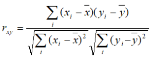
Spearman: rank correlation: 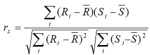
Kendal: rank correlation: 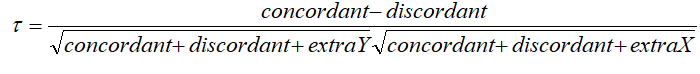
| Numbered figure captions | ||||
|---|---|---|---|---|
| ||||
|

An example of the resulting scatterplot is in Figure 3. Each dot is a feature (gene/transcript) while the expression values in the two samples can be read off the coordinate axes, in the same units as present in the data node. For instance, if you normalized your RNA-seq data by transcripts per million (TPM), the coordinate axis will give you expression in TPMs. Pearson’s correlation coefficient and the slope of the regression line are in the upper left corner of the plot.
| Numbered figure captions | ||||
|---|---|---|---|---|
| ||||
|

...
| |
|
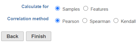
Click Finish to run the task. The output report of this task can be displayed in heatmap and/or table in the data viewer.
| Additional assistance |
|---|
| Rate Macro | ||
|---|---|---|
|
...
Overview
Content Tools