Page History
...
Principal Components Analysis (PCA) is an excellent method to visualize similarities and differences between the samples in a data set. PCA can be invoked through a workflow, by selecting (![]() ) from the main command bar, or by selecting Scatter Plot from the View section of the main toolbar. We will use a workflow.
) from the main command bar, or by selecting Scatter Plot from the View section of the main toolbar. We will use a workflow.
- Select Gene Expression from Select Gene Expression from the Workflows drop-down menu
- Select PCA Scatter Plot from the QA/QC section of the Gene Expression workflow
...
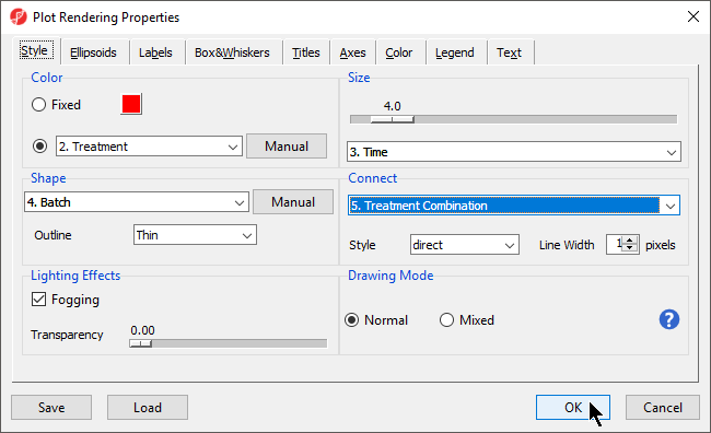
We can change the plot properties to better visualize the effects of different variables.
- Select (
 ) to open the ConfigurePlot Properties dialog
 - Set Shape to 4. Batch
- Set Size to 3. Time
- Set Connect to 5. Treatment Combination
- Select OK (Figure 2)
| Numbered figure captions | ||||
|---|---|---|---|---|
| ||||
|
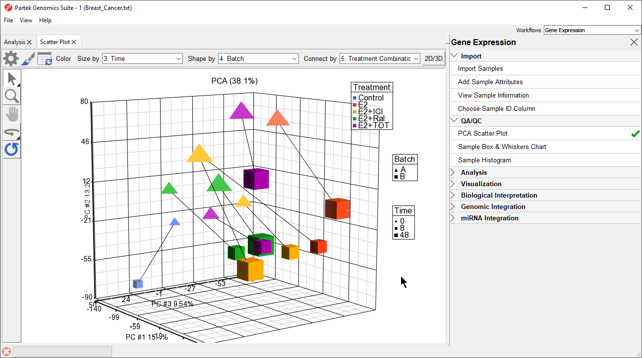
The PCA scatter plot now shows information about treament, batch, and time for each sample (Figure 3).
| Numbered figure captions | ||||
|---|---|---|---|---|
| ||||
|
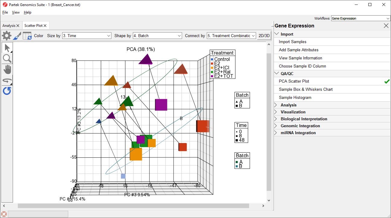
- Select () to open the ConfigurePlot Properties dialog
- Select Ellipsoids from the tab
- Select Add Ellipse/Ellipsoid
- Select Ellipse
- Select Batch from the Categorical Vairable(s) panel and move it to the Group Variable(s) panel
- Select OK
- Select OK to close the dialog
The ellipses help illustrate that the data is spearated by batches (Figure 4).
| Numbered figure captions | ||||
|---|---|---|---|---|
| ||||
|
Ways to address the batch effect in the data set will be detailed later in this tutorial.
| Page Turner | ||
|---|---|---|
|
| Additional assistance |
|---|
|
| Rate Macro | ||
|---|---|---|
|
Overview
Content Tools