Page History
| Table of Contents | ||||||
|---|---|---|---|---|---|---|
|
The primary use of the Dot Plot is to visualize the distribution of the gene intensity values of one gene across all dot plot is visualizing intensity values across samples.
We will invoke a Dot Plot dot plot from a gene list child spreadsheet with genes on rows.
- Right-click on the row header for of the gene you want to be visualized visualize
- Select Dot Plot from the pop-up menu (Figure 1)
...
- Select Configure Plot (
 ) from the plot command bar to launch the Configure Plot dialog (Figure 3).
...
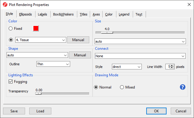
- Select Plot Properties (
 ) from the plot command bar to launch the Plot Properties dialog (Figure 4).
| Numbered figure captions | ||||
|---|---|---|---|---|
| ||||
|
...
- Set Shape to 3. Type using the drop-down menu
- Select Select the Box&Whiskers from the dialog tabstab
- Set Box Width to 15 pixels
- Select Titles from the dialog tabsSelect the Titles tab
- Set X-Axis under Configure Axes Titles to Tissue
- Select OK to modify the plot
...
Like many visualizations in Partek Genomics Suite, the Dot Plot dot plot is interactive.
- Select (
 ) to activate Selection Mode
Legends can now be dragged and dropped to new locations on the plot. Samples can be selected by left-clicking the sample or left-clicking and dragging a box around samples.
...
- Select (
 ) to move between rows on the source spreadsheet
 - Select (
 ) to swap the horizontal and vertical axes
| Page Turner | ||
|---|---|---|
|
| Additional assistance |
|---|
|
| Rate Macro | ||
|---|---|---|
|
Overview
Content Tools