Page History
...
In addition, the Post-alignment QA/QC report for single-end reads (Figure 1) contains the Unique column. This refers to the fraction of uniquely aligned reads.
| Numbered figure captions | ||||
|---|---|---|---|---|
| ||||
|

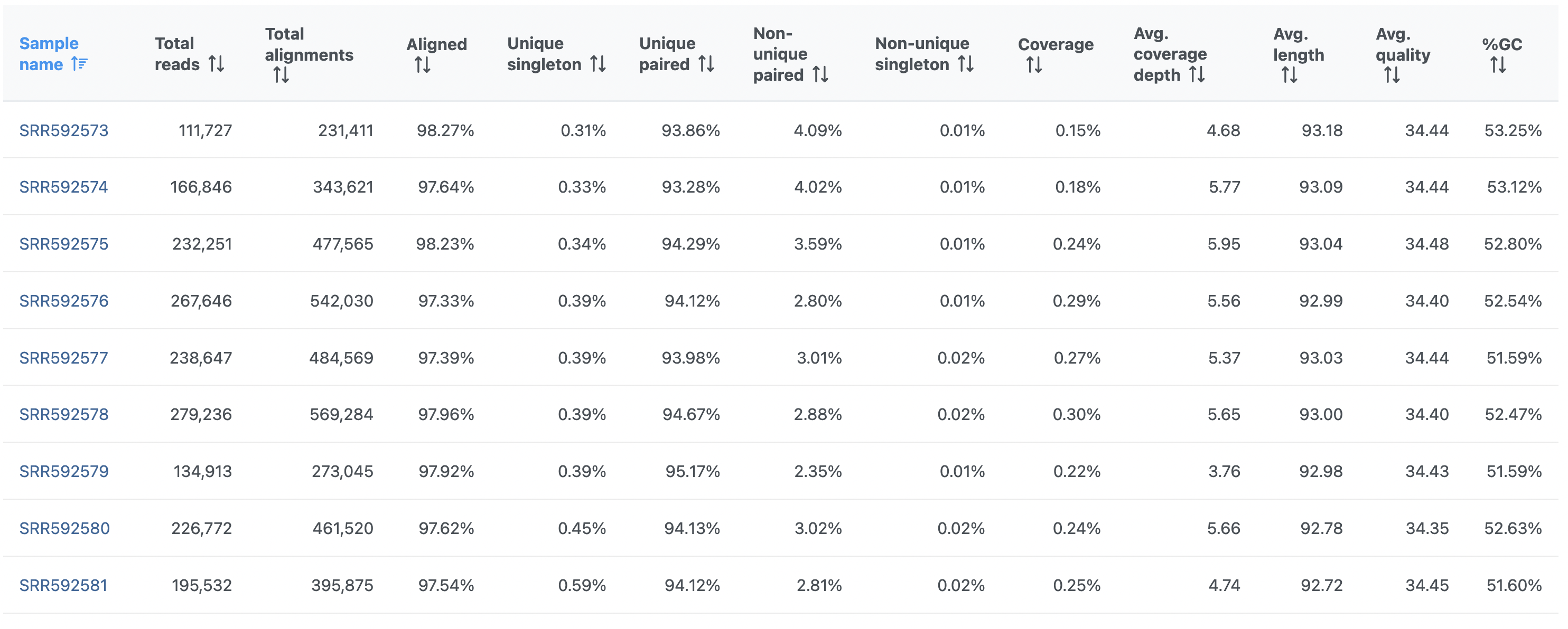
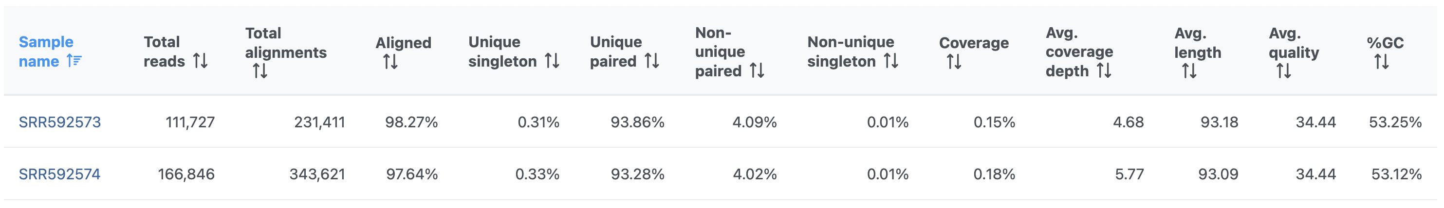
On the other hand, the Post-alignment QA/QC report for paired-end reads (Figure 2) contains these columns:
...
| Numbered figure captions | ||||
|---|---|---|---|---|
| ||||
|

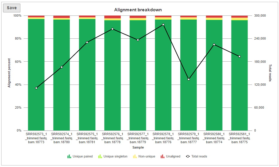
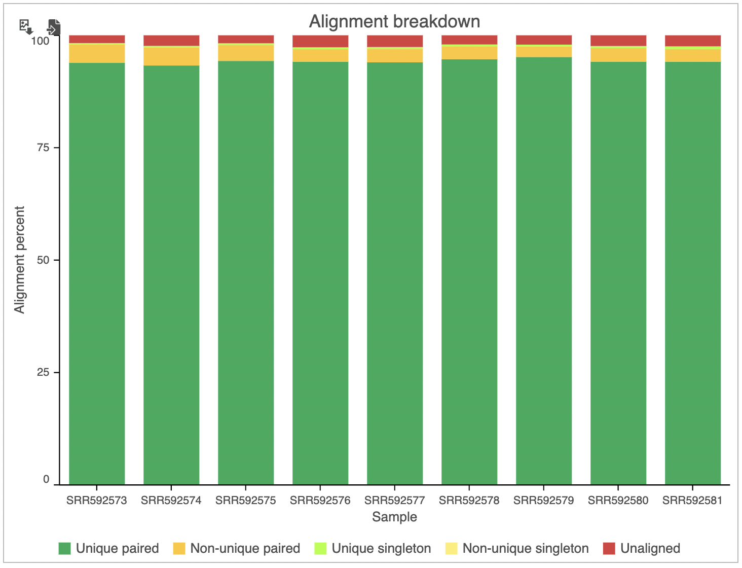
In addition to the summary table, several graphs are plotted to give a comparison across multiple samples in the project. Those graphs are Alignment breakdown, Coverage, Average base quality per position, Average base quality score per read, and Average alignments per read. Two of those (Average base quality plots) have already been described.
...
| Numbered figure captions | ||||
|---|---|---|---|---|
| ||||
|
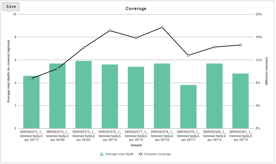
The Coverage plot (Figure 4) shows the Average read depth (in covered regions) for each sample using columns and can be red off the left-hand y-axis. On the same plot, the percentage of covered genome bases (Genome coverage) in each sample is represented by the black line and quantified by the right-hand y-axis.
| Numbered figure captions | ||||
|---|---|---|---|---|
| ||||
|
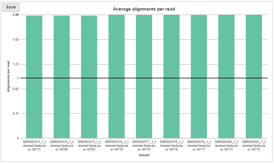
The last graph is Average alignments per read (Figure 5) and shows the average number of alignments for each read, with samples as columns. For single-end data, the expected average alignments per read is one, while for paired-end data, the expected average alignments per read is two.
...
| Numbered figure captions | ||||
|---|---|---|---|---|
| ||||
|
| Additional assistance |
|---|
| Rate Macro | ||
|---|---|---|
|
...
Overview
Content Tools