Page History
...
By including Batch in the ANOVA model, the variability due to the batch effect is accounted for when calculating p-values for the non-random factors. In effectthis sense, the batch effect has already been removed. However, visualizing biological effects can be very difficult if batch effects are present in the original intensity data used to generate visualizations. We can modify the original intensity data to remove the batch effect using the Remove Batch Effect tool.
...
The Remove Batch Effect tool functions much like ANOVA in reverse, calculating the variation attributed to the effect factor being removed then adjusting the original intensity values to remove the effectvariation. Once the variation caused by the batch effect has been removed, tools like PCA or clustering can be used to visualize what the data would look like if the batch effect was not present.
...
The Remove Batch Effects dialog will open. The tool functions by performing an ANOVA then modifying the original intensities values to remove the effects of the specified factor(s).
- Select Treatment, Time Time, and Batch
- Select Add Factor > to add them to the ANOVA Factor(s) panel
- Select Batch in the ANOVA Factor(s) panel
- Select Add Factor > to add Batch to the Remove Effect(s) of These Factor(s) panel
...
Visualization of ANOVA results for single probe(sets)/genes can also benefit benefits from batch removal. To illustrate this, we first need to repeat our ANOVA using the new batch-remove intesitiy values spreadsheet.
- Select the Analysis tab
- Select 1-removeresult (batch-remove) in the spreadsheet tree
- Select Stat from the main toolbar
- Select ANOVA...
- Add Treatment, Time, and Batch factors to the ANOVA Factor(s) panel
- Add Treatment * Time interaction to the ANOVA Factor(s) panel
- Select Contrats...
- Select Treatment from the Select FactorSelect Factor/Interaction drop-down menu
- Select Yes for Data is already log transformed?
- Set up contrasts of treatment vs. control for E2, E2+ICI, E2+Ral, and E2+TOT (Figure 7)
...
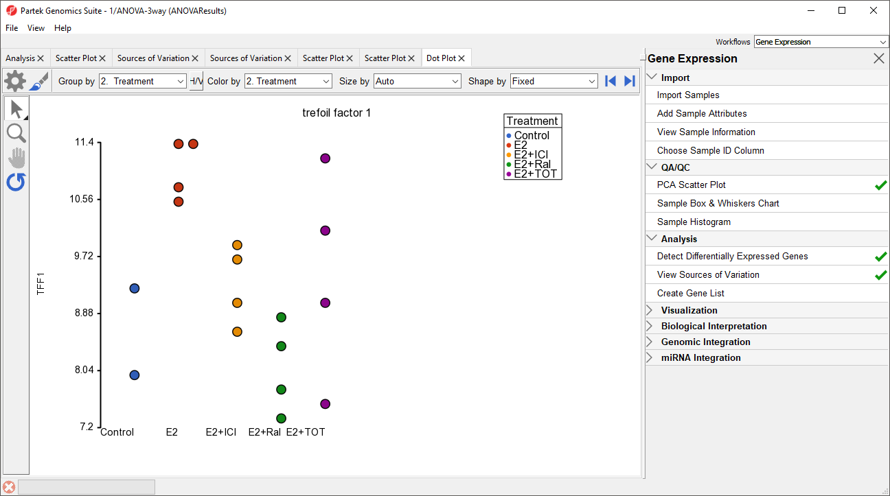
A dot plot for trefoil factor 1 (TFF1) will open (Figure 9). The dot plot shows gene intensity values (y-axis) for each sample. Samples are grouped by Treatment.
| Numbered figure captions | ||||
|---|---|---|---|---|
| ||||
|
...
- Select H/V to switch the horizontal and vertical axis
- Select (
 )
) - Set Color to Set Color to Batch
- Set Size to Time
- Set Connect to to Treatment Combination (Figure 10)
...
Overview
Content Tools