Page History
...
With the probe intensities spreadsheet and the gene list open in the Analysis tab, follow these steps to filter the probe intensities spreadsheet.
- Select the probe intensities spreadsheet in the spreadsheet tree; here, it is Down_Syndrome-GE
- Select Filter from the main task bar
- Select Filter Columns
- Select Filter Columns Base on a List... (Figure 1)
...
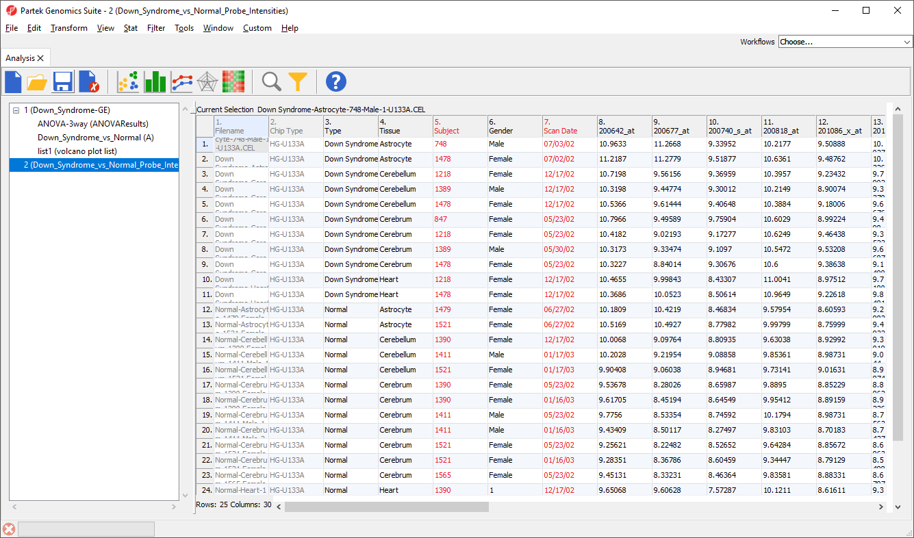
Now we have a probe intensities spreadsheet containing only the probe intensity values for our 23 genes of interest (Figure 4).
| Numbered figure captions | ||||
|---|---|---|---|---|
| ||||
|
...
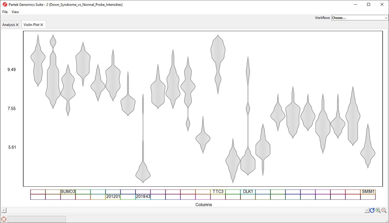
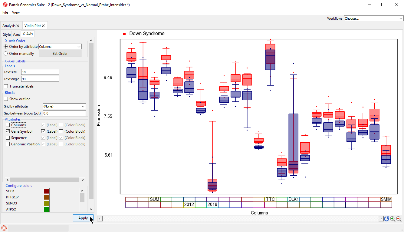
A Violin Plot tab will open (Figure 5). This plot shows the intensity value ranges of the 23 genes (probe sets) for all samples as violin plots.
| Numbered figure captions | ||||
|---|---|---|---|---|
| ||||
|
- Select View from the main taskbar
- Select Toggle Properties
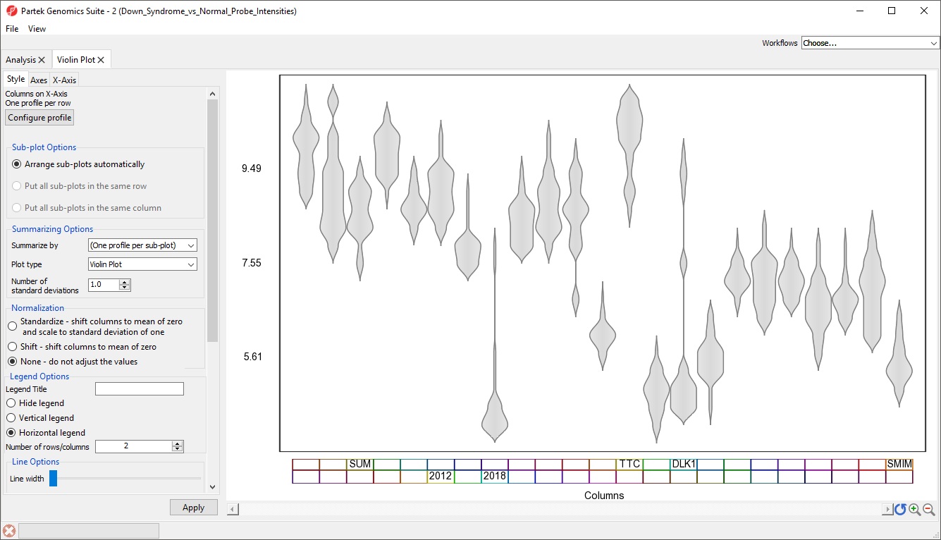
We can now see the plot properties panel to the left of the violin plot (Figure 6).
| Numbered figure captions | ||||
|---|---|---|---|---|
| ||||
|
...
| Numbered figure captions | ||||
|---|---|---|---|---|
| ||||
|
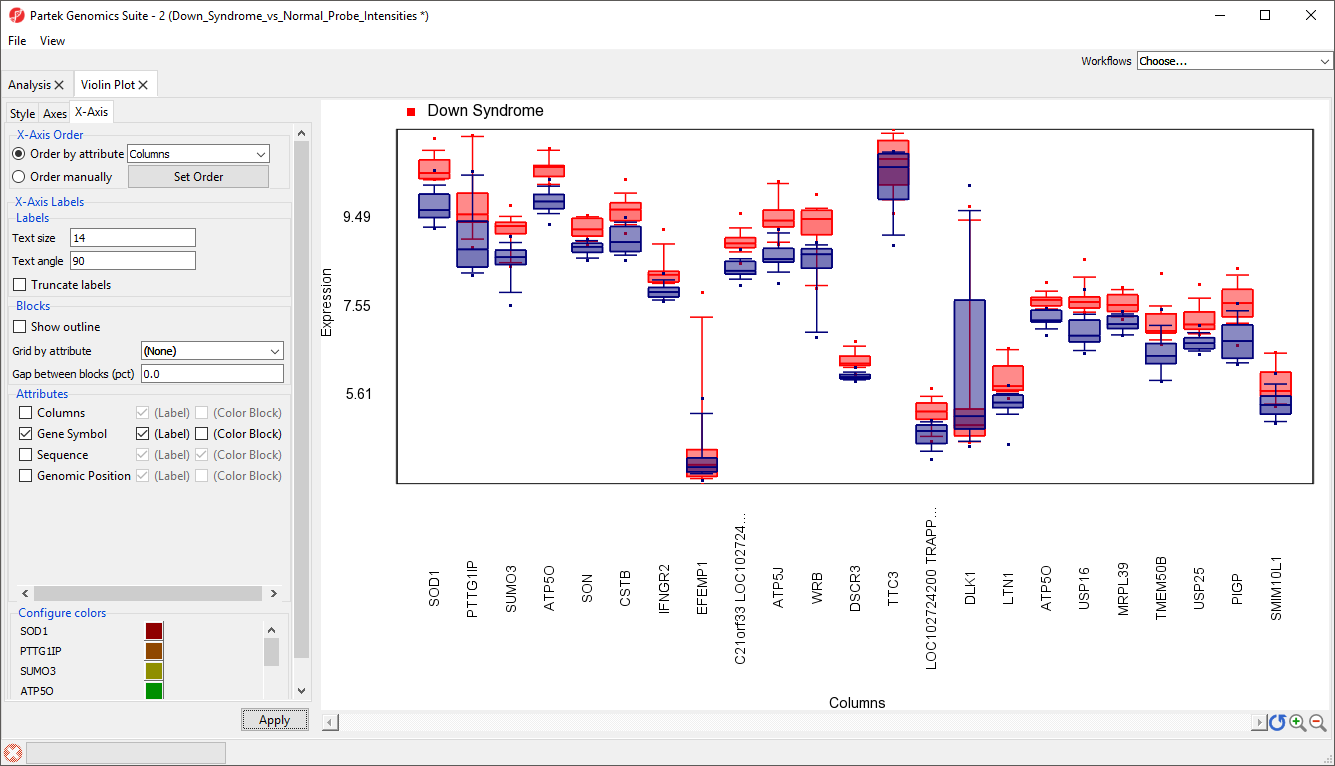
To improve our view of the gene symbols, we can modify the X-axis legend.
...
| Numbered figure captions | ||||
|---|---|---|---|---|
| ||||
|
| Numbered figure captions | ||||
|---|---|---|---|---|
| ||||
|
...
| Numbered figure captions | ||||
|---|---|---|---|---|
| ||||
|
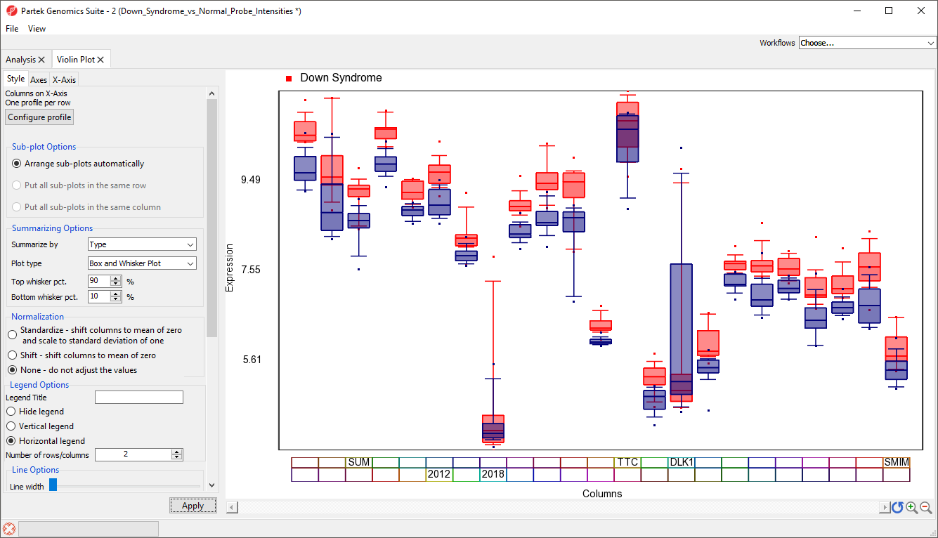
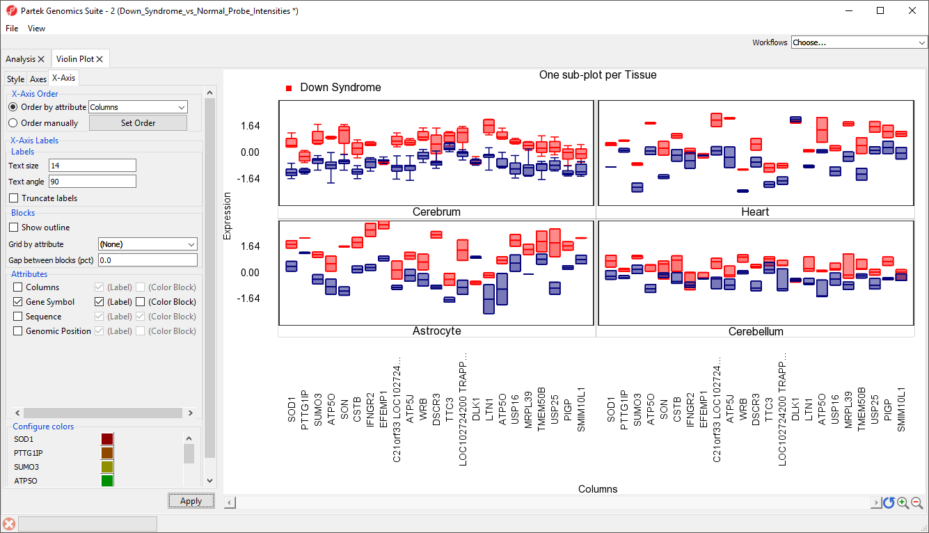
Plots can also be split by categorical variables. We can use this to visualize differential expression of genes between Down syndrom and normal patients in different tissue types.
...
There should now be a sub-plot for each category, in this case there are four sub-plots, one for each tissue (Figure 13). There are no error bars for several plots because there are not enough samples in those categories.
| Numbered figure captions | ||||
|---|---|---|---|---|
| ||||
|
...
Overview
Content Tools