Page History
...
| Numbered figure captions | ||||
|---|---|---|---|---|
| ||||
|


Random vs. fixed effects – mixed model ANOVA
...
| Numbered figure captions | ||||
|---|---|---|---|---|
| ||||
|

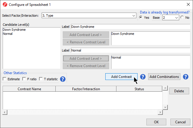
Because the data is log2 transformed, Partek Genomics Suite will automatically detect this and will automatically select Yes for Data is already log transformed? in the top right-hand corner of the dialog. Partek Genomics Suite will use the geometric mean of the samples in each group to calculate the fold change and mean ratio for the contrast between the Down syndrome and normal samples.
...
| Numbered figure captions | ||||
|---|---|---|---|---|
| ||||
|


- By default, Specify Output File is checked and gives a name to the output file. If you are trying to determine which factors should be included in the model and you do not wish to save the output file, simply uncheck this box
- Select OK in the ANOVA dialog to compute the 3-way mixed-model ANOVA
- Several progress messages will display in the lower left-hand side of the ANOVA dialog while the results are being calculated.
...
| Numbered figure captions | ||||
|---|---|---|---|---|
| ||||
|

For additional information about ANOVA in Partek Genomics Suite, see Chapter 11 Inferential Statistics in the User’s Manual (Help > User’s Manual).
...
| Numbered figure captions | ||||
|---|---|---|---|---|
| ||||
|

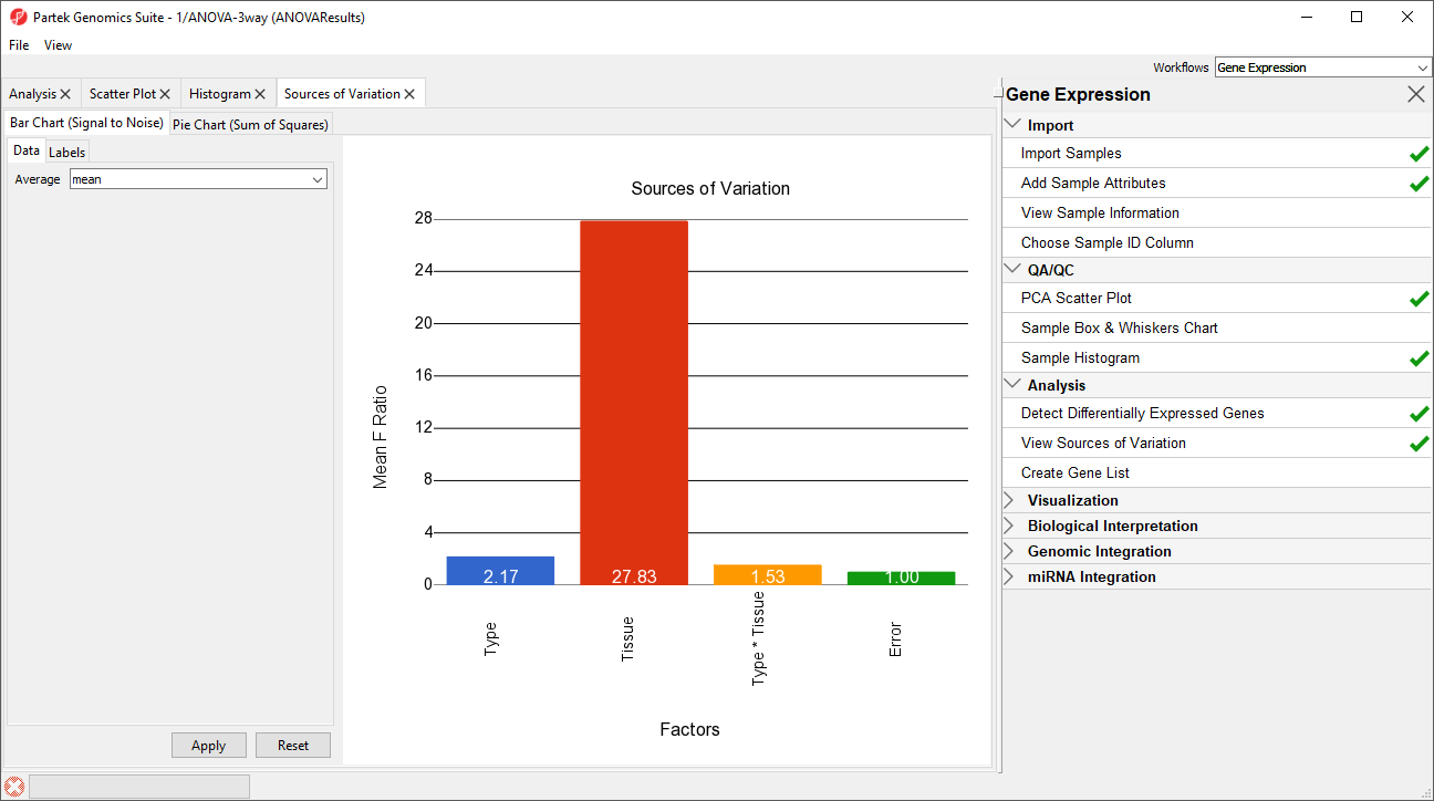
This plot presents the mean signal-to-noise ratio of all the genes on the microarray. All the non-random factors in the ANOVA model are listed on the X-axis (including error). The Y-axis represents the mean of the ratios of mean square of all the genes to the mean square error of all the genes. Mean square is ANOVA’s measure of variance. Compare the bar for each signal to the bar for error; if a factor's bar is higher than error's bar, that factor contributed significant variation to the data across all the variables. Notice that this plot is very consistent with the results in the PCA scatter plot. In this data, on average, Tissue is the largest source of variation.
...
| Numbered figure captions | ||||
|---|---|---|---|---|
| ||||
|

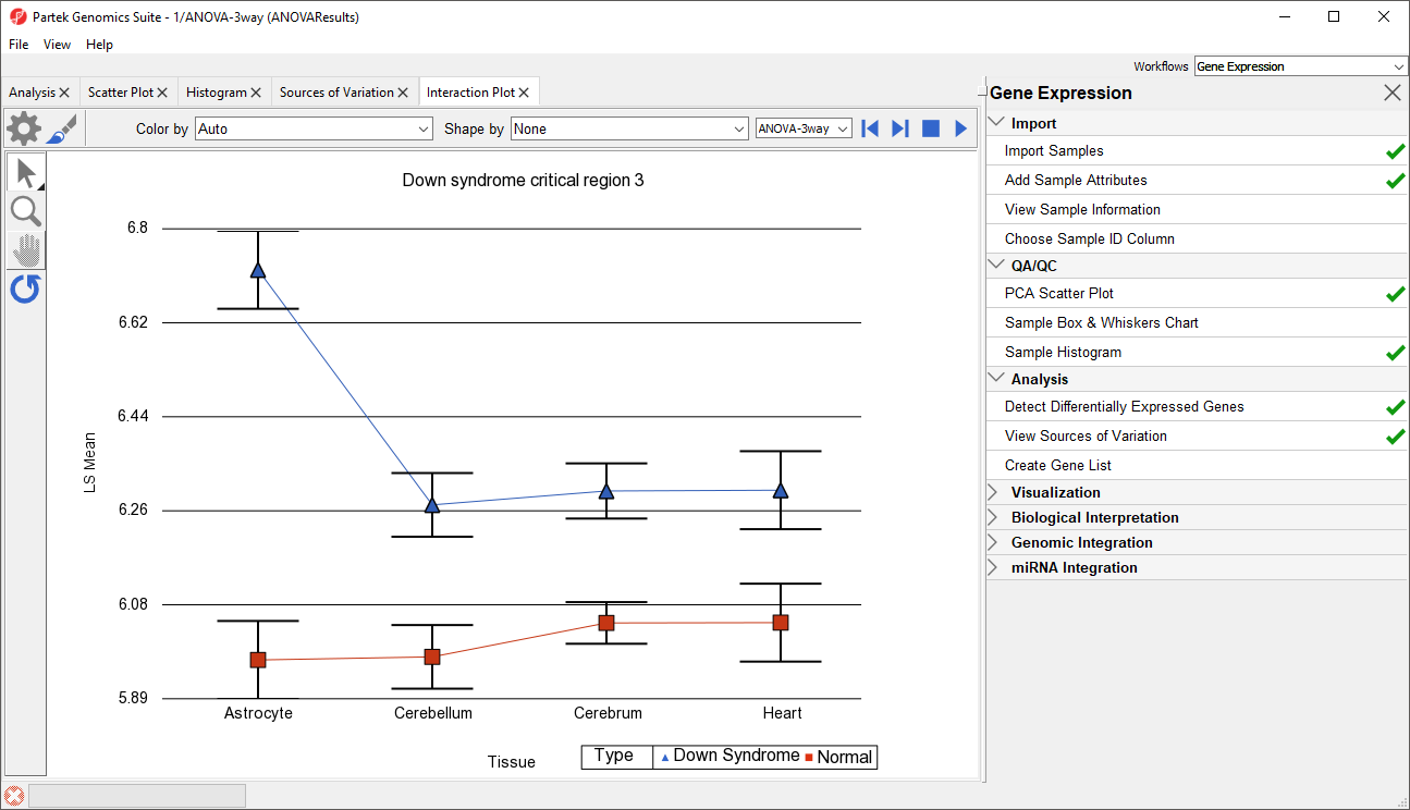
Generate these plots for rows 3 (DSCR3) and 8 (CSTB). If the lines in the interaction plot are not parallel, then there is a chance that there is an interaction between Tissue and Type. Error bars show standard error of the least squared mean. DSCR3 is a good example of this (Figure 7). We can look at the p-values in column 9, p-value(Type * Tissue) to check if this apparent interaction is statistically significant.
...
| Numbered figure captions | ||||
|---|---|---|---|---|
| ||||
|

We can view the expression levels of a gene for each sample using a dot plot.
...
| Numbered figure captions | ||||
|---|---|---|---|---|
| ||||
|

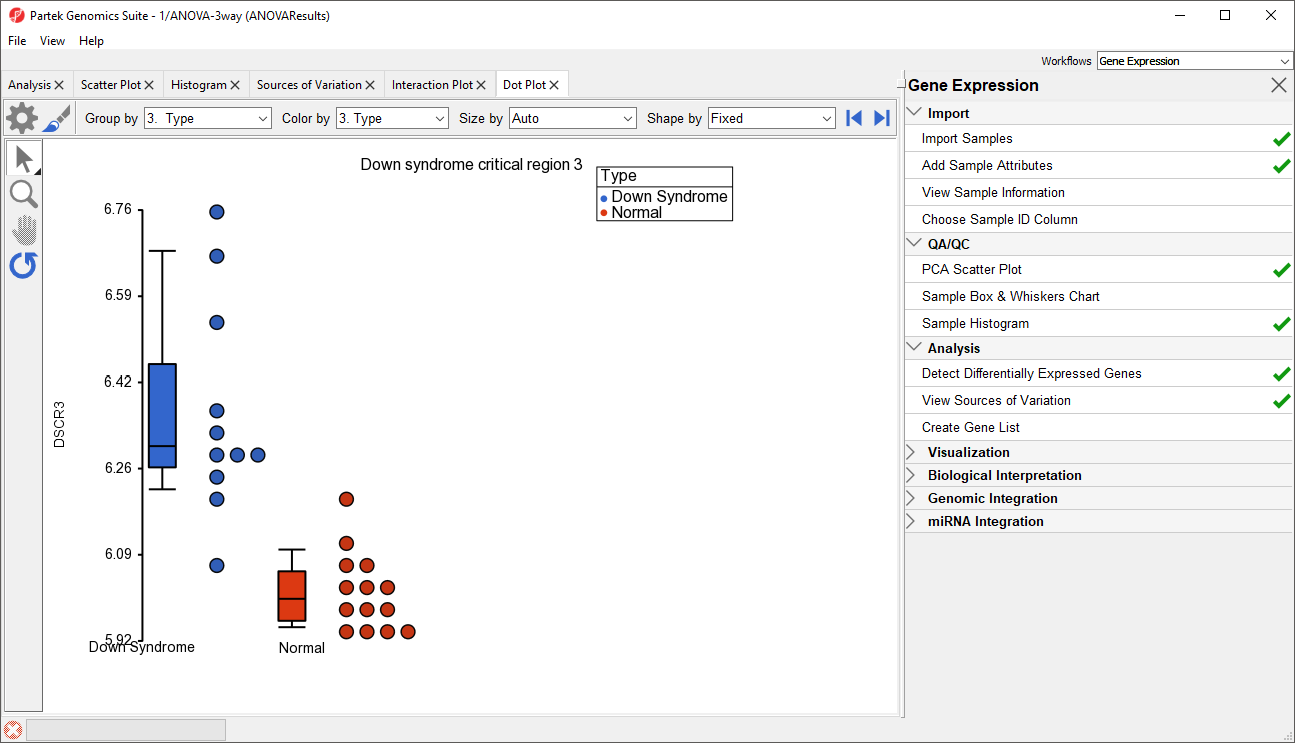
In the plot, each dot is a sample of the original data. The Y-axis represents the log2 normalized intensity of the gene and the X-axis represents the different types of samples. The median expression of each group is different from each other in this example. The median of the Down syndrome samples is ~6.3, but the median of the normal samples is ~6.0. The line inside the Box & Whiskers represents the median of the samples in a group. Placing the mouse cursor over a Box & Whiskers plot will show its median and range.
...
Overview
Content Tools