Page History
...
| Numbered figure captions | ||||
|---|---|---|---|---|
| ||||
|

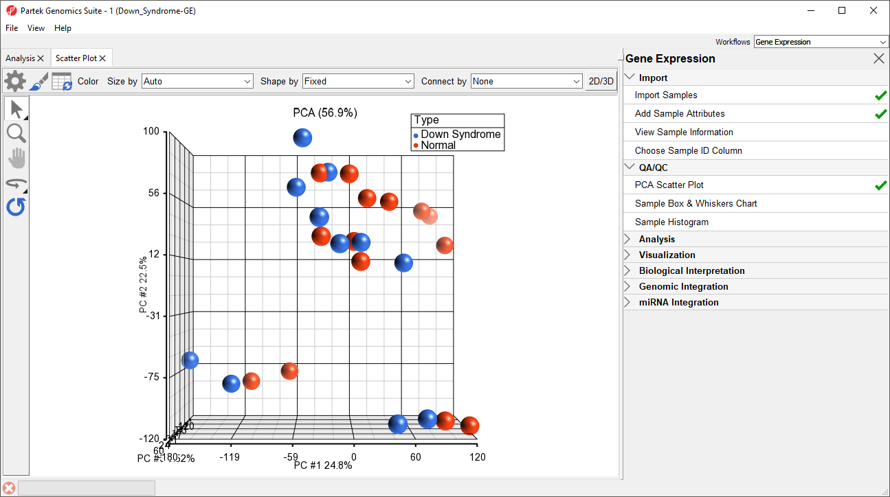
In the scatter plot, each point represents a chip (sample) and corresponds to a row on the top-level spreadsheet. The color of the dot represents the Type of the sample; red represents a normal sample and blue represents a Down syndrome sample. Points that are close together in the plot have similar intensity values across the probe sets on the whole chip, while points that are far apart in the plot are dissimilar
...
| Numbered figure captions | ||||
|---|---|---|---|---|
| ||||
|

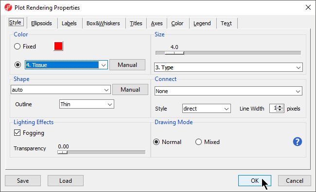
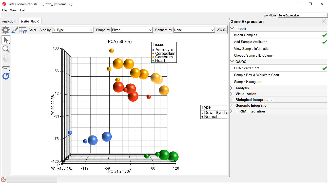
Notice now that the data are clustered by different tissues (Figure 3).
...
| Numbered figure captions | ||||
|---|---|---|---|---|
| ||||
|

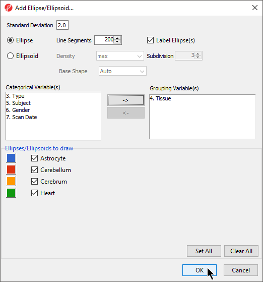
Another way to see the cluster pattern is to put an ellipse around the Tissue groups.
...
| Numbered figure captions | ||||
|---|---|---|---|---|
| ||||
|

By rotating this PCA plot, you can see that the data is separated by tissues, and within some of the tissues, the Down syndrome samples and normal samples are separated. For example, in the Astrocyte and Heart tissues, the Down syndrome samples (small dots) are on the left, and the normal samples (large dots) are on the right (Figure 5).
...
| Numbered figure captions | ||||
|---|---|---|---|---|
| ||||
|

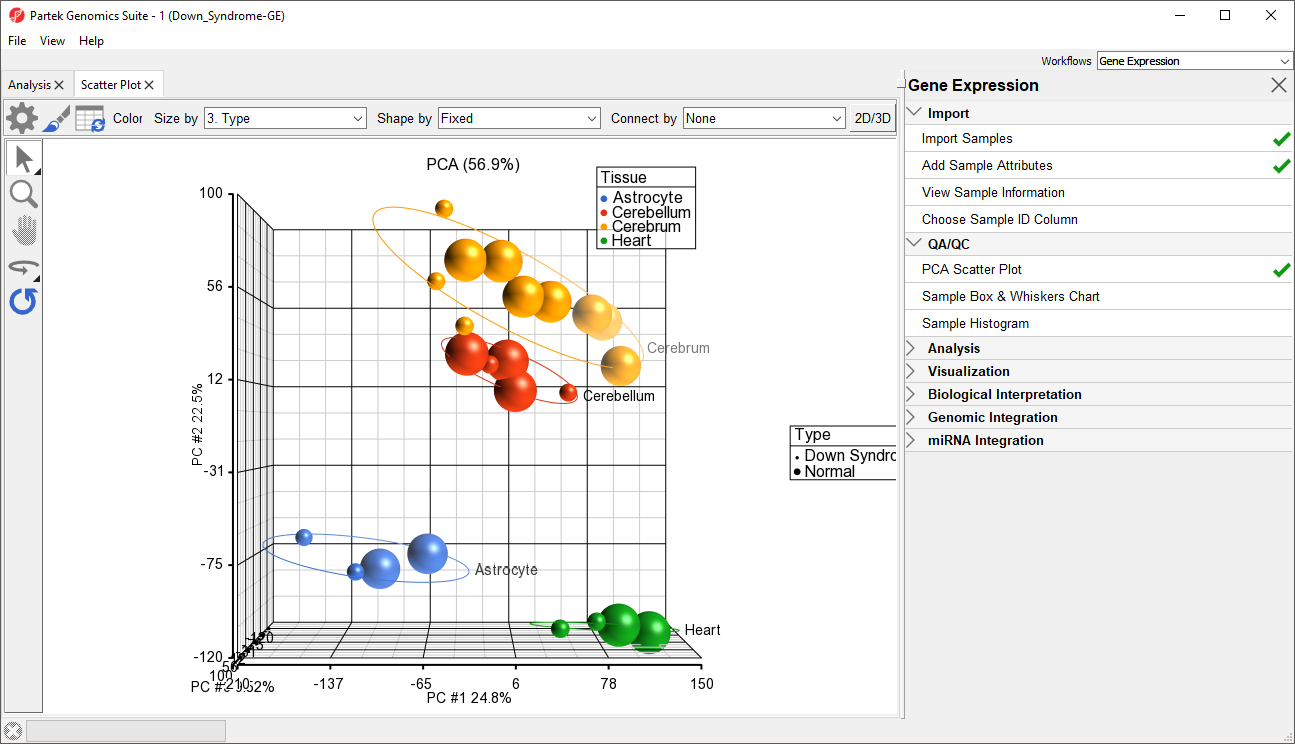
PCA is an example of exploratory data analysis and is useful for identifying outliers and major effects in the data. From the scatter plot, you can see that the tissue is the biggest source of variation. There are many genes that express differently between the tissues, but not as many genes that express differently between type (Down syndrome and normal) across the whole chip.
...
| Numbered figure captions | ||||
|---|---|---|---|---|
| ||||
|

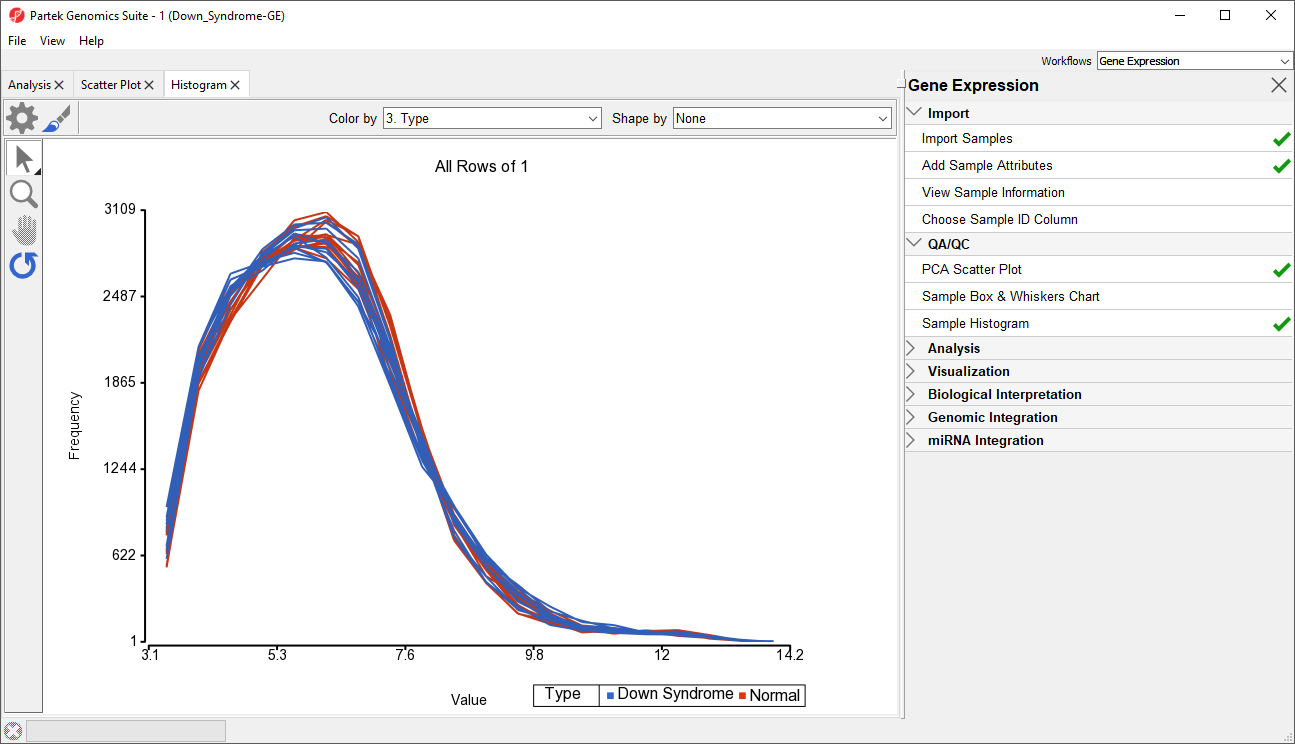
The histogram plots one line for each of the samples with the intensity of the probes graphed on the X-axis and the frequency of the probe intensity on the Y-axis. This allows you to view the distribution of the intensities to identify any outliers. In this dataset, all the samples follow the same distribution pattern indicating that there are no obvious outliers in the data. As demonstrated with the PCA plot, if you click on any of the lines in the histogram, the corresponding row will be highlighted in the spreadsheet 1 (Down_Syndrome-GE). You can also change the way the histogram displays the data by clicking on the Plot Properties button. Feel free to explore these options on your own.
...
Overview
Content Tools