Join us for a webinar: The complexities of spatial multiomics unraveled
May 2
Page History
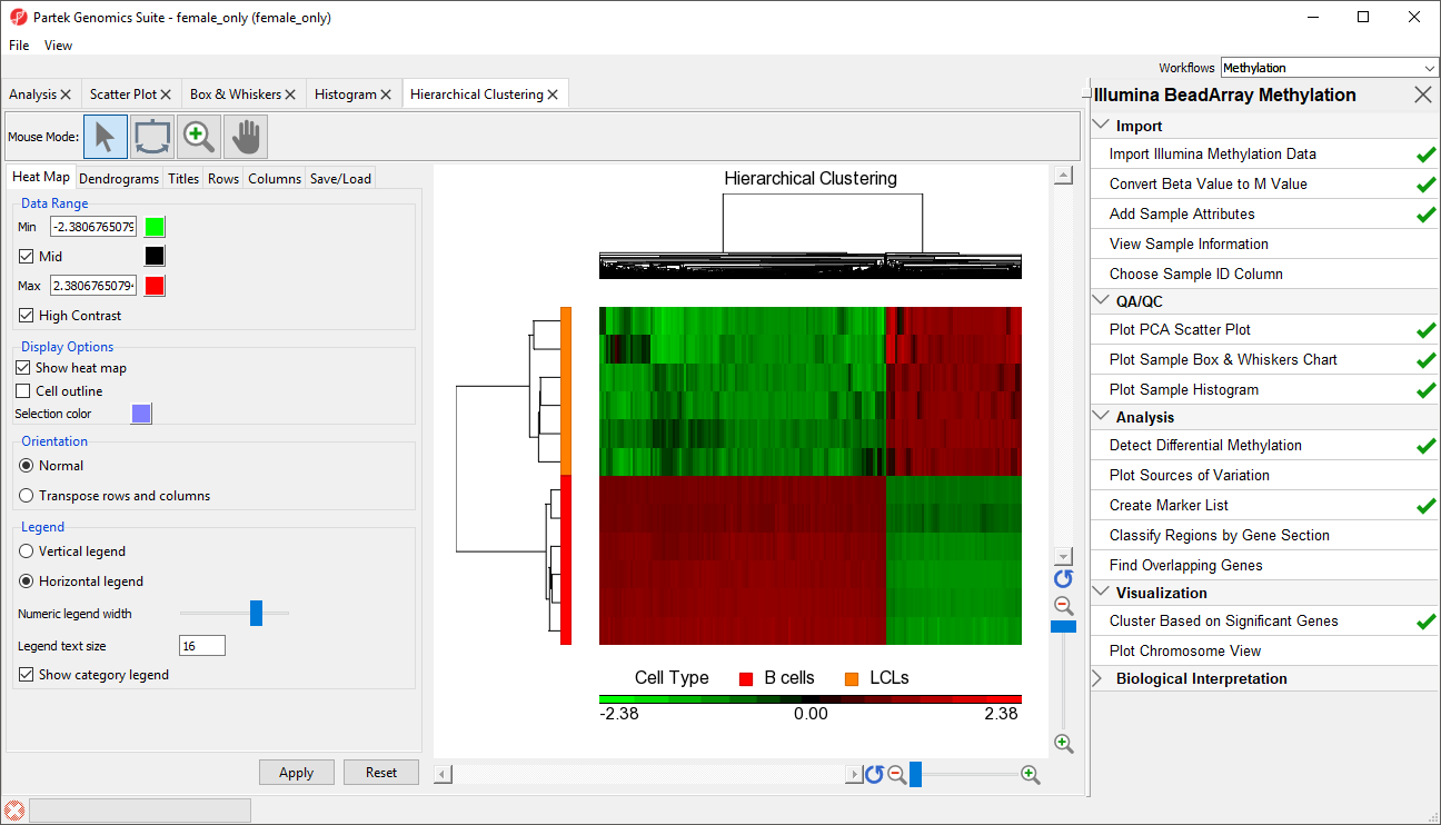
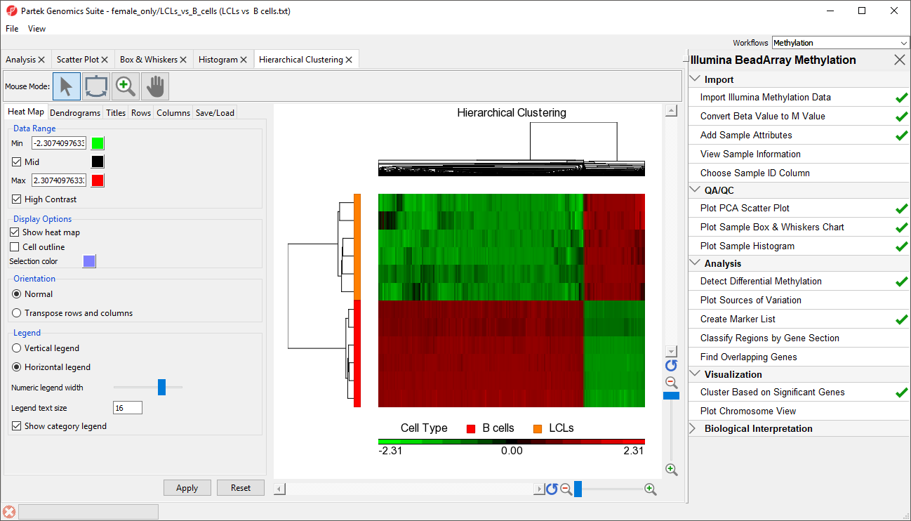
The significant CpG loci detected in the previous step actually form a methylation signature that differentiates , which we shall now visualise by between LCLs and B cells. We can build and visualize this methylation signature using clustering and a heat map.
- Select the LCLs vs. B cells spreadsheet in the spreadsheet pane on the left
- Select Cluster Based on Significant Genes from the Visualization panel of the Illumina BeadArray Methylation workflow
- Select Hierarchical Clustering for Specify Method (Figure 1)
...
- Select OK
- Verify that LCLs vs . B cells is selected in the drop-down menu
- Select Standardize for Expression normalization (Figure 2)
| Numbered figure captions | ||||
|---|---|---|---|---|
| ||||
|
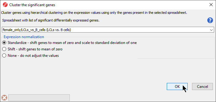

- Select OK
The heat map will be displayed on the Hierarchical Clustering tab (Figure 3).
| Numbered figure captions | ||||
|---|---|---|---|---|
| ||||
|
...
Overview
Content Tools