Page History
There are two main visualizations for use with GO ANOVA outputs:
- Dot plots used to visualize differential expression of functional groups
- Profiles used for visualizing disruption of gene expression patterns within the group
Dot Plots
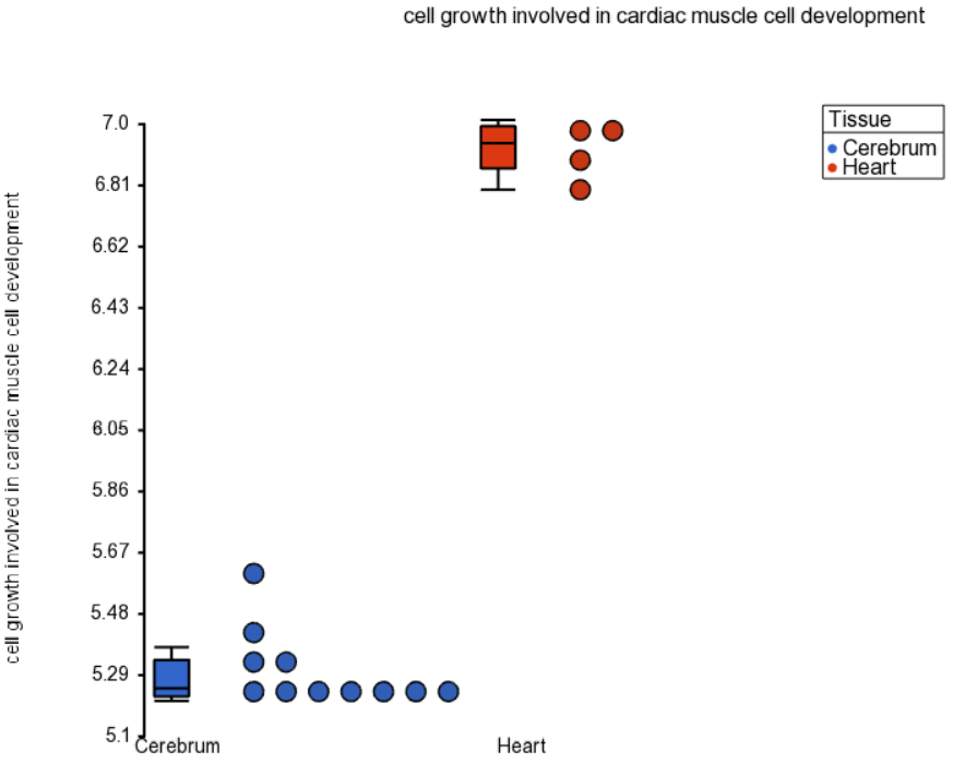
Dot plots represent each sample with a single dot. The position of each dot is calculated as the average expression of all genes included in the functional group. Invoke this plot by right clicking on the row header of a functional group of interest and choosing Dot Plot (Orig. Data). The color, shape, and size of the dots can be set to represent sample information in the plot properties dialogue, invoked by pressing on the red ball in the upper left.
Figure 1 shows a dot plot for a GO category "cell growth involved in cardiac muscle cell development", which is expressed in the heart at a level of almost four times that of the brain, evidenced by the difference of just under two units on the y-axis (in the current example the values on the y-axis are shown in log2 space). Note that the replicates are grouped neatly, making this category highly significant. That is not a surprise, given that the genes belonging to that category are likely very specific for the heart.
| Numbered figure captions | ||||
|---|---|---|---|---|
| ||||
|
| Additional assistance |
|---|
|
| Rate Macro | ||
|---|---|---|
|
Overview
Content Tools