There are two main visualizations for use with GO ANOVA outputs:
- Dot plots used to visualize differential expression of functional groups
- Profile plots used for visualizing disruption of gene expression patterns within the group
Dot Plots
Dot plots represent each sample with a single dot. The position of each dot is calculated as the average expression of all genes included in the functional group. Invoke this plot by right clicking on the row header of a functional group of interest and choosing Dot Plot (Orig. Data). The color, shape, and size of the dots can be set to represent sample information in the plot properties dialogue, invoked by pressing on the red ball in the upper left.
Figure 1 shows a dot plot for a GO category "cell growth involved in cardiac muscle cell development", which is expressed in the heart at a level of almost four times that of the brain, evidenced by the difference of just under two units on the y-axis (in the current example the values on the y-axis are shown in log2 space). Note that the replicates are grouped neatly, making this category highly significant. That is not a surprise, given that the genes belonging to that category are likely very specific for the heart.
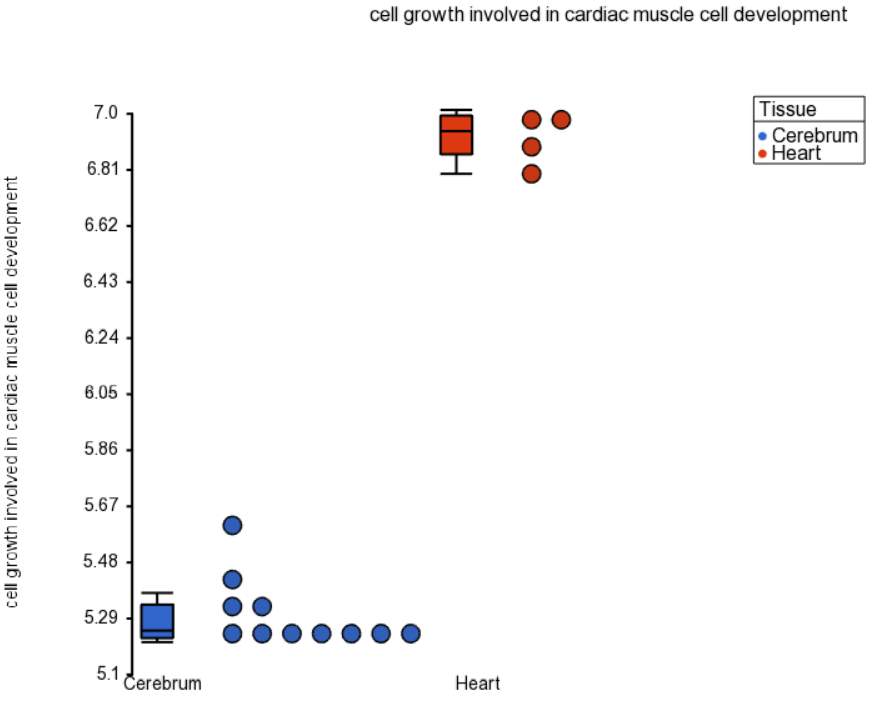 Figure 1. Dot plot of a significantly differentially expressed GO category. Each dot is a sample, box-and-whiskers summarize groups
Profile Plots
Profile plots or profiles represent each category of one of the GO ANOVA factors as a few overlapping lines. Horizontal coordinates refer to individual genes or probes in the original data. Vertical coordinates represents expression of the individual gene. Invoke this plot by right clicking on the row header of a function group of interest and choosing Profile (Orig. Data). This plot is useful as the pattern of gene expression in the group is displayed as a line. If the pattern is conserved across treatments, the lines will lie parallel, but if the gene reacts differently, the lines will follow a different pattern, maybe even cross each other.
Profile plot on Figure 2 visualizes a GO category without differential expression, but with significant disruption. Note that the gene TNNI3 is up-regulated in the heart, while STX1A is down-regulated in the heart.
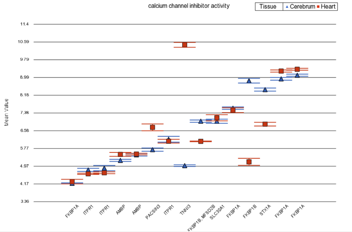 Figure 2. Profile plot of a GO category with significant disruption but not differential expression. Each data point is a gene (error bars are standard error of the mean)
Additional Assistance
If you need additional assistance, please visit our support page to submit a help ticket or find phone numbers for regional support.


| Your Rating: |
|
Results: |

|
33 | rates |
Overview
Content Tools