Page History
...
Gene-specific analysis (GSA) is a statistical modeling approach used to test for differential expression of genes or transcripts in Partek® Flow®Partek Flow. The terms "gene", "transcript" and "feature" are used interchangeably below. The goal of GSA is to identify a statistical model that is the best for a specific transcript, and then use the best model to test for differential expression.
...
In GSA, the data are used to choose the best model for each transcript. Then, the best model produces p-values, fold change estimates, and other measures of importance for the factor(s) of interest.
| Numbered figure captions | ||||
|---|---|---|---|---|
| ||||
|
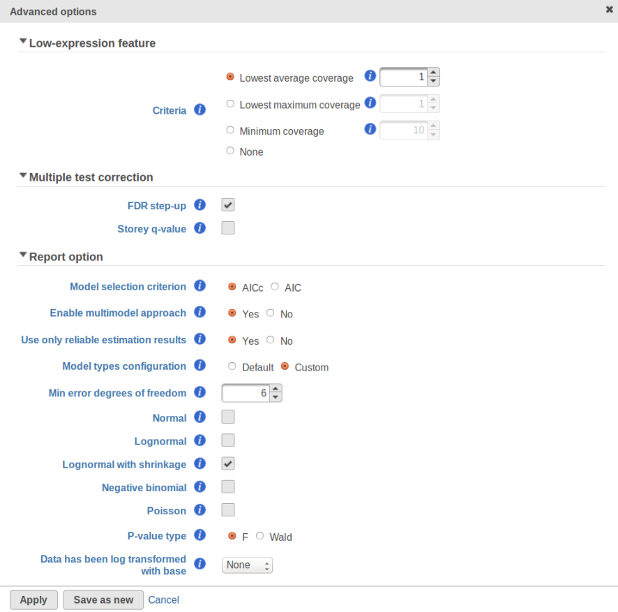
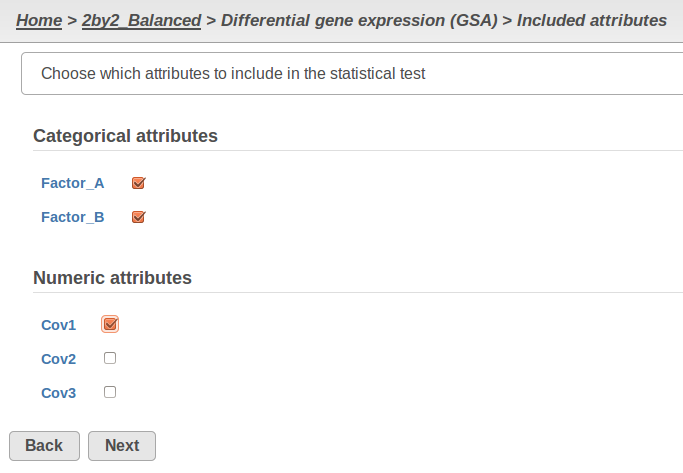
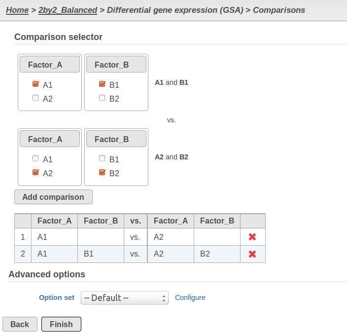
Currently, GSA is capable of considering the following five response distributions: Normal, Lognormal, Lognormal with shrinkage, Negative Binomial, Poisson (Figure 1). The GSA interface has an option to restrict this pool of distributions in any way, e.g. by specifying just one response distribution. The user also specifies the factors that may enter the model (Figure 2A) and comparisons for categorical factors (Figure 2B).
| Numbered figure captions | ||||
|---|---|---|---|---|
| ||||
A) Choosing factors (attributes) in GSA
B) Choosing comparisons in GSA |
...
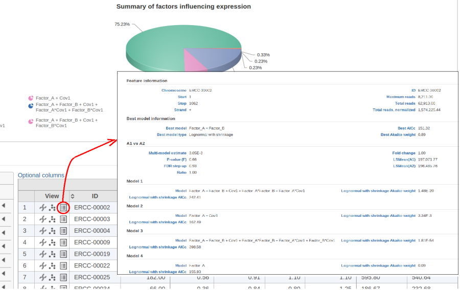
The model with the lowest information criterion is considered the best choice. It is possible to quantify the superiority of the best model by computing the so-called Akaike weight (Figure 3).The model's weight is interpreted as the probability that the model would be picked as the best if the study were reproduced. In the example above, we can obtain 15 Akaike weights that sum up to one. For instance, if the best model has Akaike weight of 0.95, then it is very superior to other candidates from the model pool. If, on the other hand, the best weight is 0.52, then the best model is likely to be replaced if the study were reproduced. We can still use this "best shot" model for downstream analysis, keeping in mind that that the accuracy of this "best shot" is fairly low.
| Numbered figure captions | ||||
|---|---|---|---|---|
| ||||
|
...
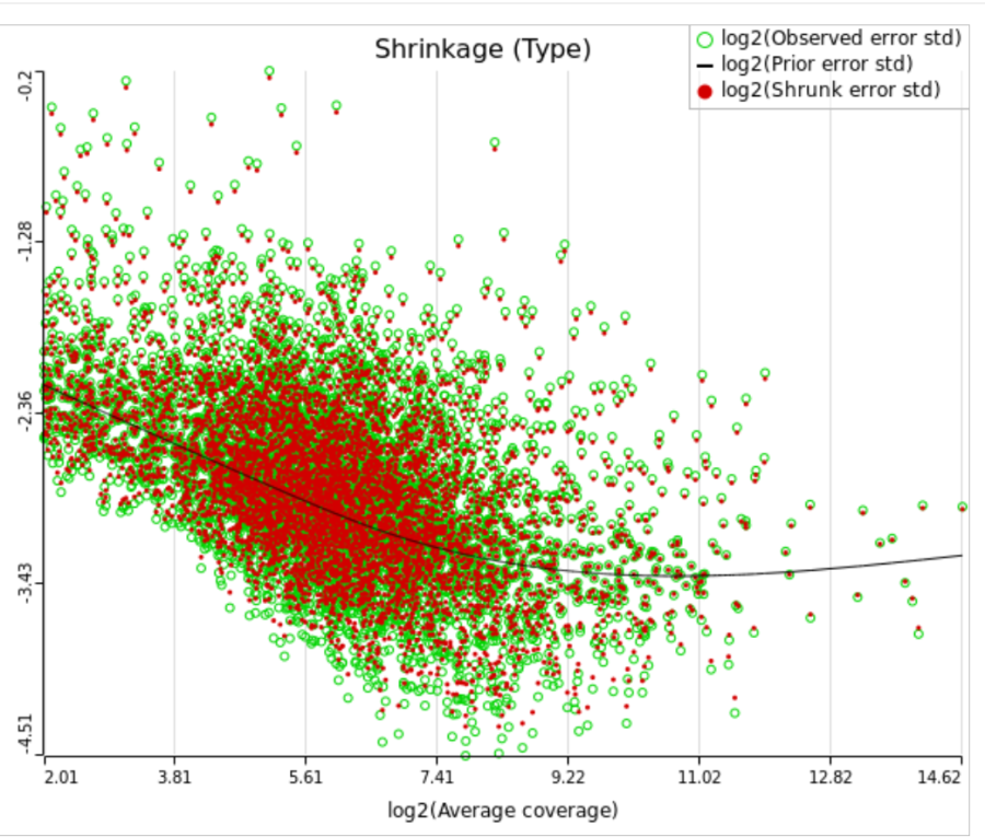
When "Lognormal with shrinkage" is enabled, a separate shrinkage plot is displayed for each design (Figure 4). First, a lognormal linear model is fitted for each gene separately, and the standard deviations of residual errors are obtained (green dots in the plot). Applying shrinkage amounts to two more steps. We look at how the errors change depending on the average gene expression and we estimate the corresponding trend (black curve). Finally, the original error terms are adjusted (shrunk) towards the trend (red dots). The adjusted error terms are plugged back into the lognormal model to obtain the reported results such as p-value.
| Numbered figure captions | ||||
|---|---|---|---|---|
| ||||
|
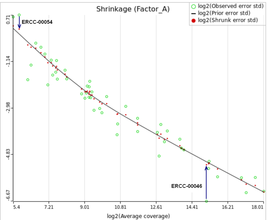
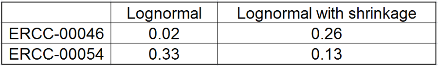
All other things being equal, the comparison p-value goes up as the magnitude of error term goes up, and vice-versa. As a result, the "shrunken" p-value goes up (down) if the error term is adjusted up (down). Table 1 reports some results for two features highlighted in Figure 4
| Numbered figure captions | ||||
|---|---|---|---|---|
| ||||
|
For a large sample size, the amount of shrinkage is small, (Figure 5), and the "Lognormal" and "Lognormal with shrinkage" p-values become virtually identical.
| Numbered figure captions | ||||
|---|---|---|---|---|
| ||||
|
...
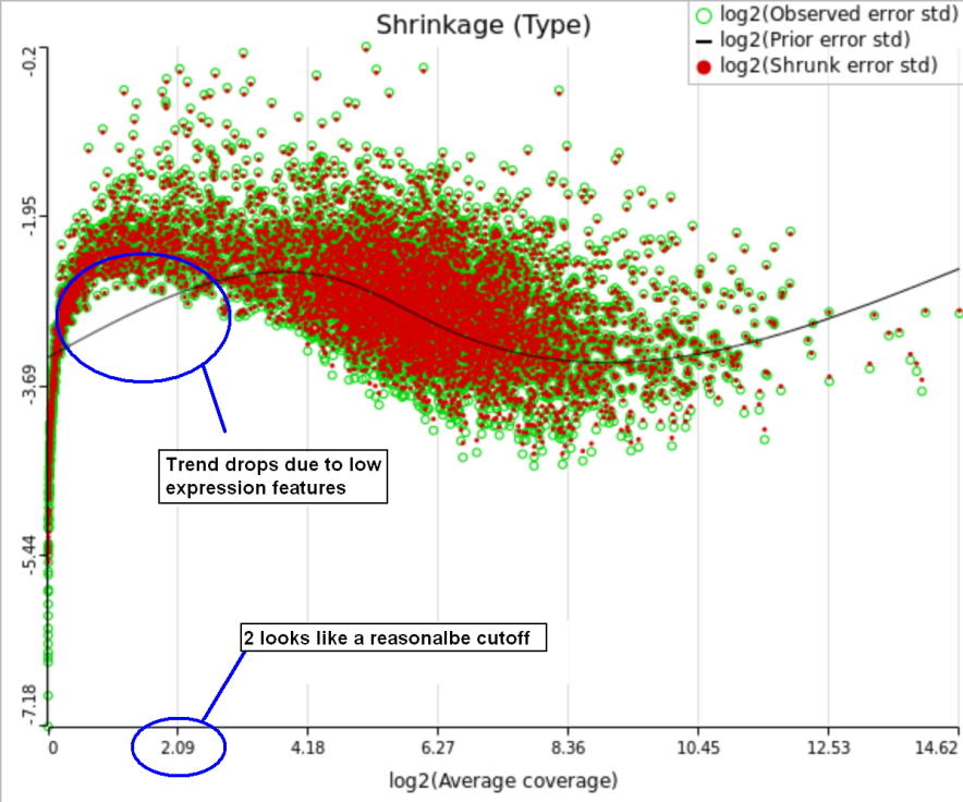
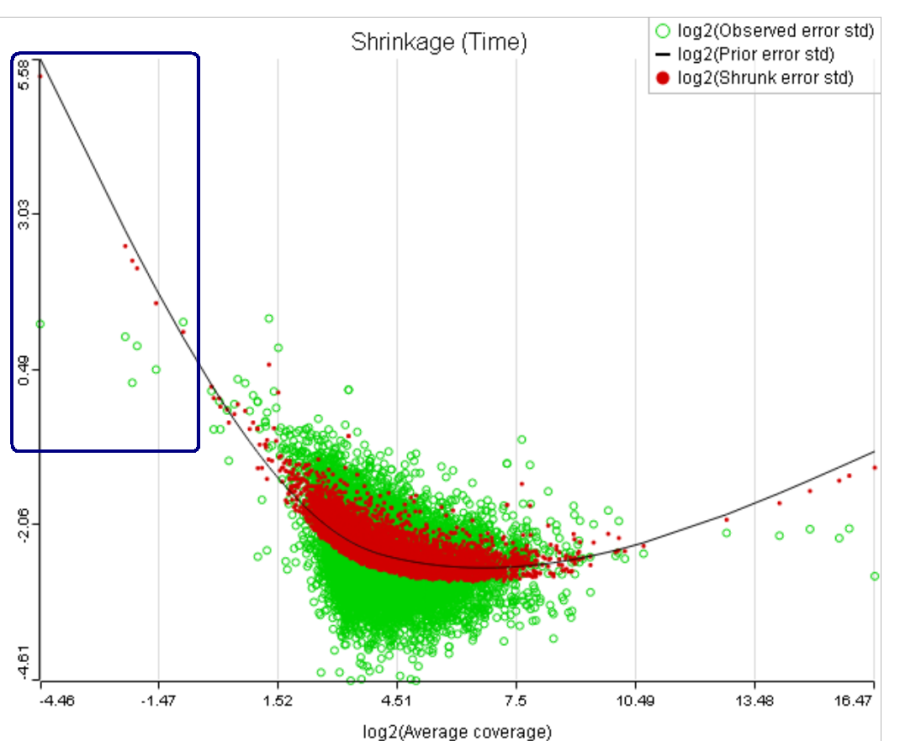
A rule of thumb suggested by limma authors is to set the low expression threshold to get rid of the drop and to obtain a monotone decreasing trend in the left-hand part of the plot.
| Numbered figure captions | ||||
|---|---|---|---|---|
| ||||
|
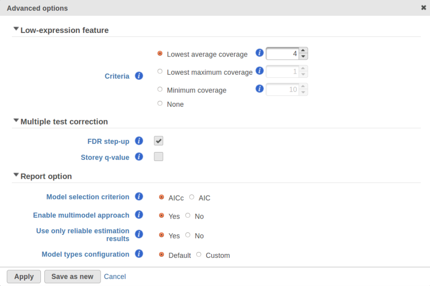
For instance, in Figure 5 it looks like a threshold of 2 can get us what we want. Since the x axis is on the log2 scale, the corresponding value for "Lowest average coverage" is 2^2=4 (Figure 6). After we set the filter that way and rerun GSA (Figure 7), the shrinkage plots takes the required form (Figure 8).
| Numbered figure captions | ||||
|---|---|---|---|---|
| ||||
|
...
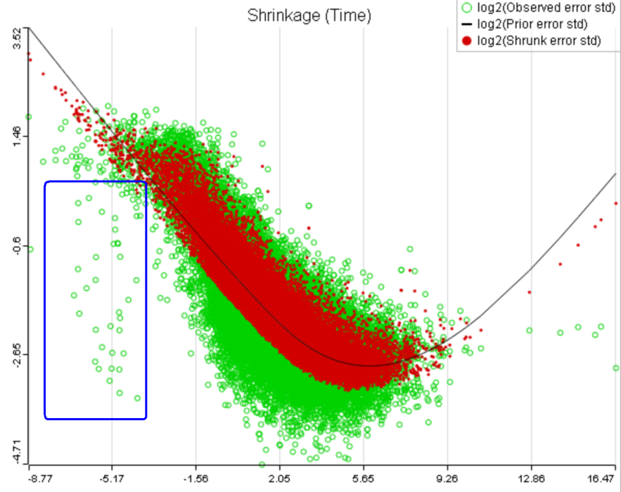
That line of reasoning suggests that neither DESeq2 nor limma are perfectly equipped for dealing with abnormal features. In fact, "limma trend" has no way to deal with them at all: shrinkage is applied regardless. If such abnormality is coupled with a low level of expression, it could be a good idea to get rid of the outlying features by raising the low expression threshold. For instance, while the trend in Figure 8A is monotone and decreasing in the left hand part of the plot, there are many low expression features with abnormally low error terms. Unless we have a special interest in those features, it makes sense to raise the low expression threshold so as to get rid of them.
| Numbered figure captions | ||||
|---|---|---|---|---|
| ||||
A) Average expression threshold can be raised to get rid of low expression features with abnormal error terms, circled in blue
B) Six low expression features (circled in blue) account for a very sharp increase in the trend which can have an unduly large effect on overall results |
...
Speaking of higher expression features, presently GSA has no automatic method to separate "abnormal" and "normal" features, so the user has to do some eyeballing of the shrinkage plot. However, for the purpose of investigating standalone outliers GSA can quantify the benefit of shrinkage in a well grounded way. In order to do that, one can enable both Lognormal and Lognormal with shrinkage in Advanced Options (Figure 9).
| Numbered figure captions | ||||
|---|---|---|---|---|
| ||||
|
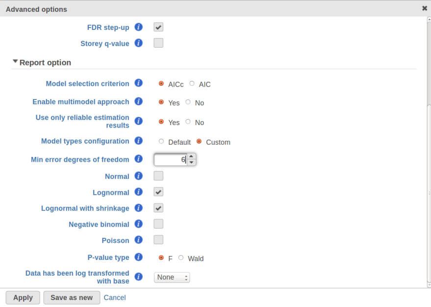
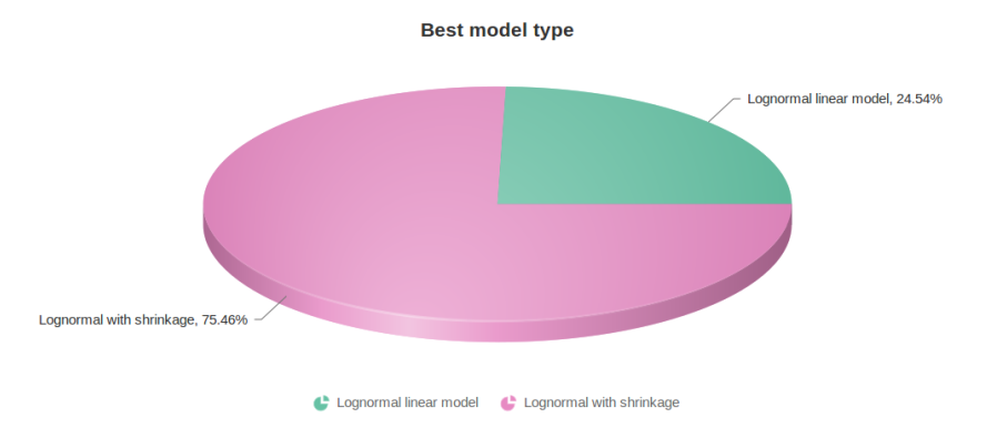
Figure 10 contains a pie chart for the dataset whose shrinkage plot is displayed in Figure 4. Because of a small sample size (two groups with four observations each) we see that, overall, shrinkage is beneficial: for an "average" feature, Akaike weight for feature-specific Lognormal is 25%, whereas Lognormal with shrinkage weighs 75%.
...
...
| Numbered figure captions | ||||
|---|---|---|---|---|
| ||||
|
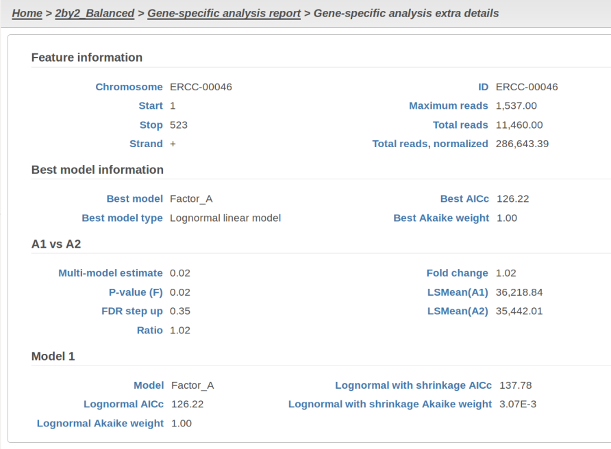
At the same time, if we look at ERCC-00046 specifically (Figure 11) we see that Lognormal with shrinkage fits so bad that its Akaike weight is virtually zero, despite having fewer parameters than feature-specific Lognormal.
| Numbered figure captions | ||||
|---|---|---|---|---|
| ||||
|
...
[1] Auer, 2011, A two-stage Poisson model for testing RNA-Seq.
[2] Burnham, Anderson, 2010, Model selection and multimodel inference.
[3] Dillies et al, 2012, A comprehensive evaluation of normalization methods.
[4] Storey, 2002, A direct approach to false discovery rates.
[5] Law et al, 2014, Voom: precision weights unlock linear model analysis. Note that this paper introduces both "limma trend" and "limma voom", but the present implementation in GSA corresponds to "limma trend".
[6] Love et al, 2014, Moderated estimation of fold change and dispersion for RNA-Seq data with DESeq2.
[7] Bioconductor support forum. Accessed last: 4/12/16. https://support.bioconductor.org/p/80745/#80758
| Additional assistance |
|---|
| Rate Macro | ||
|---|---|---|
|
...
Overview
Content Tools