Page History
...
| Numbered figure captions | ||||
|---|---|---|---|---|
| ||||
|
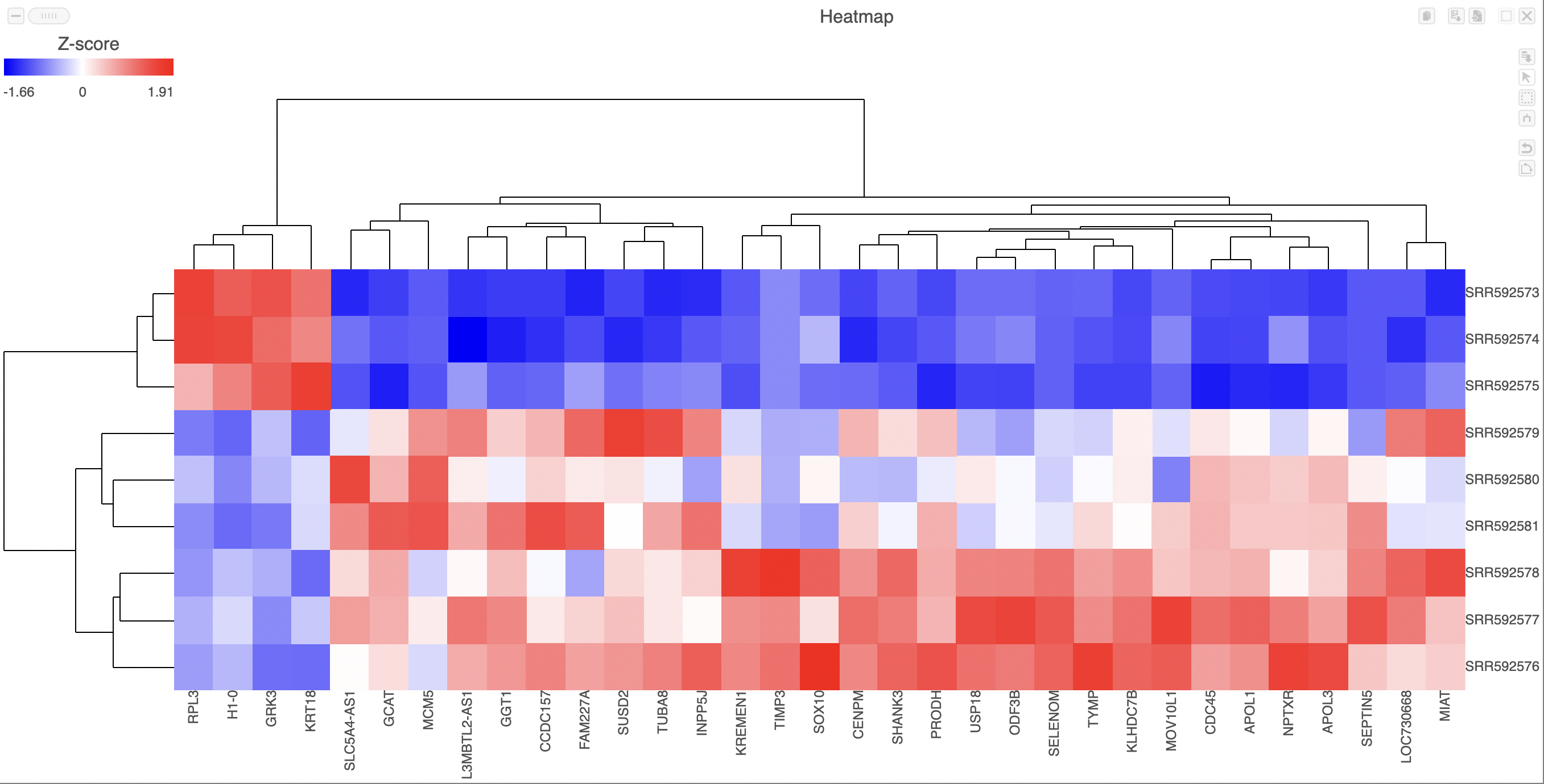
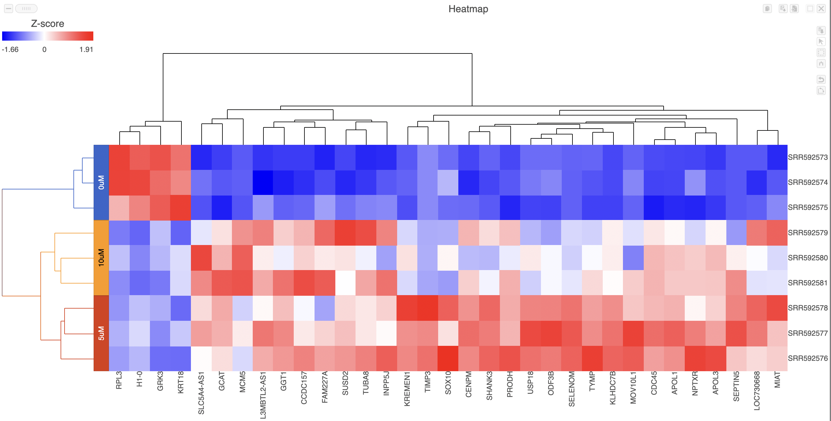
Samples are shown on rows and genes on columns. Clustering for samples and genes is shown through the dendrogram trees. More similar samples/genes are separated by fewer branch points of the dendrogram tree.
The heatmap displays standardized expression values with a mean of zero and standard deviation of one.
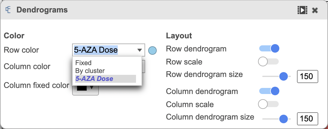
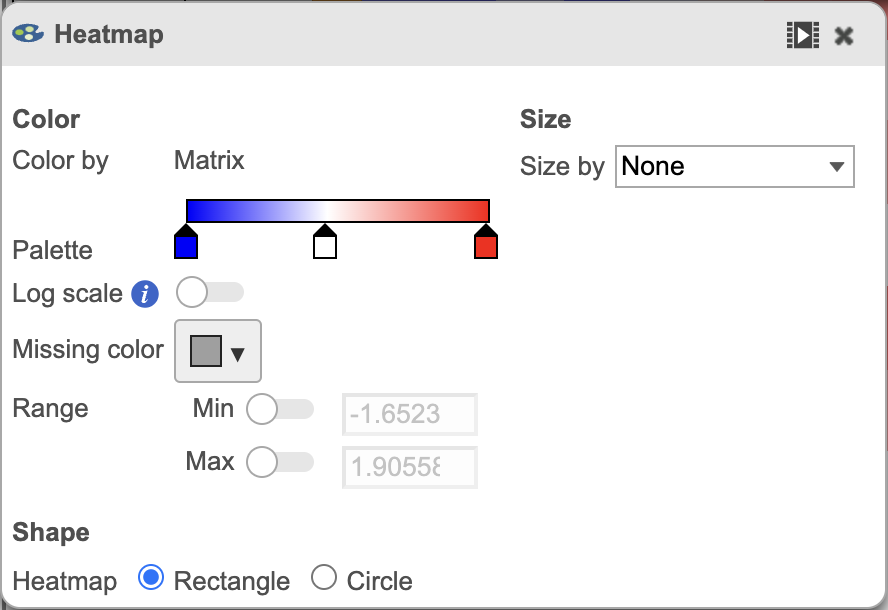
The heatmap can be customized to improve data visualization using the menu on the Configuration panel on the left. You can select Annotations to choose the appropriate attribute to annotate the rows, as well as coloring the dendogram using the Dendogram menu. The color palette used to viusalize gene expression can be modified by accessing the Heatmap menu on the left and selecting the colors to be used from the sliding bar (Figure 4). (Figure 2).
| Numbered figure captions | ||||
|---|---|---|---|---|
| ||||
   |
Once selected, the custom annotations will appear on the figure (Figure 3).
| Numbered figure captions | ||||
|---|---|---|---|---|
| ||||
|
...
Overview
Content Tools