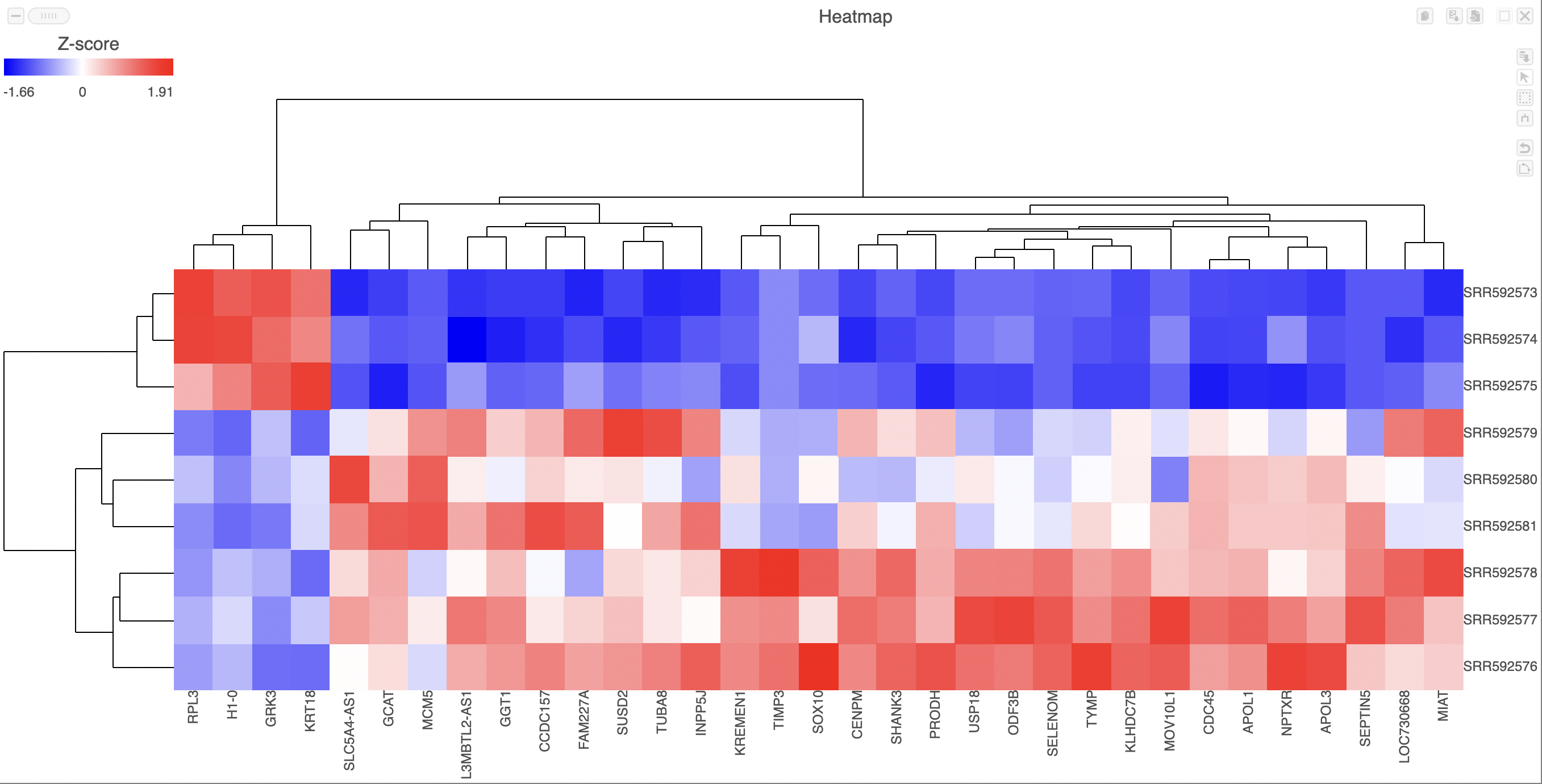
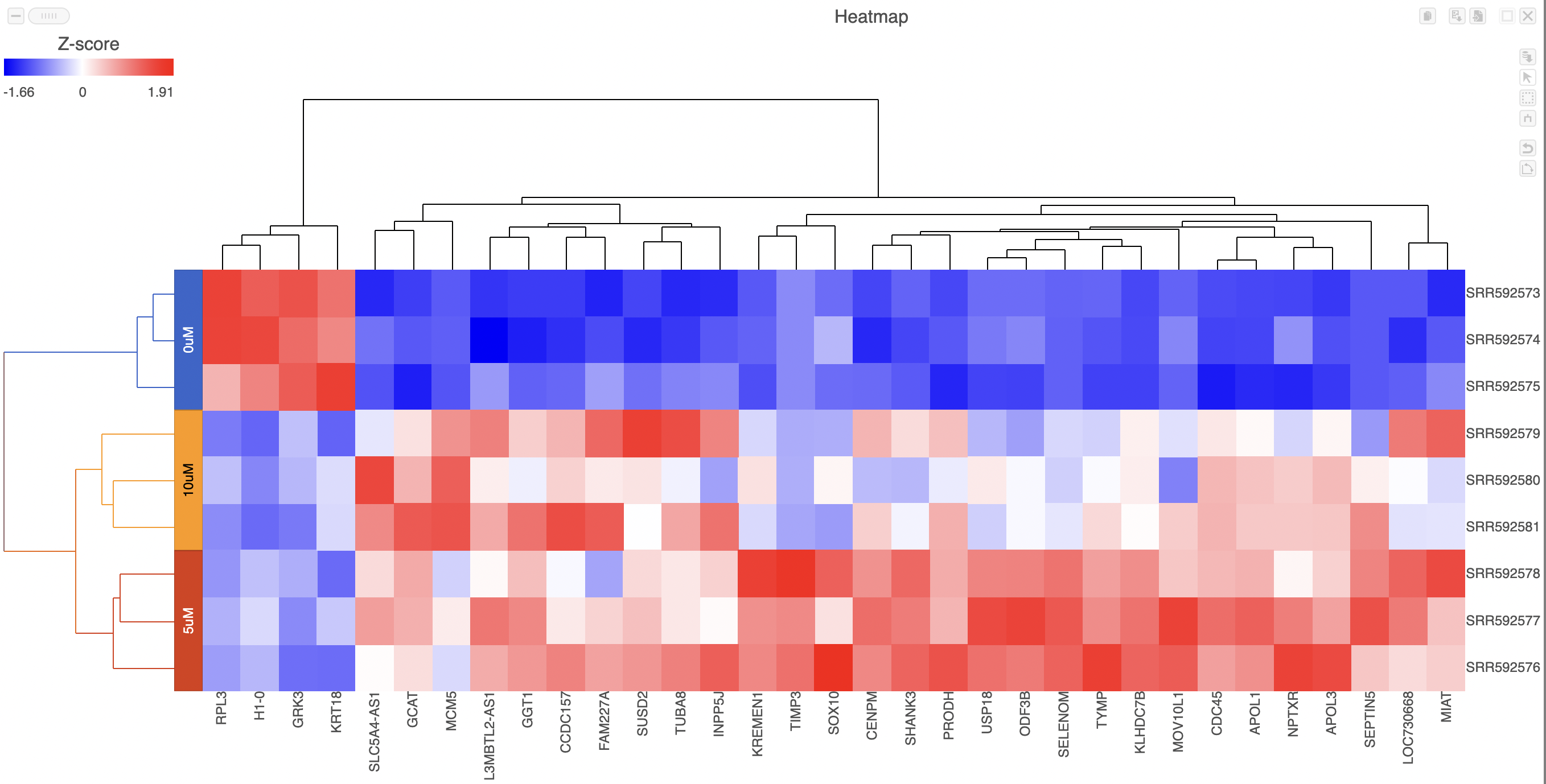
Heatmaps can be used to explore gene expression trends across samples. They are a useful tool in visualising the results of the hierarchical clustering of a gene list. They can be employed to visually distinguish between different samples and different treatments across a dataset. After having performed a hierarchical clustering task, double-clicking the Hierarchical clustering / heatmap task node will automatically launch the heatmap in a new data viewer session (Figure 1).
Samples are shown on rows and genes on columns. Clustering for samples and genes is shown through the dendrogram trees. More similar samples/genes are separated by fewer branch points of the dendrogram tree.
The heatmap displays standardized expression values with a mean of zero and standard deviation of one.
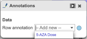
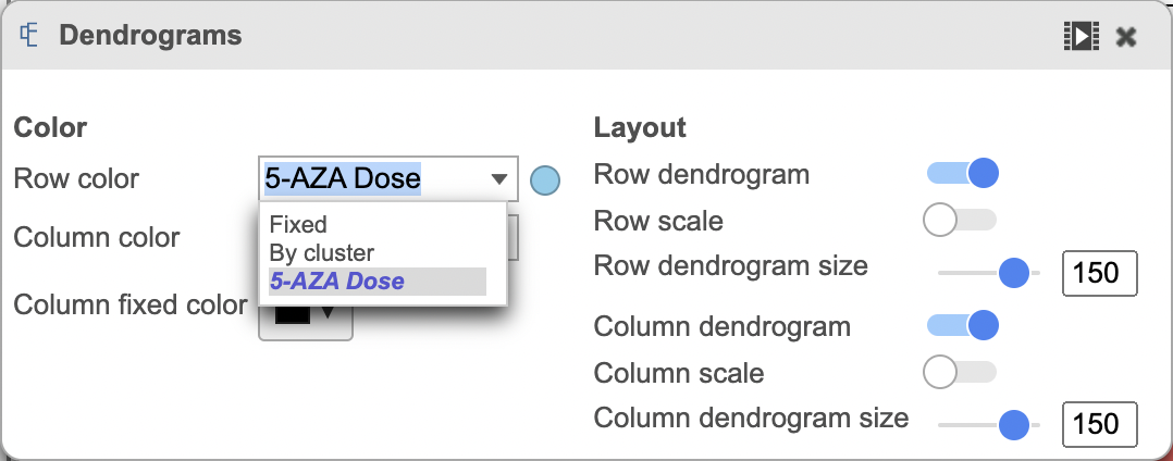
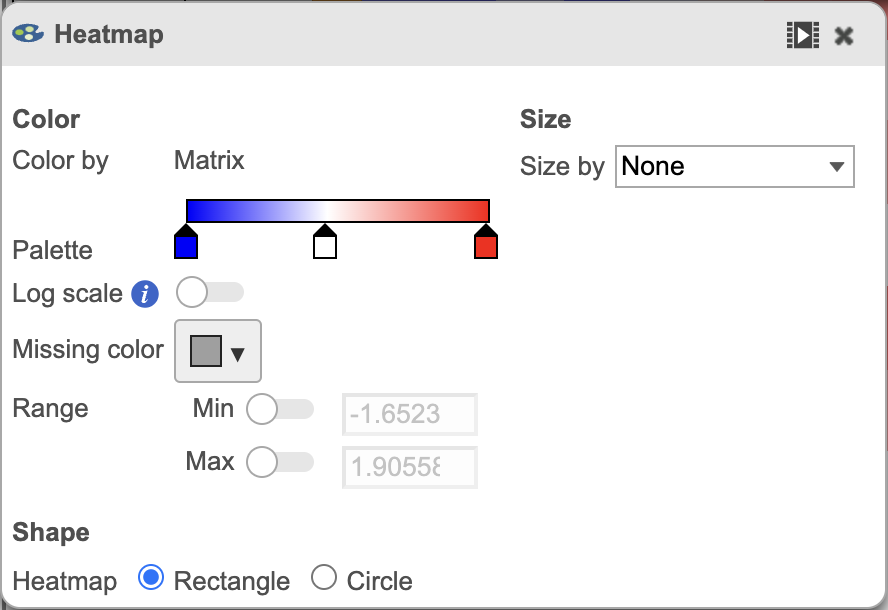
The heatmap can be customized to improve data visualization using the menu on the Configuration panel on the left. You can select Annotations to choose the appropriate attribute to annotate the rows, as well as coloring the dendogram using the Dendograms menu. The color palette used to viusalize gene expression can be modified by accessing the Heatmap menu on the left and selecting the colors to be used from the sliding bar (Figure 4). (Figure 2).
Once selected, the custom annotations will appear on the figure (Figure 3).
ghjkl
Click the Save image button to save a PNG or SVG image to your computer.
Click the Send to notebook button to send the image to a page in the Notebook.
ghjkl
ghjkl
ghjkl
Additional Assistance
If you need additional assistance, please visit our support page to submit a help ticket or find phone numbers for regional support.
