Page History
...
| Numbered figure captions | ||||
|---|---|---|---|---|
| ||||
|
Graph-based clustering
Graph-based clustering (Figure 12) identifies groups of similar cells using PC SVD values as the input. By including only the most informative PCsSVDs, noise in the data set is excluded, improving the results of clustering.
- Click the PCA data nodeClick Exploratory analysis SVD output
- Click Exploratory analysis in the task menu
- Click Click Graph-based clustering
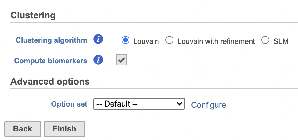
Clustering can be performed on each sample individually or on all samples together. Here, we are working with a single sample.
- Check Compute biomarkers to compute features that are highly expressed when comparing each cluster (Figure 11)
- Click Configure to access the Advanced options and change the Number of nearest neighbors to 50 and Nearest Neighbor Type to K-NN for this example tutorial. Check Compute biomarkers
- Click Finish to run as default
| Numbered figure captions | ||||
|---|---|---|---|---|
| ||||
|

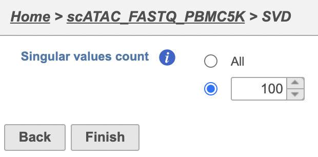
The Number of principal components should be set based on the your examination of the Scree plot and component loadings table. The default value of 100 is likely exhaustive for most data sets, but may introduce noise that reduces the number of clusters that can be distinguished.
- Click Finish to run the task
|
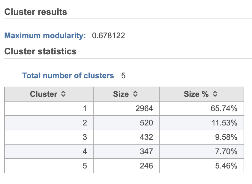
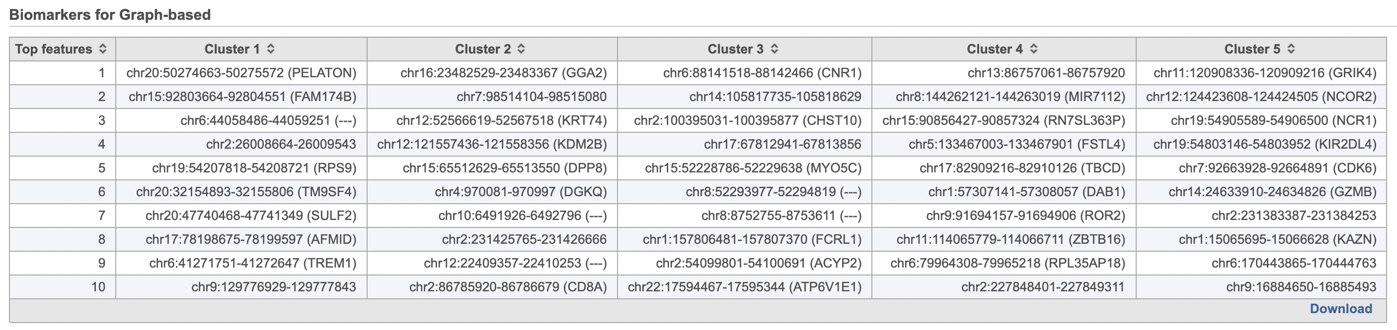
A new Graph-based clusters data and a Biomarkers data node will be generated along with the task nodes.
- Double-click the Graph-based clusters node to see the cluster results and statistics (left screenshot on Figure 1213)
- Double-click the Biomarkers node to see the computed biomarkers if you have selected this option (right screenshot on Figure 1214)
The Graph-based clustering result lists (Figure 13) lists the Total number of clusters and what proportion of cells fall into each cluster as well as Maximum modularity which is a measurement of the quality of the clustering result where optimal modularity is 1. The Biomarkers node includes report (Figure 14) includes the top features for each graph-based cluster. It displays the top-10 genes that distinguish each cluster from the others. Download at the bottom right of the table can be used to view and save more features. These are calculated using an ANOVA test comparing the cells in each group to all the other cells, filtering to genes that are 1.5 fold upregulated, and sorting by ascending p-value. This ensures that the top-10 genes of each cluster are highly and disproportionately expressed in that cluster.
...
| Numbered figure captions | ||||
|---|---|---|---|---|
| ||||
|

We will use t-SNE to visualize the results of Graph-based clustering.
t-SNE
|
| Numbered figure captions | ||||
|---|---|---|---|---|
| ||||
|
UMAP
t-Distributed Stochastic Neighbor Embedding (t-SNE) is a dimensional reduction technique that prioritizes local relationships to build a low-dimensional representation of the high-dimensional data that places objects that are similar in high-dimensional space close together in the low-dimensional representation. This makes t-SNE well suited for analyzing high-dimensional data when the goal is to identify groups of similar objects, such as cell types in single cell RNA-Seq data.
...
Overview
Content Tools