Page History
...
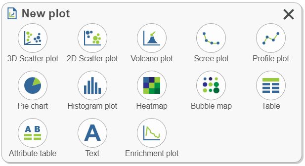
- Click a plot type. Choosing a plot type will suggest appropriate data options from results available in the analysis pipeline. The search bar can be used to navigate to a specific node of interest (e.g. normalized). Select a data node to add it to the sheet.
- Alternatively, drag and drop the plot to the sheet (blue landing sitestargets) and continue with any additional selections.

Get Data 
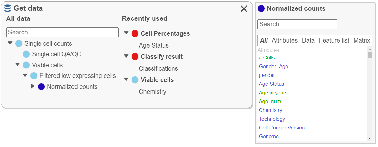
All data results from building the analysis pipeline are found here. This icon is used to create plots, to plot attributes and features of interest (e.g. color a plot by a gene of interest from the normalized data node), and to plot Recently used data nodes and droppables.
Find the data node by expanding the pipeline or use the Search bar to quickly locate results.
- To create a plot, drag the node to the sheet and continue with additional selections.
- Recently used (right side) data is organized according to the node from which it is derived and will update according to recent use. If the data viewer session is saved, recently used will be saved.
- Click a node under All data to search data found within that node such as attributes, genes, or lists. Drag data (green droppable) to blue targets (e.g. search the normalized counts node for a gene then drag the gene to color a tSNE plot). Numeric attribute names (e.g # cells) are green while categorical attribute names (e.g. classifications) are blue.

Tools
Select & Filter 
...
Overview
Content Tools