Terminology
Data Viewer - a collection of sheets
Sheet - one or more linked plots and controls
Plot - a visualization
Icon - graphical representation of tools or controls
Panel (menu) - Collection of tools and options available for user selection
Droppable - data that can be dragged and dropped
Target - location to drop a droppable
Node - ![]() data results from the analysis pipeline
data results from the analysis pipeline
FAQs
Q- What is the Data Viewer?
A - The Data viewer is a general-purpose data visualization tool that includes 2D and 3D scatter plots, histograms, heatmaps, violin plots, and more.
Q- How is it invoked?
A- Select a data node and double-click to view the task results in the Data viewer. You can also select the Data viewer tab in a project to either start a new session or revisit a saved session.
Q- Can I open more than one icon at a time and move it around?
A- Yes, open as many icons as you need at a time and move them around the screen. Either click ![]() in the right corner to close the icon or click on the icon in the menu again to close the icon.
in the right corner to close the icon or click on the icon in the menu again to close the icon.
Q- Is there a recently used function?
A- Yes, there is a recently used function within the Get data icon. This lets you drag recent nodes or the green droppables (data within a node) to blue targets.
How do I get started and navigate the data viewer?
To get started in a new data viewer session click New session  or open a previously saved session. Clicking New session will prompt you to drag and drop an available plot or data node to visualize your data onto the sheet. To do this, use New plot or Get data under Setup in the left menu. The menu descriptions can be shown
 ![]() or hidden
or hidden ![]() as desired. The menu is organized into single-click Common Controls, Setup, Tools, and Configure icons. Common controls and Setup icons do not change but Tools and Configure icons are context-sensitive and will change according to the selected plot type. Multiple icons can be open at once and their dialogs dragged around the screen as desired. Close the dialog by clicking the
as desired. The menu is organized into single-click Common Controls, Setup, Tools, and Configure icons. Common controls and Setup icons do not change but Tools and Configure icons are context-sensitive and will change according to the selected plot type. Multiple icons can be open at once and their dialogs dragged around the screen as desired. Close the dialog by clicking the ![]() in the right corner or by clicking on the icon again in the menu.
in the right corner or by clicking on the icon again in the menu.
- Common controls:
 Save - overwrite a saved session
 Save as - save a new session using a new name
 Undo - recover backward actions
 Redo - recover forward actions
 Export image - download one plot of all plots in a view to your computer
 Send to notebook - save an image of the entire sheet (all of the plots in view) to the notebook
 Capture video - Start capturing a video of the sheet with various formats (nice for 3D scatter plots)
- Setup:
 New plot - icons used to make a new plot
 Get data - select data from the analysis pipeline
- Tools:
 Select & filter - make selections and filter
  Classify - modify and apply selections as classifications
  Additional actions - create a feature list
 - Configure icons are context-sensitive and available options will change according to the plot type selected. Please navigate to the Configure help section below for more details.
How do I make a plot?
To make a new plot in the Data viewer, use the Setup icons.
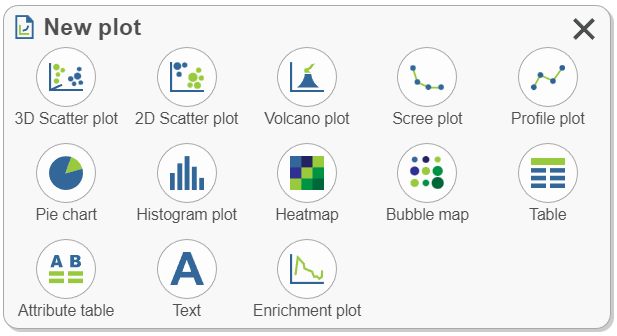
![]() New plot - Clicking to choose a plot type will suggest any appropriate data options from the results that are available in the analysis pipeline, click a node of interest to add it to the sheet.
New plot - Clicking to choose a plot type will suggest any appropriate data options from the results that are available in the analysis pipeline, click a node of interest to add it to the sheet.
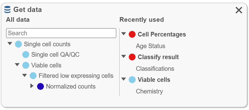
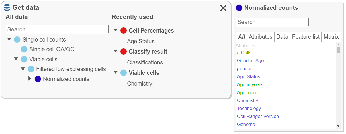
![]() Get data - The data type chosen controls which plots will be available for use after the data is dragged onto the sheet. Note that All data nodes (left) follow the hierarchy used in the analysis pipeline while Recently used (right) nodes are updated according to recent use and can similarly be used to plot data.
Get data - The data type chosen controls which plots will be available for use after the data is dragged onto the sheet. Note that All data nodes (left) follow the hierarchy used in the analysis pipeline while Recently used (right) nodes are updated according to recent use and can similarly be used to plot data.
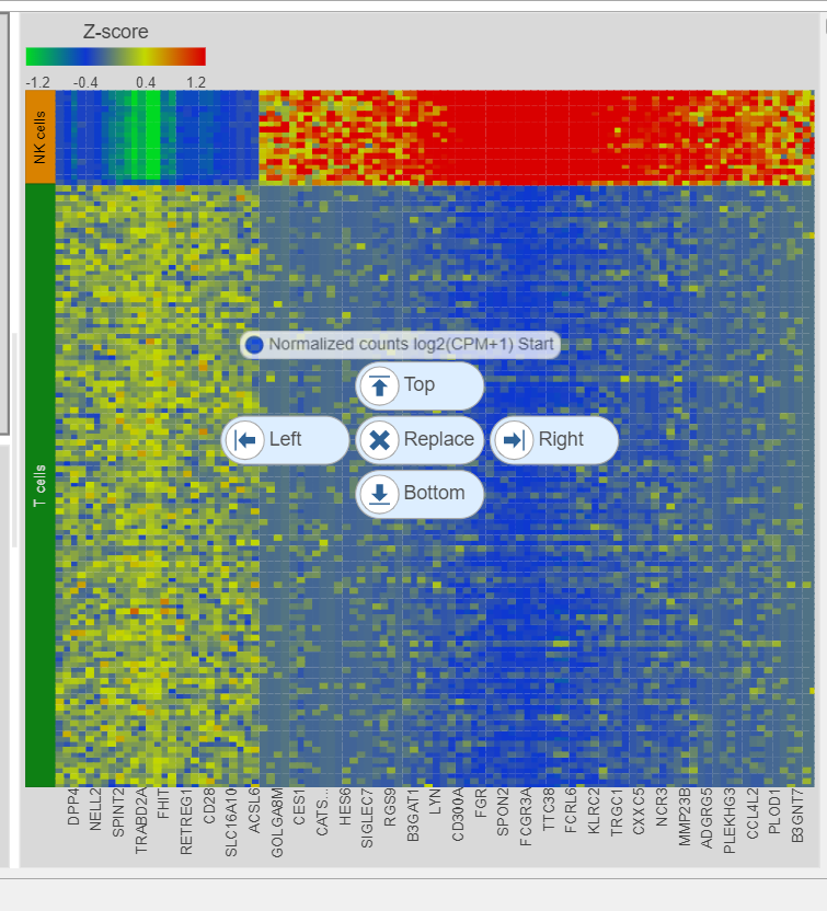
Note the target locations presented in blue (top, bottom, left, right, & replace) when dragging data. In this example, a data node chosen from Get data, is being dragged onto the sheet and can be placed at the Top, Right, Bottom, Left, or Replace the existing heatmap. Once dropped on a target location, a plot type must be chosen.
Can you have multiple plots on the sheet?
Yes, build them together.
- All plots are interactive.
- All plots are from the same data project.
- Selection (in the left-side menu for setting manual or criteria selections and on the right side of individual plots for manual selection by Pointer mode (
 click to select points), Rectangle mode (
 draw rectangle to select points), Ellipse mode (
 draw ellipse to select points), or Lasso mode (
 draw lasso to select points) and filtering options are linked for the plots on the sheet. Clear filters
 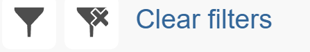 in the Select & Filter mode to remove selections.
 - Save plots together from the menu with Export image and Send to notebook or independently within each plot with Export image
 and Send to notebook
 .
.
When there are multiple plots, how are they controlled and configured?
- Each plot has its own window that can be resized by dragging the edge of the plot.
- Click a plot window to make it active (a dark gray border will appear around the window when active). The Configure icons display settings for the active plot.
- When more than one plot is open on a sheet, plots can be rearranged by dragging from one position to another
 , duplicated
  , enter full screen
 , and exit full screen
 .
. - If multiple plot types are selected together with ctrl-click or shift-click, only the plot configuration controls that are shared will be available for use.
- Select & Filter - applies to all of the plots on the sheet.
- Controls are located in the same place for each plot, either in the menu on the left, the top of the plot, or the right side of the plot. Even though each plot type has its own available controls that will vary, common controls such as those available above Setup in the menu:
At the left of the plot:![]() Save
Save![]() Save a
Save a![]() Undo
Undo![]() Redo
Redo![]() Export image
Export image![]() To notebook
To notebook
![]() Capture video
Capture video
At the top of the plot: ![]() Hide controls
Hide controls![]() Show controls Click and drag to move the plot
Show controls Click and drag to move the plot![]() Duplicate
Duplicate![]() Export image
Export image
![]() Send to notebook
Send to notebook![]() Enter Full screen,
Enter Full screen, ![]() Exit Full screen
Exit Full screen![]() Remove plot
Remove plot
My screen is full of plots. How do I add more plots without starting a new data viewer session?
Multiple sheets (where plots are added) are allowed in the data viewer. This is helpful when you cannot fit more plots on the sheet (screen), but you still want to use all of the settings that you are working with (e.g., recently used).
- Sheet navigation uses a panel at the bottom of the screen
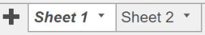 . Use
. Use  to Add a sheet or the
  to Duplicate, Rename, or Delete a sheet.
Why does some data highlight in green when I hover over it?
Any data highlighted in a green background  when hovered over can be dragged and dropped onto a blue target
 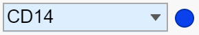 .
.
- This includes legend, axis titles, criteria used in Select & Filter, and table features. Any data present in Plot data will be highlighted in green and can be dragged to make a plot.
- Drag and drop manipulation is also possible for data nodes
 present in the configure icons (e.g., Axes and Style).
How do I color my plot by a gene?
There are multiple ways to color plots by a gene or protein (feature) of interest. You can also color by more than one feature on the same plot or even feature lists. You can also choose to represent a feature with styles other than color, like shape or size.
- Drag and drop the gene of interest from the appropriate node in Get data (e.g., normalized counts). The Recently used list can be helpful for this if you have already recently used the gene.
- Open the Style icon and change Color by. Make sure you are on the appropriate node
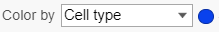 . Some plot types (e.g., tSNE) will invoke Style by clicking the legend. This is where you would color by a feature list that you have saved under list management.
 - Drag and drop features from another plot on the sheet (e.g., an axis title from a violin plot) or drag and drop features from criteria added to the Select & Filter icon.
Can I plot genes from tables without going back to the analysis pipeline?
Yes, report results such as those generated during differential analysis can be accessed in the data viewer and specific genes can be plotted.
- The tables must be plotted on the sheet. One way to do this is to choose New plot , select Table
 (only data in table format are available), then the data to plot. Features (green with hover) are now available to drag and drop on the plot type of interest.
How do I manipulate my plot without using Tools or Configure?
- Selections can be made directly on the plot . This can include selecting populations of cells or selecting genes of interest (e.g., to classify clusters of cells). The menu must still be used to filter , classify
 , and create gene lists
  after in-plot selection.
 - Clicking on the Legend will invoke configure options. The configure options invoked will vary depending on the plot type.
- Clicking the axis titles will invoke the axes configuration.
Setup
 New plot
- Click a plot type. Choosing a plot type will suggest appropriate data options from results available in the analysis pipeline. The search bar can be used to navigate to a specific node of interest (e.g., normalized). Select a data node to add it to the sheet.
- Alternatively, drag a plot onto the sheet and drop it on a blue target, then continue with your selections.
 Get Data
All data results from building the analysis pipeline are found here. This icon is used to create plots, to plot attributes and features of interest (e.g., color a plot by a gene of interest from the normalized data node), and to plot Recently used data.
Find the data node by expanding the pipeline or use the Search bar to quickly locate results.
- To create a plot, drag the node to the sheet and continue with additional selections.
- Recently used (right side) data is organized according to the node from which it is derived and will update according to recent use. If the data viewer session is saved, recently used will be saved.
- Click a node under All data to search data found within that node such as attributes, genes, or lists. Drag data (green droppable) to blue targets (e.g., search the normalized counts node for a gene then drag the gene to color a tSNE plot). Numeric attribute names (e.g., # cells) are green while categorical attribute names (e.g., classifications) are blue.
Tools
Select & Filter
This icon is where selections are made (left side) and filtered (right side). Selecting and filtering will be applied to all plots in the sheet. Selections can be used to filter and/or classify ![]() . Selections used to filter can be named under classify
. Selections used to filter can be named under classify ![]() and indicate the number of cells included.
and indicate the number of cells included.
- Deselected points (the points that are not selected) can either be Dim (colors are not as bright) or Gray (not colored but instead gray)
- There are two selection modes: Manual and Criteria.
- Manual
- Manual governs in plot selections which can undergo filtering or classification.
- Manual governs in plot selections
- Criteria
- Criteria allows additions according to the selected node
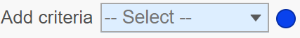 (this is criteria used to configure the plot like attributes or genes).
 - Data can be dragged directly to Add criteria to generate selections or use the drop-down.
- When criteria are added, the icon will grow with the selections. Remove the selections by clicking
 .
. - Selections can be dragged to blue targets.
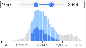
- Each criterion can be modified. Invert can be used to include or exclude selections. When modifying criteria by low or high values, pin histogram lets you see multiple histograms at a time. Histograms are colored according to selections; dark blue is the current selection, gray is data outside the current selection (i.e. the positions of the slider handles), and light blue is data that is within the slider’s selected region but is currently deselected by other criteria.
- Criteria allows additions according to the selected node
- Manual
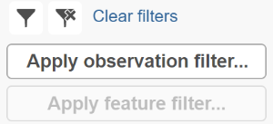
- Filter
Click: to include selected points
 to exclude selected points
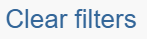 to remove filters
- The Apply observation filter and Apply feature filter are used to apply filters to data nodes in the analysis pipeline.
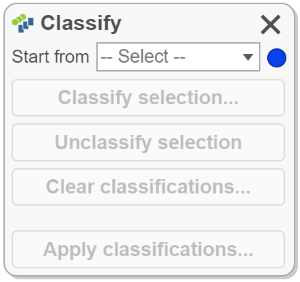
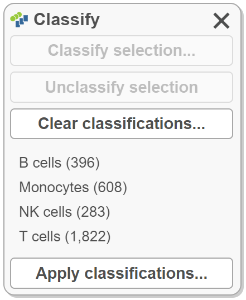
 Classify
The Classify icon holds draft classifications to be applied or saved classifications that can be opened, applied, and refined as necessary then saved again as a classification with a new name. Classification names can be edited, and the Classifications can be deleted. The number of points in the classification are listed and will be updated in accordance with any changes. Classify selection requires a label (name) and will overwrite any previously applied classification. Apply classifications can be used to apply the classification to the project. We recommend frequently saving the data viewer session while classifying cells, prior to applying the classifications; any classifications that have been made but not applied can be viewed on plots using "New classification".
 Additional actions
The Additional actions icon holds other available plot actions. This icon will become available for applicable plot types (e.g., heatmap). Currently, it is used to Create a feature list.
Configure
These are the configuration options for plots under Configure. Each of the below icons open a dialog box with plot configuration options. Dialogs can be dragged anywhere on the screen and remain open until closed by clicking ![]() in the upper right corner of the dialog. Multiple dialogs can be open at once. Changes are auto saved and do not affect other plots unless both plots are selected and modified together. If a dialog is open but is not available for use in the currently selected plot, a warning will appear.
in the upper right corner of the dialog. Multiple dialogs can be open at once. Changes are auto saved and do not affect other plots unless both plots are selected and modified together. If a dialog is open but is not available for use in the currently selected plot, a warning will appear.
 Description
- Click the Title on a plot or choose the Description icon from the menu.
- This contains Title and Legend settings.
 Axes
Axes
- Click the Axes icon from the menu. The axes dialogue can also be opened by clicking the X, Y, or Z axis titles.
- The available options change depending on the plot type.
- Transpose the axis.
- Modify the plotted Content (the data represented).
- Alter the Grid and Sorting settings.
- Features and attributes can be dragged to the Axes card . Alternatively, drag feature and attributes from the axis to plots using the data node .
 Content
- Content configuration options are available for tables and text where it contains modification options as well as the node where the data comes from in the analysis pipeline; to change this source select the node of interest by clicking on it.
 Style
Style
- Style can be invoked from the menu or by clicking the Legend on most plot types.
- Color, Size, Shape, Labeling, Summary (e.g. violin), and Style (bar or line) settings are accessed using this icon.
 Grouping
- Grouping is only invoked from the menu.
- Access split, connect, and highlight by options.
 Statistics
- Statistics are invoked in the menu.
- Used for Analytics (regression line) and to modify plot Significance.
 Background
- The Background can be modified for some plot types; this setting is found in the menu.
- PNG, JPG, and BMP files are supported by all major web browsers. Your browser may support additional formats.
 Control
- Control is used for 3D scatter plots and found in this menu.
- Settings for moving the 3D plot.
Heatmap & Bubble map
Please see Hierarchical Clustering Configuration Settings for details related to configuring a heatmap or bubble map in the data viewer.
Additional Assistance
If you need additional assistance, please visit our support page to submit a help ticket or find phone numbers for regional support.


| Your Rating: |
|
Results: |

|
5 | rates |
Overview
Content Tools