Page History
...
To get started in a new data viewer session click New session  or open a previously saved session. New session will prompt you to drag and drop an available plot or data node to visualize your data on the sheet; to do this, use Create plot New plot or Plot data Get data under Setup in the left menu. The menu words can be shown
 ![]() or hidden
or hidden ![]() . The menu is organized as single-click common controls, Setup, Tools, and Configure icons. Common controls and Setup icons do not change but Tools and Configure icons will change according to the selected plot type. Icons can be open at the same time, moved around, and are closed by clicking
. The menu is organized as single-click common controls, Setup, Tools, and Configure icons. Common controls and Setup icons do not change but Tools and Configure icons will change according to the selected plot type. Icons can be open at the same time, moved around, and are closed by clicking ![]() in the right corner.
in the right corner.
- Common controls include: Save
 which will overwrite a saved session and Save as
  which will save a new session but must be given a new name, Undo
  and Redo
  which recovers backwards and forwards actions, and Export image
  and Send to notebook
  where an image of the entire sheet (all of the plots in view) can be saved or sent to the notebook.
 - Setup includes: Create plot New plot
 and Plot data Get data
  which are the icons used to make a new plot and navigate data from the analysis pipeline.
 - Tools include: Select & Filter
 to make selections and filter selections, Classify
  to modify and apply selections as classifications, and Additional actions
  to create a feature list.
 - Configure icons will change according to the plot type and will also update for each plot prior to closing the icon. Please navigate to the Configure help section below for more details.
...
To make a new plot in the data viewer, use the Setup icons.
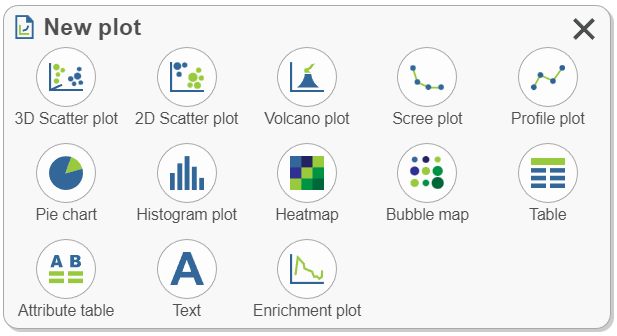
- Select a plot type with Create plot New plot
 . Clicking a plot type will suggest appropriate data options from results available in the analysis pipeline, then click the node of interest to add it to the sheet. Alternatively, drag and drop the plot to the sheet and continue with any additional selections.

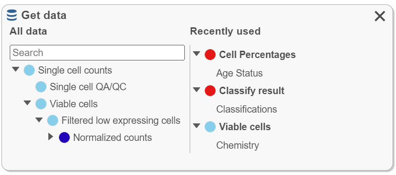
- Select data with Plot data Get data
 . Choosing data will suggest appropriate plot types once the data is dragged onto the sheet. Note that All data nodes (left) follow the hierarchy used in the analysis pipeline while Recently used (right) nodes are updated according to recent use and can similarly be used to plot data.

- Note the blue targets when dragging data. In the case presented below, a data node, chosen from Plot Get data, is being placed onto the sheet and it can be placed on the Top, Right, Bottom, Left, or Replace the heatmap. Once dropped to the target, a plot type must be chosen.
...
There are multiple ways to color plots by a gene or protein (feature) of interest. You can also color by more than one feature on the same plot or even feature lists. You can also choose to represent a feature with styles other than color, like shape or size.
- Drag and drop the gene of interest from the appropriate node in Plot data Get data (e.g. normalized counts). The Recently used list can be helpful for this if you have already recently used the gene.
- Open the Style icon and change Color by. Make sure you are on the appropriate node
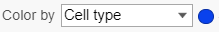 . Some plot types (e.g. tSNE) will invoke Style by clicking the legend. This is where you would color by a feature list that you have saved under list management.
 - Drag and drop features from another plot on the sheet (e.g. an axis title from a violin plot) or drag and drop features from criteria added to the Select & Filter icon.
...
- The tables must be plotted on the sheet. One way to do this is to choose Create plot New plot , select Table
 (only data in table format are available), and select the data of interest to plot. Features (green with hover) are now available for drag and drop to the plot type of interest.
...
- Selections can be made directly on the plot


 . This can include selecting populations of cells or selecting genes of interest (e.g. to classify clusters of cells). The menu must still be used to filter , classify
  , and create gene lists
  after in-plot selection.
 - Clicking on the Legend will invoke configure options. The configure options invoked will vary depending on the plot type.
- Clicking the axis titles will invoke the axes configuration.
Setup
...
New plot
- Click a plot type. Choosing a plot type will suggest appropriate data options from results available in the analysis pipeline. The search bar can be used to navigate to a specific node of interest (e.g. normalized). Select a data node to add it to the sheet.
- Alternatively, drag and drop the plot to the sheet (blue landing sites) and continue with any additional selections.
...
Get Data
All data results from building the analysis pipeline are found here. This icon is used to create plots, to plot attributes and features of interest (e.g. color a plot by a gene of interest from the normalized data node), and to plot Recently used data nodes and droppables.
...
Overview
Content Tools