...
| Numbered figure captions |
|---|
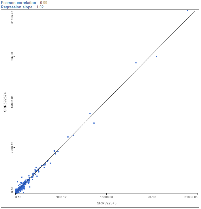
| SubtitleText | Sample correlation plot. Each dot is a sample, the line is the regression line of sample shown on the y-axis over the sample shown on the x-axis. The plot is based on the same expression units as the data that the plot was invoked on |
|---|
| AnchorName | correlation-plot |
|---|
|
|
To visualize a different pair of samples, select another sample from the X axis or Y axis list on the left and push
Apply.