Page History
...
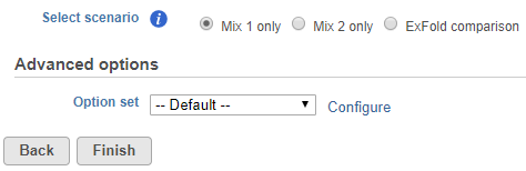
To start ERCC assessment, select an unaligned reads node and go to ERCC (Bowtie) in the context sensitive menu. You can change the Bowtie parameters before the alignment (Figure 1), although the default parameters work fine for most data.
| Numbered figure captions | ||||
|---|---|---|---|---|
| ||||
|
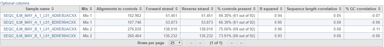
ERCC task report starts with a table (Figure 2), which summarises the result on the project level. The table provides the total number of alignments to the ERCC controls, which is further divided into the total number of alignments to the forward strand and the reverse strand. The summary table also gives the percentage of ERCC controls that contain alignment counts (i.e. are present). Generally, the fraction of present controls should be as high as possible, however, there are certain ERCC controls that may not contain alignment counts due to their low concentration; that information is useful for evaluation of the sensitivity of the RNA-seq experiment. The Pearson’s correlation coefficient (r) of the present ERCC controls is listed in the next column. As a rule of a thumb, you should expect a good correlation between the observed alignment counts and the actual concentration, or else the RNA-seq quantification results may not be accurate. Finally, the last two columns give estimates of bias with regards to sequence length and GC content, by giving the correlation of the alignment counts with the sequence length and the GC content, respectively.
| Numbered figure captions | ||||
|---|---|---|---|---|
| ||||
|
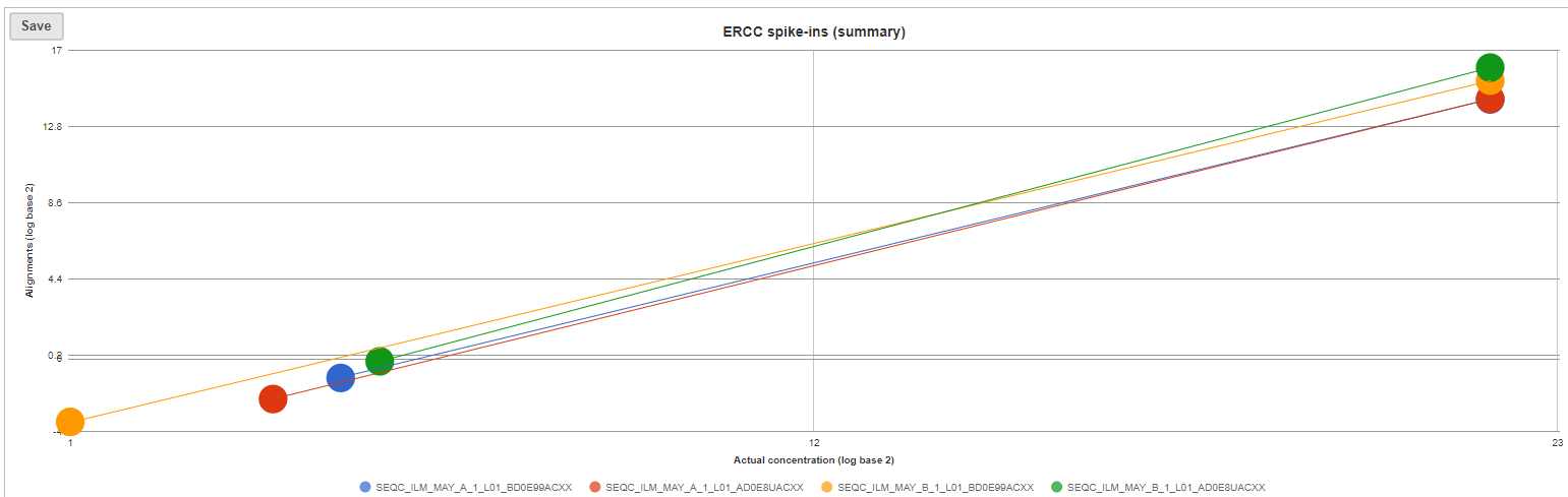
The ERCC spike-ins plot (Figure 3) shows the regression lines between the actual spike-in concentration (x-axis, given in log2 space) and the observed alignment counts (y-axis, given in log2 space), for all the samples in the project. The samples are depicted as lines, and the probes with the highest and lowest concentration are highlighted as dots. Regression line for a particular sample can be turned off by simply clicking on the sample name in the legend beneath the plot.
| Numbered figure captions | ||||
|---|---|---|---|---|
| ||||
|
Optionally, you can invoke a principal components analysis plot (View PCA), which is based on RPKM-normalised counts, using the ERCC sequences as the annotation file (not shown).
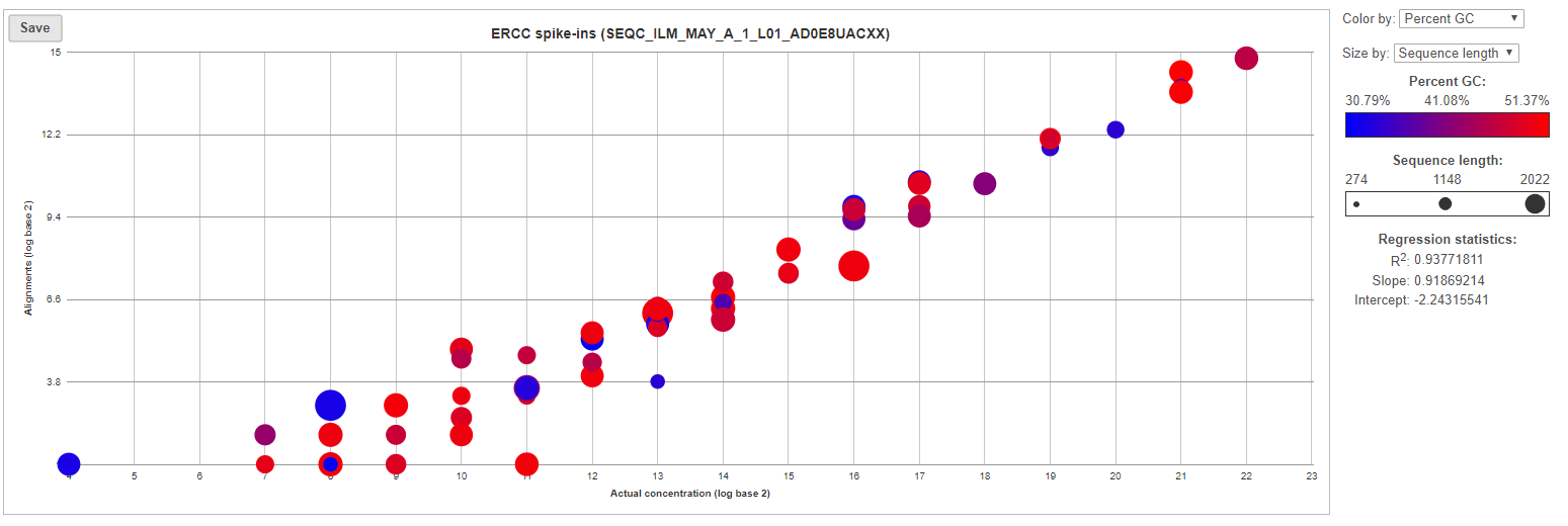
For more details, go to the sample-level report (Figure 4) by clicking a sample name on the summary table. First, you will get a comprehensive scatter plot of observed alignment counts (y-axis, in log2 space) vs. the actual spike-in concentration (x-axis, in log2 space). Each dot on the plot represents an ERCC sequence, coloured based on GC content and sized by sequence length (plot controls are on the right).
| Numbered figure captions | ||||
|---|---|---|---|---|
| ||||
|
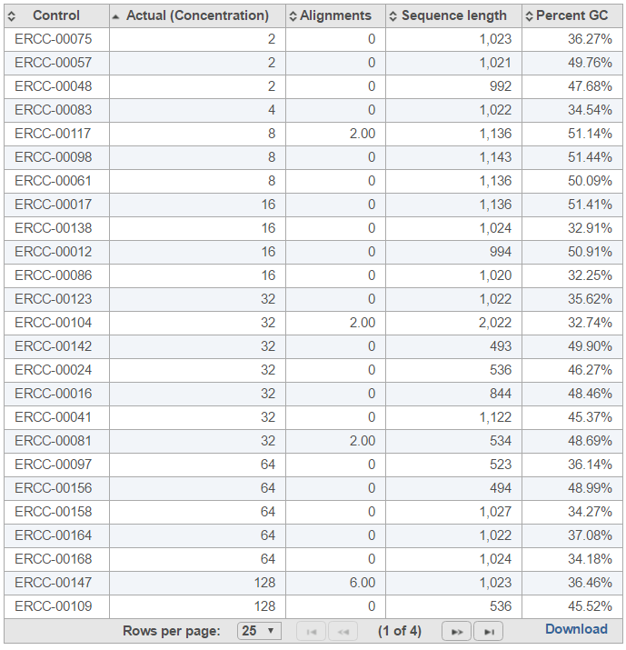
The table (Figure 5) lists individual controls, with their actual concentration, alignment counts, sequence length, and % GC content. The table can be downloaded to the local computer by selecting the Download link.
| Numbered figure captions | ||||
|---|---|---|---|---|
| ||||
|
| Additional assistance |
|---|
|
| Page Turner | ||
|---|---|---|
|
| Rate Macro | ||
|---|---|---|
|
Overview
Content Tools