Page History
...
- Click the Merged counts data node
- Click Exploratory analysis in the toolbox
- Click PCA
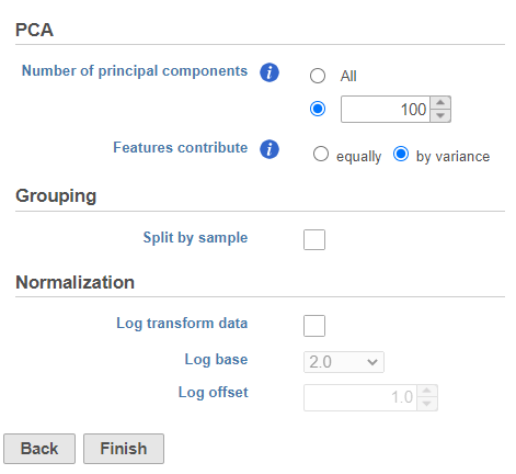
- Click Finish to run the PCA with default settings (Figure ?1)
| Numbered figure captions | ||||
|---|---|---|---|---|
| ||||
|
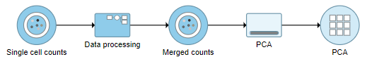
A PCA task node will be added to the pipeline under the Analyses tab and a circular PCA output data node will be produced (Figure ?2).
| Numbered figure captions | ||||
|---|---|---|---|---|
| ||||
|
...
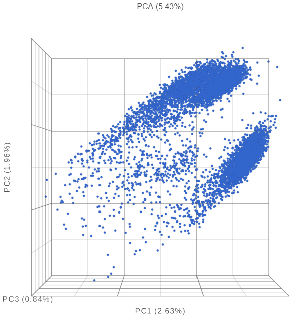
The PCA plot will open in a new data viewer session. A 3D scatterplot will be displayed on the canvas (Figure ?3).
| Numbered figure captions | ||||
|---|---|---|---|---|
| ||||
|
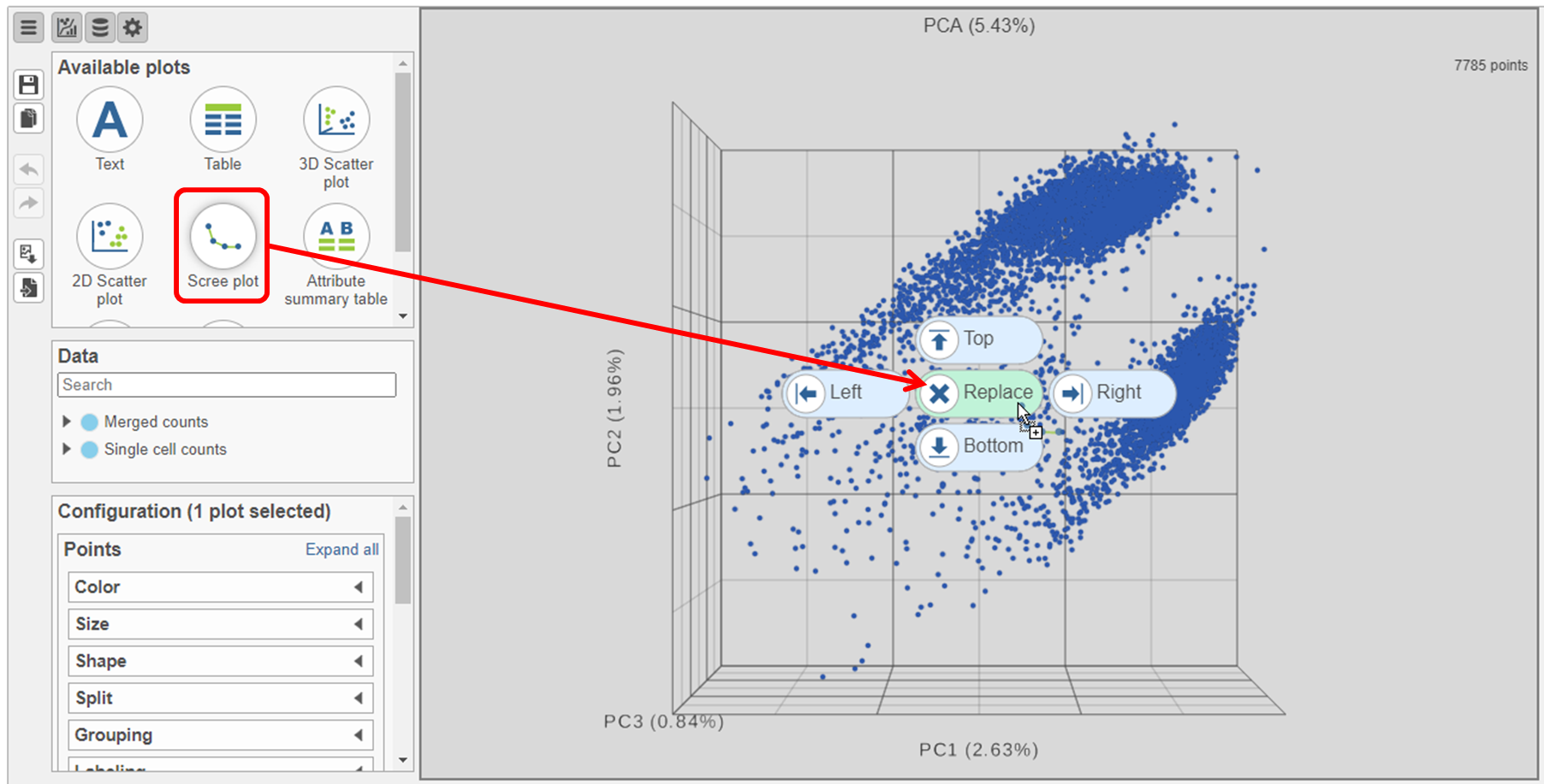
- Click and drag the Scree plot from the Available plots card on the left onto the canvas
- Drop it over the Replace option (Figure ?4)
| Numbered figure captions | ||||
|---|---|---|---|---|
| ||||
|
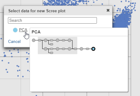
- Select PCA as data for the new Scree plot (Figure ?5)
| Numbered figure captions | ||||
|---|---|---|---|---|
| ||||
|
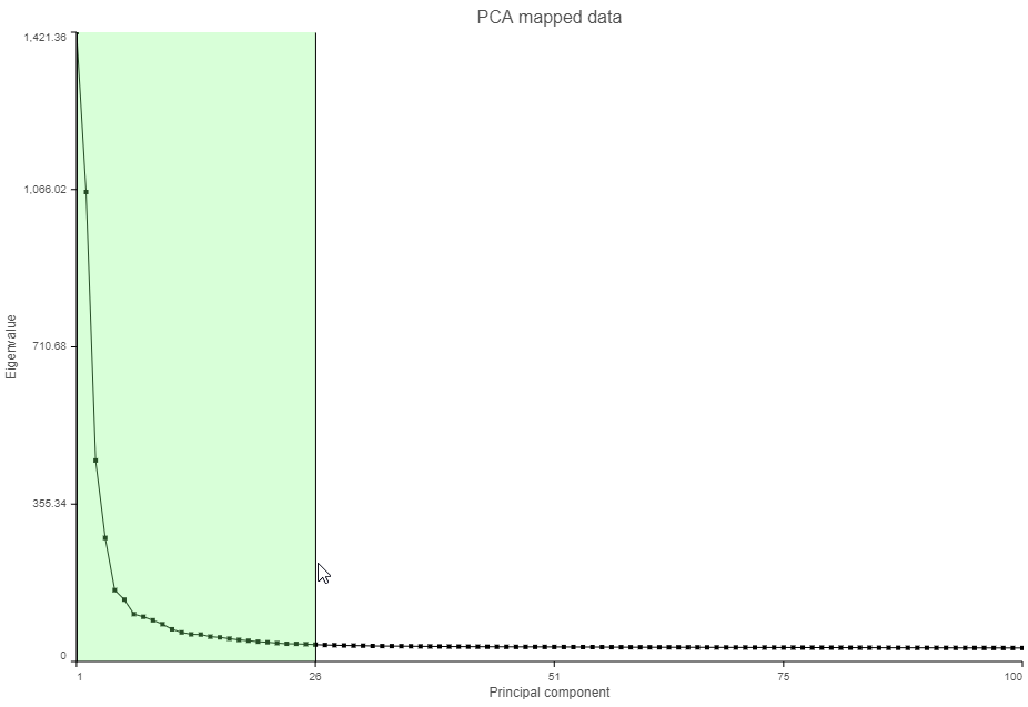
The Scree plot (Figure ?6) shows the eigenvalues on the y-axis for each of the 100 PCs on the x-axis. The higher the eigenvalue, the more variance explained by each PC. Typically, after an initial set of highly informative PCs, the amount of variance explained by analyzing additional components is minimal. By identifying the point where the Scree plot levels off, you can choose an optimal number of PCs to use in downstream analysis steps like graph-based clustering and UMAP.
...
- Click and drag over the first set of PCs to zoom in (Figure ?7)
| Numbered figure captions | ||||
|---|---|---|---|---|
| ||||
|
- Mouse over the Scree plot to identify the point where additional PCs offer little additional information (Figure ?8)
In this data set, a reasonable cut-off could be set anywhere between around 10 and 30 PCs. We will use 15 in downstream steps.
...
- Click the project name near the top to go back to the Analyses tab
- Click the circular PCA data node
- Click Exploratory analysis in the toolbox
- Click Graph-based clustering
- Set the number of principal components to 15 (Figure ?9)
- Click Finish to run the task
...
Overview
Content Tools