Page History
...
Once we have classified our cells, we can use this information to perform comparisons between cell types or between experimental groups for a cell type. In this project, we only have a single sample, so we will compare cell types.
- Click the Antibody Capture data node
- Click Differential analysis
- Click GSA
The first step is to choose which attributes we want to consider in the statistical test.
- Check Cell type to include it in the statistical test
- Click Next
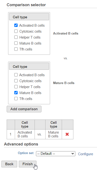
Next, we will set up the comparison we want to make. Here, we will compare the Activated and Mature B cells.
- Check Activated B cells in the top panel
- Check Mature B cells in the bottom panel
- Click Add comparison
The comparison should appear in the table as Activated B cells vs. Mature B cells.
- Click Finish to run the statistical test (Figure ?)
| Numbered figure captions | ||||
|---|---|---|---|---|
| ||||
|
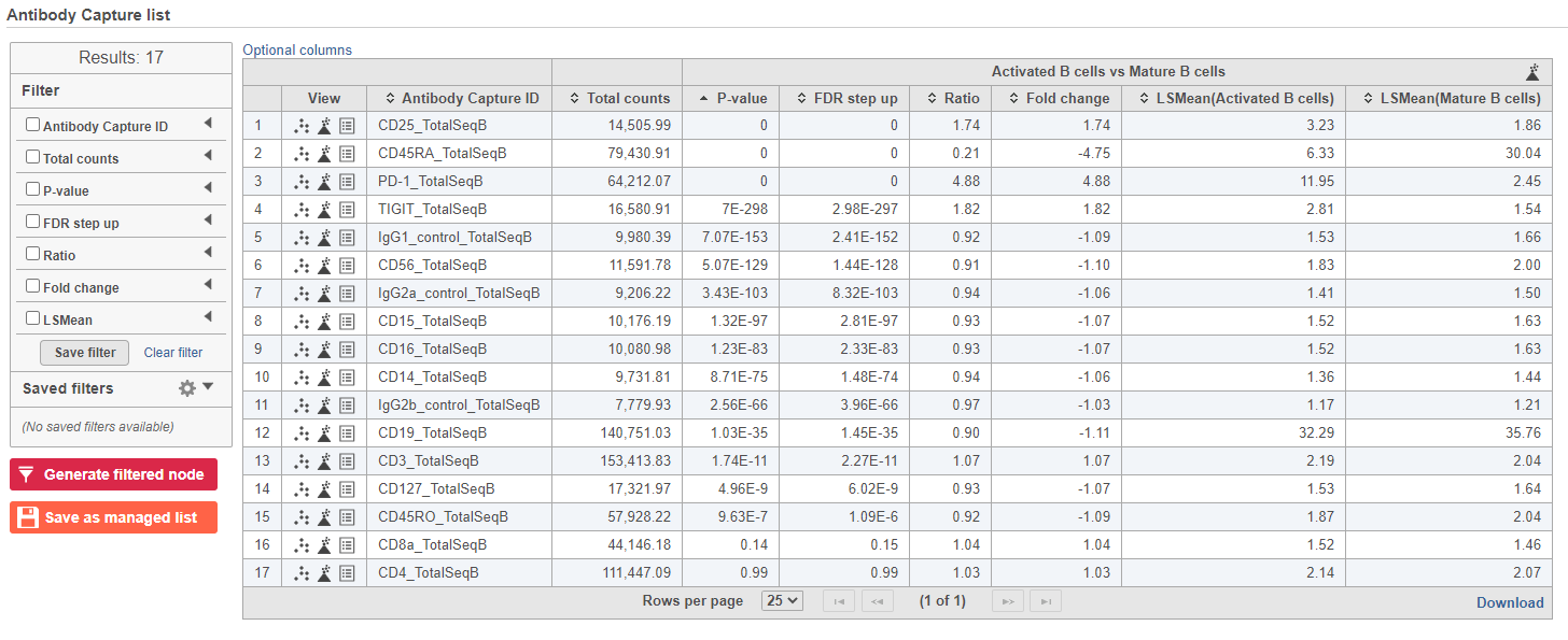
The GSA task produces a GSA data node.
- Double-click the GSA data node to open the task report
The report lists each feature tested, giving p-value, false discovery rate adjusted p-value (FDR step up), and fold change values for each comparison (Figure ?)
| Numbered figure captions | ||||
|---|---|---|---|---|
| ||||
|
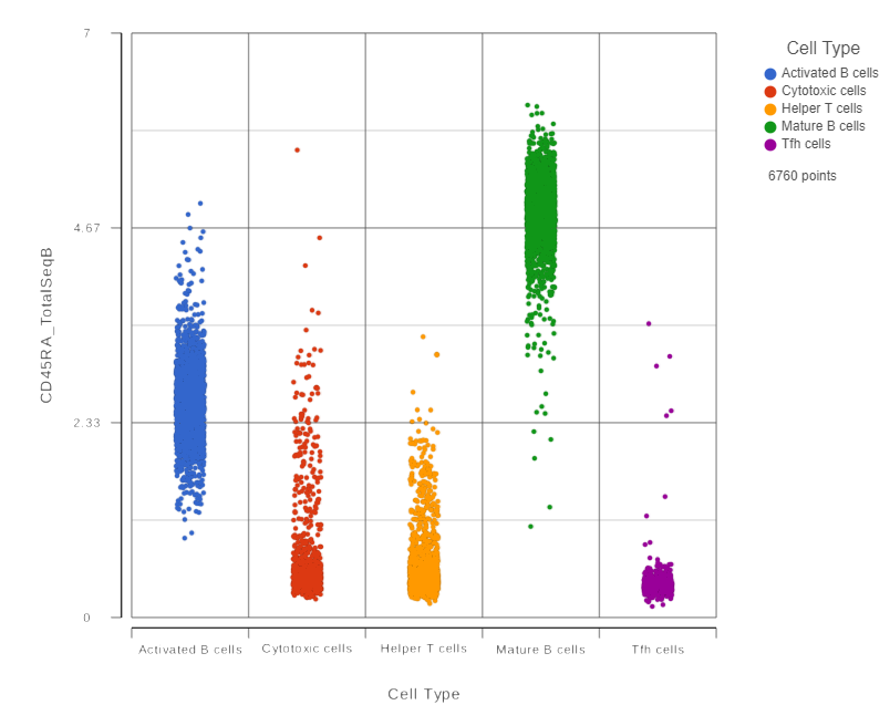
In addition to the listed information, we can access dot and violin plots for each gene or protein from this table.
- Click
 in the CD45RA_TotalSeqB row
This opens a dot plot in a new data viewer session, showing CD45A expression for cells in each of the classifications (Figure ?)
| Numbered figure captions | ||||
|---|---|---|---|---|
| ||||
|
...
- Expand the Summary card
- Switch on Violins
- Switch on Overlay
- Switch on Colored
- Expand the Data card
- Use the slider to increase the Jitter
- Expand the Color card
- Use the slider to decrease the Opacity (Figure ?)
| Numbered figure captions | ||||
|---|---|---|---|---|
| ||||
|

- Click the project name to return to the Analyses tab
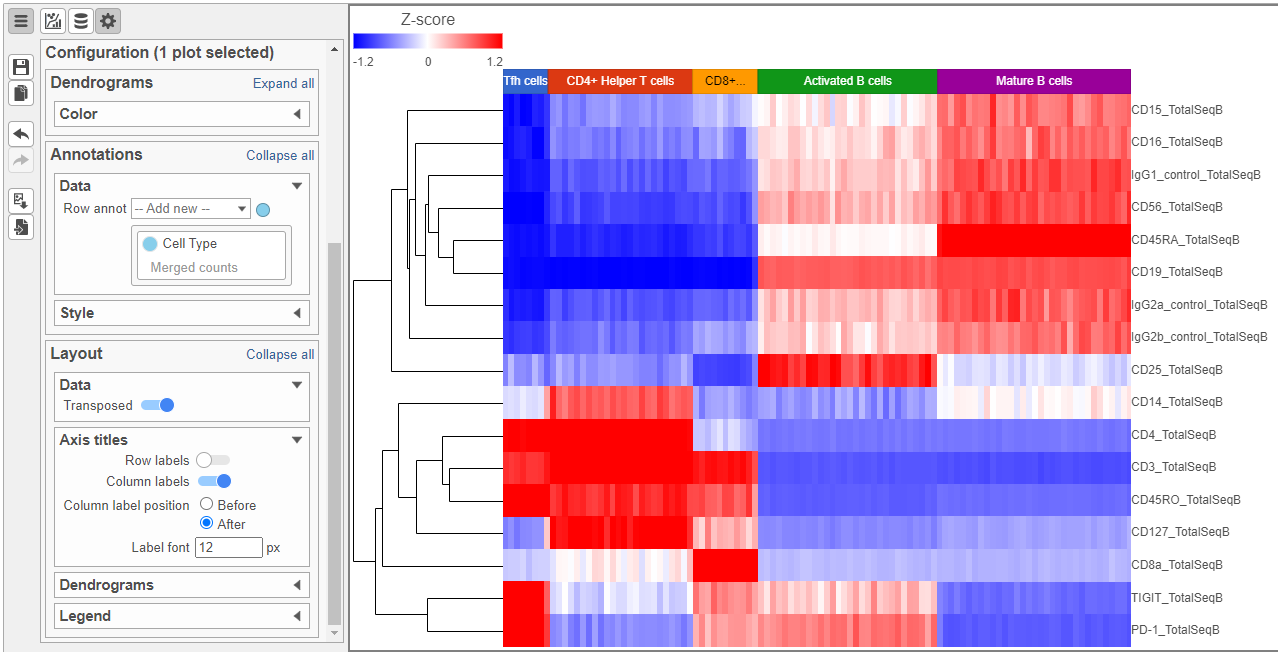
To visualize all of the proteins at the same time, we can make a hierarchical clustering heat map.
- Click the GSA data node
- Click Exploratory analysis in the toolbox
- Click Hierarchical clustering/heat map
- Check Samples at the top to cluster the cells in addition to features
- Click Finish to run with other default settings
- Double-click the Hierarchical clustering task node to open the heat map (Figure ?)
| Numbered figure captions | ||||
|---|---|---|---|---|
| ||||
|
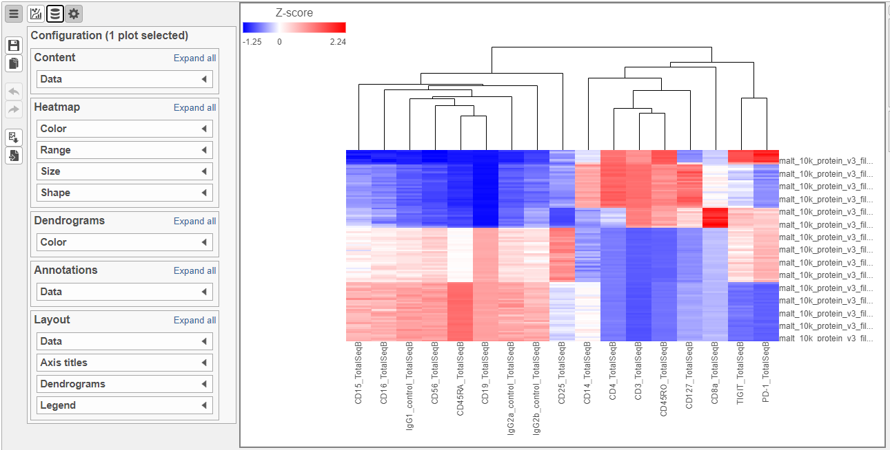
The heat map can easily be customized to illustrate our results.
- Click
 to transpose the heat map
 - Set High to 2.6 to match the low range
- Set the Sample dendrogram to By sample attribute Cell type
- Set Attributes to Cell type
- Click
 and set Rotation to 0
 - Uncheck Samples under Show labels
| Numbered figure captions | ||||
|---|---|---|---|---|
| ||||
|
Differential Analysis, Visualization, and Pathway analysis - Gene Expression Data
...
Overview
Content Tools