Page History
...
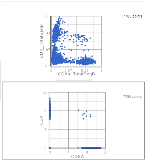
The second 2D scatter plot has the CD8A and CD4 mRNA markers on the x- and y-axis, respectively (Figure ?). The protein expression data has a better dynamic range than the gene expression data, making it easier to identify sub-population. This an advantage of CITE-Seq data over single cell RNA-Seq data alone.
| Numbered figure captions | ||||
|---|---|---|---|---|
| ||||
|
- On the first 2D scatter plot (with protein markers), click
 in the top right corner
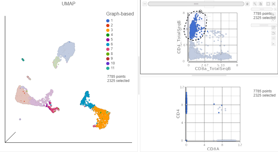
 - Manually select the cells with high expression of the CD4_TotalSeqB protein marker (Figure ?)
More than 2000 cells show positive expression for the CD4 cell surface protein.
| Numbered figure captions | ||||
|---|---|---|---|---|
| ||||
|
- Click
in the top right of the plot to switch back to pointer mode
- Click on a blank spot on the plot
- On the second 2D scatter plot (with mRNA markers), click
- Manually select the cells with high expression of the CD4 gene marker (Figure ?)
...
| Numbered figure captions | ||||
|---|---|---|---|---|
| ||||
|
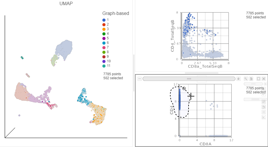
This time, approximately 500 cells show positive expression for the CD4 marker gene. This means that the protein data is also less sparse than the gene expression data.
T cells
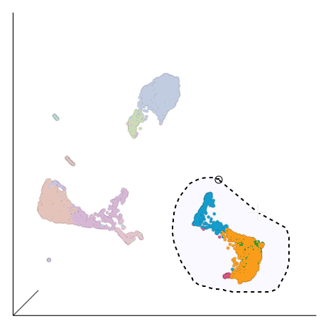
Based on the exploratory analysis above, most of the CD3 positive cells are in the group of cells in the bottom right corner of the UMAP plot. This is likely to be a group of T cells. We will now examine this group in more detail to identify T cell sub-populations.
- Click
- Click in the top right corner of the 3D UMAP plot
- Draw a lasso around the group of putative T cells (Figure ?)
| Numbered figure captions | ||||
|---|---|---|---|---|
| ||||
|
- Click
- Click
 in the top right of the plot to switch back to pointer mode
 - Click and drag the plot to rotate it around
Deselected cells are excluded and the axes have been rescaled to give better resolution of the selected points (Figure ?). Note that the UMAP has not been recalculated, the axes have just been rescaled.
| Numbered figure captions | ||||
|---|---|---|---|---|
| ||||
|
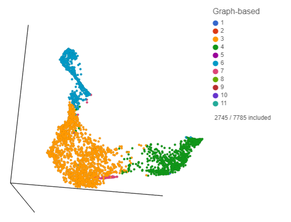
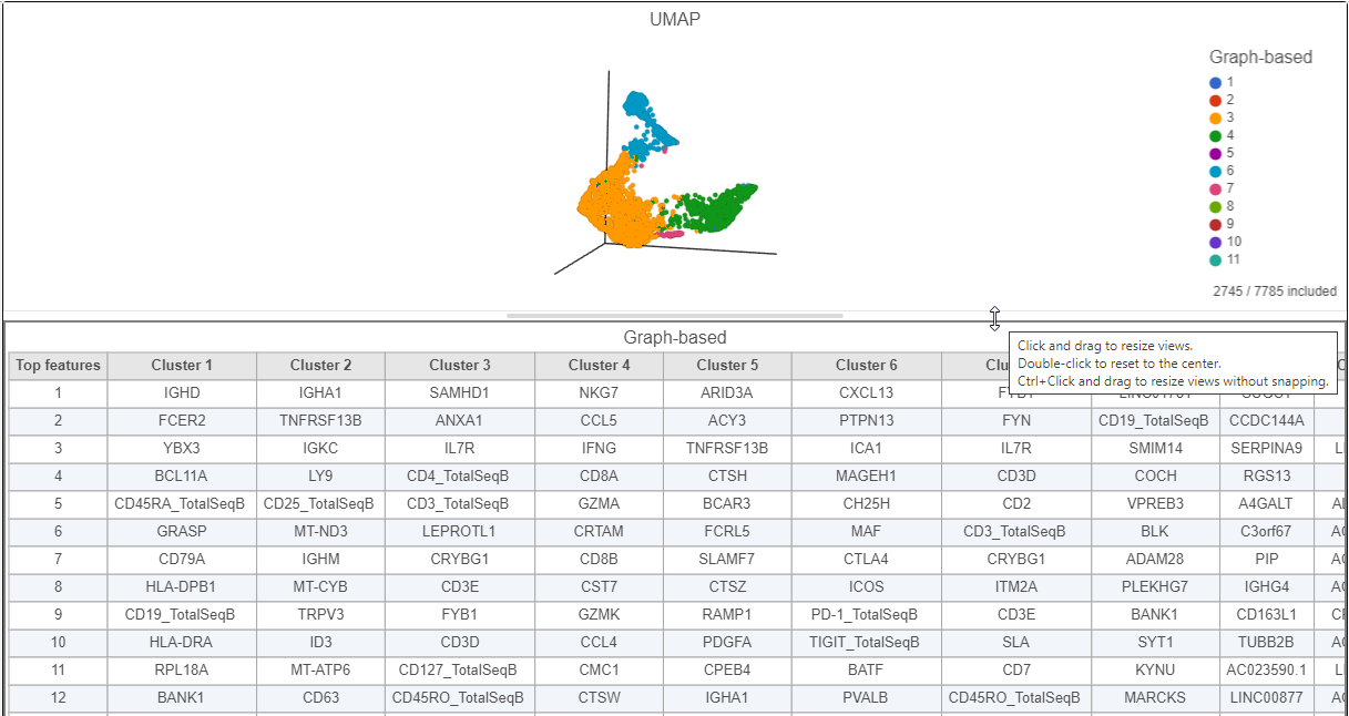
This group of putative T cells predominantly consists of cells assigned to graph-based clusters 3, 4, 6, and 7. Examining the biomarker table for these clusters can help us infer cell types.
- Click and drag the bar between the UMAP plot and the biomarker table to resize the biomarker table to see more of it (Figure ?)
If you need to create more space on the canvas, hide the selection panel using the icon on the right and/or the
![]() icon to hide the menu on the left.
icon to hide the menu on the left.
| Numbered figure captions | ||||
|---|---|---|---|---|
| ||||
|
B cells
| Additional assistance |
|---|
...
Overview
Content Tools