Page History
...
Once the graph-based clustering task has completed, we can visualize the results with a UMAP plot. You could use the same steps here to generate a t-SNE plot. For this tutorial, we will use UMAP, as it is faster on several thousand cells.
- Click the circular Graph-based clusters data node
- Click Exploratory analysis in the toolbox
- Click UMAP
- Set the number of principal components to 15 (Figure ?)
- Click Finish to run the task
...
Notes on Performing Exploratory Analysis with Protein or Gene Expression Data Only
In this tutorial, we have performed exploratory analysis on merged protein and gene expression data, and we will perform classification on the merged data in the next step.
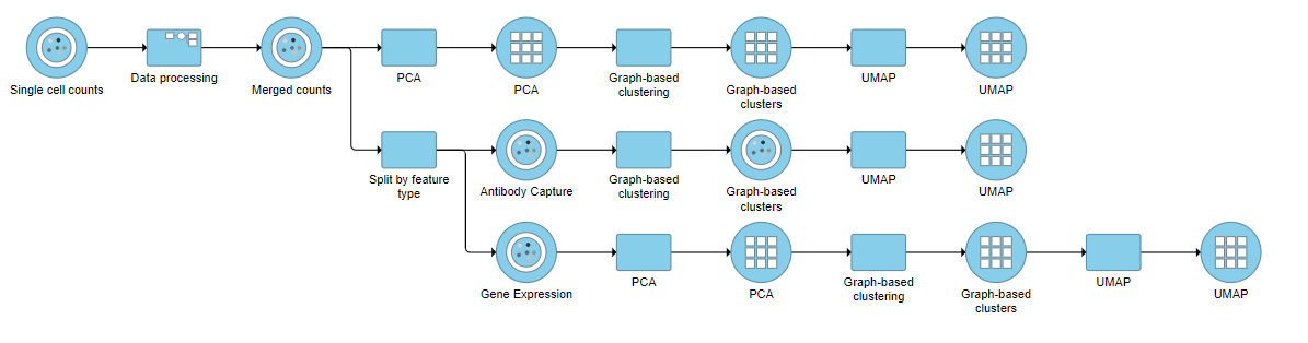
It can be interesting to perform exploratory analysis on the two feature types separately. For example, you might be interested to see how the clustering of the same cells differs based on protein expression profiles vs. their gene expression profiles. To do this, select the Merged counts data node, click Pre-analysis tools, followed by Split by feature type from the toolbox. A new task, Split by feature type, will be added to the pipeline resulting in two output data nodes: Antibody capture (protein data) and Gene expression (mRNA data). Both contain the same high-quality cells.
Performing exploratory analysis with gene expression data is the same as for the merged counts. Because there are a large number of genes, you will need to reduce the dimensionality with PCA, choose an optimal number of PCs and perform downstream clustering and visualization (e.g. graph-based clustering and UMAP/t-SNE). Performing exploratory analysis with protein data is different. There is no need to reduce the dimensionality as there are only a handful of features (17 proteins in this case), so you can proceed straight to downstream clustering and visualization. Figure ? shows an example of how the pipeline might look if the data is split and analyzed separately.
| Numbered figure captions | ||||
|---|---|---|---|---|
| ||||
|
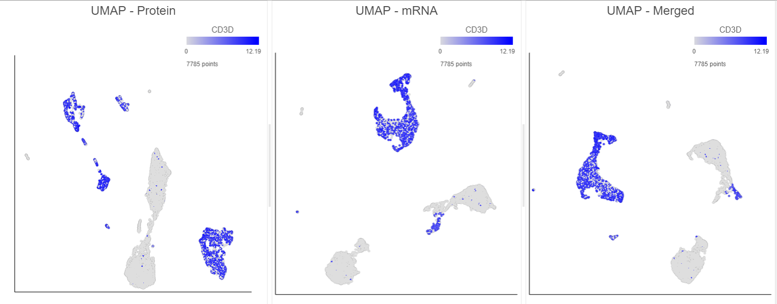
You can then use the Data viewer to bring together multiple plots for comparison (Figure ?).
| Numbered figure captions | ||||
|---|---|---|---|---|
| ||||
|
| Page Turner | ||
|---|---|---|
|
...
Overview
Content Tools