Page History
Interaction plot is a statistical chart, typically used to visualize interaction effect of two factors on e.g gene expression levelANOVA is to partition the variation among all the observations into different components. One component is due to the variation among the different groups of the factors in the model, which represents signal; another component is due to the variation within groups, which represents noise (it is also called error, because it is the variability that is not explained by any factors ). F-statistic is a ratio of the two components, that is signal vs noise ratio
F = Between group variance / within group variance
Large F value of a factor indicates between group variation is large relative to the within group variation, which results in a small p-value. On the other hand, small F value of a factor indicates the between group variation is small relative to the within group variation, which results in a big p-value.
In Partek® Flow®, interaction plot is only available on result of ANOVA with two way interaction included in the model through a Feature list node, by selecting the interaction plot icon ( ![]() ) in the View column. The plot will be displayed in a new browser tab source of variation plot is using bar chart to show F ratio of each factor in the ANOVA model relative to the error. It is available on ANOVA report, click on the icon
) in the View column. The plot will be displayed in a new browser tab source of variation plot is using bar chart to show F ratio of each factor in the ANOVA model relative to the error. It is available on ANOVA report, click on the icon  to invoke the plot to exam the variation contribution of all the factors in the ANOVA model relative to the within group variation (an example plot is on Figure 1).
...
| Numbered figure captions | ||||
|---|---|---|---|---|
| ||||
|

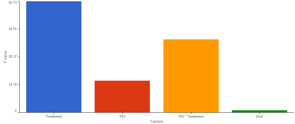
The chart title is based on the feature (e.g. gene or transcript) that the plot was invoked on. The y-axis is scaled automatically, based on the range of the data, and the units correspond to the input units of the parent Feature list node, i.e. if the data were normalized using transcripts per million (TPM), the y-axis will be in TPM-normalised counts. Dots represent samples. Hovering the cursor over a sample invokes a popup balloon message shows sample ID and the respective expression value. The legend is in the upper right corner and is based on the data attribute specified under the Color by option (on the leftF value, X-axis represent the factors specified in ANOVA model as well as Error term which will have the F value as 1 (since error is the denominator, so F value would be 1).
Plot controls are in the panel on the left. The <Previous and Next> buttons enable you to switch between genomic features as they appear in the parent Feature list. The Group by option defines the grouping on the x-axis, with the drop-down list containing the data attributes as present in the Data tab. As previously mentioned, the dot The bar colors are controlled by the Color by option Customize colors option. If you want to change a color, select the Customize colors hyperlink. The resulting dialog (Figure 2) will enable you to replace an existing color by a color of your choice (click on the arrow head ![]() to invoke the color mixer) or add more colors (Add color).
to invoke the color mixer) or add more colors (Add color).
| Numbered figure captions | ||||
|---|---|---|---|---|
| ||||
|

The Connect by option is particularly useful for dependent study designs, where you can highlight the samples based on the same biological source by the connecting lines. The example on Figure 3 depicts results of a study where each RNA sample was processed by both RNA-seq and gene array; the lines connect the same samples. Finally, the Show box plot turns on (or off) per-group box-and-whiskers (for each level of the Group by attribute).
| Numbered figure captions | ||||
|---|---|---|---|---|
| ||||
|

Once you are pleased with the appearance of the dot plot, push Save image button to save it to the local machine. The resulting dialog (Figure 4) controls the resolution of the image file. The image will be saved in svg format, and the default file name is Dot plot.svg
| Numbered figure captions | ||||
|---|---|---|---|---|
| ||||
|

Use the Group order section of the control panel to change the order of the groups on the x-axis. Simply drag and drop a group label to a new position.
 icon to choose color.
| Additional assistance |
|---|
|
| Rate Macro | ||
|---|---|---|
|
...
Overview
Content Tools