The Sources of variation plot presents the relative contribution of each factor included in the ANOVA model towards explaining the variability of the data for a feature analyzed by the ANOVA.
ANOVA partitions the variation for a feature among all the observations into different components. One component is the variation among the different groups of the factors in the model, which represents signal; another component is the variation within groups, which represents noise. The variance within groups is also called error, because it is the variability that is not explained by any factors. F-statistic is a ratio of the two components, that is signal vs noise ratio
F = Between group variance / within group variance
A large F value for a factor indicates that between group variation is greater than within group variation, which results in a small p-value for that factor. Conversely, a small F value for a factor indicates the between group variation is smaller than within group variation, which results in a big p-value for that factor.
In Partek Flow, the Sources of variation plot uses a bar chart to show the F value for each factor in the ANOVA model relative to the error. The plot is available for each gene in an ANOVA result. To open the Sources of variation plot for a gene in the ANOVA results table, click on the icon  next to the gene symbol to invoke the plot. It is useful to examine the plot to understand the contribution of all the factors in the ANOVA model to the overall variance in the data set relative to their within group variation (Figure 1).
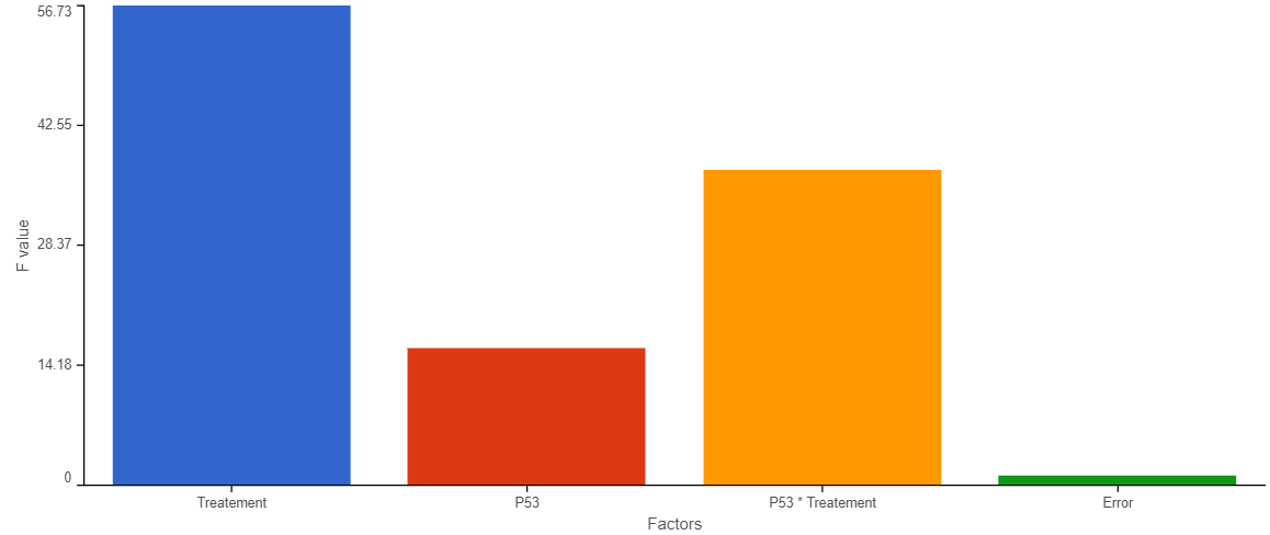
Figure 1. Source of variation plot
The chart title is the feature ID (e.g. gene or transcript). The Y-axis is the F value, X-axis categories are the factors specified in ANOVA model and the Error term. The Error term will always have an F value of 1 because error, i.e., within group variance, is the denominator in the F value calculation.
Plot controls are in the panel on the left. The <Previous and Next> buttons enable you to switch between features as they appear in the ANOVA results table. The bar chart colors are controlled by the Customize colors option. If you want to customize the colors, click the  icon to configure the color palette.
Additional Assistance
If you need additional assistance, please visit our support page to submit a help ticket or find phone numbers for regional support.


| Your Rating: |
|
Results: |

|
24 | rates |
Overview
Content Tools