Page History
...
To get an overiew of the common abberations in the group of samples over the entire genome, there are two helpful visualizations that are accessed through View Detected Regions.
- Select View Detected Regions
The View Detected Regions dialog (Figure 7) allows you to select the spreadsheet with genomic regions and choose between the histogram and copy number classification plots.
| Numbered figure captions | ||||
|---|---|---|---|---|
| ||||
|
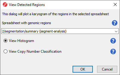
- Select summary (segment-analysis) from the drop-down menu
- Select View Histogram
- Select OK
The plot will open in a new tab titled Karyogram View (Figure 8).
| Numbered figure captions | ||||
|---|---|---|---|---|
| ||||
|
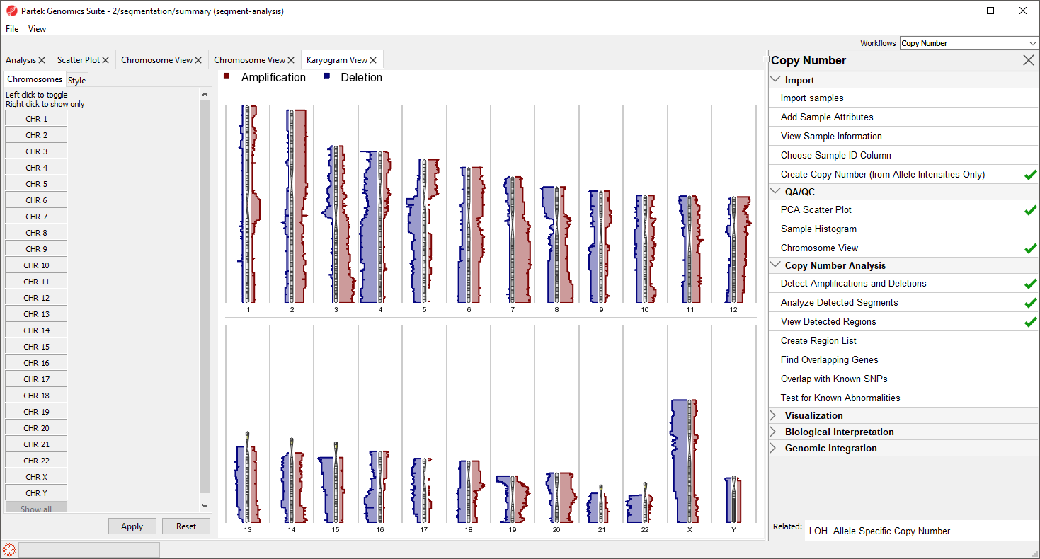
The Karyogram View shows each chromosome with red and blue histograms on either side showing amplification and deletion, repsectively. The histogram height reflects the number of samples that share either amplification of deletion a that particular region. For example, the long arms of chromosomes 3 and 7 are amplified in the majority of samples and most samples share a deletion in the long arm of chromosome 4.
Mousing over the chromosome will give cytoband information, mousing over the histogram will give the number of shared regions at each position and the numbe rof samples sharing the type of variation. Both the menu and display may be used to control which chromosomes are displayed; left-click in the menu to toggle a chromosome on/off and right click in the menu or graph to show only that chromosome.
Alternatively, we can use the Copy Number Classification plot to get a more sample-centric view.
- Select View Detected Regions
- Select View Copy Number Classification
- Select OK
The Copy Number Classificaiton also utilizes Karyogram View to provides an overview of all the samples and the copy number of regions on each chromosome (Figure 9).
| Numbered figure captions | ||||
|---|---|---|---|---|
| ||||
|
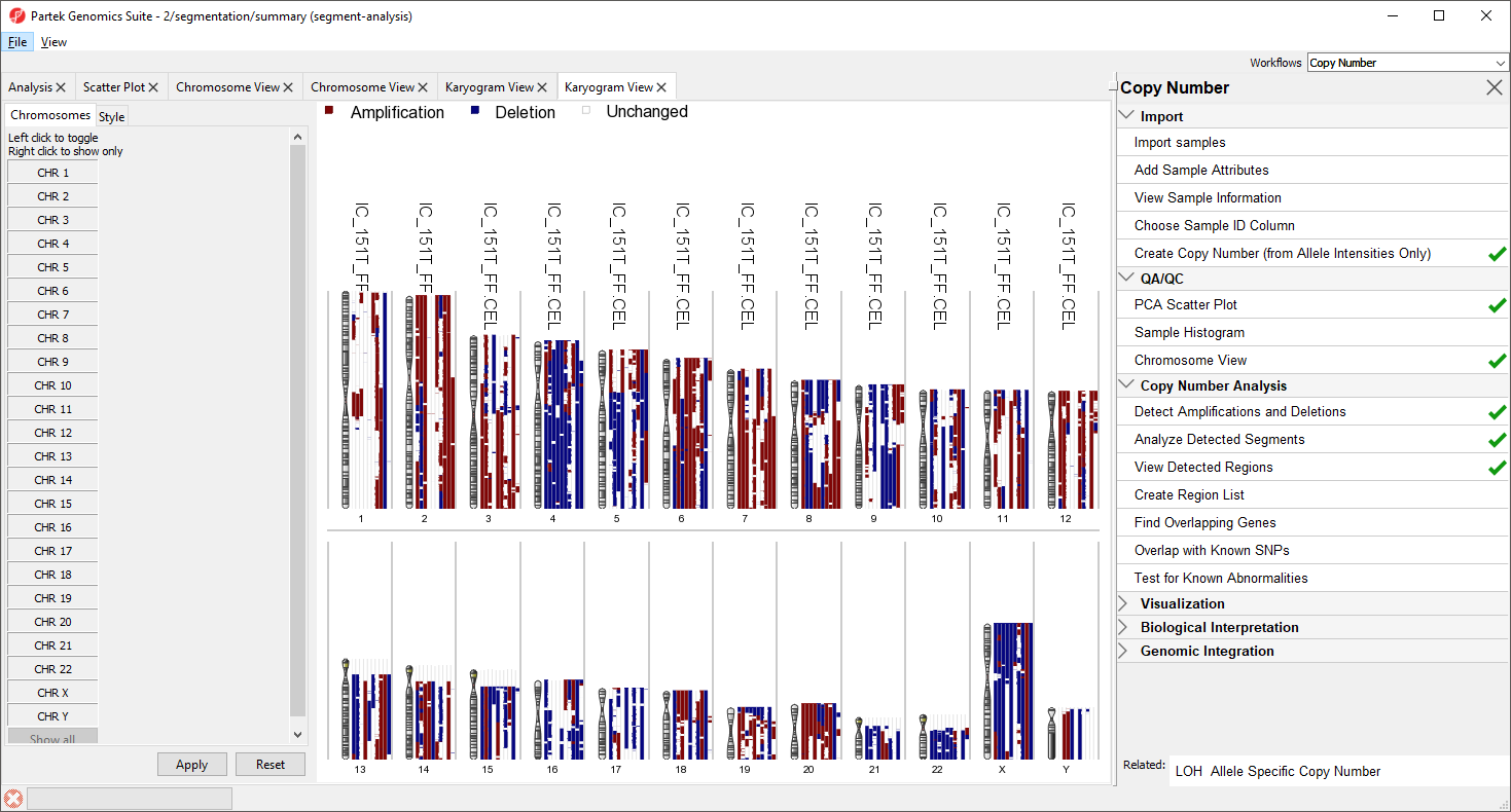
Each sample is drawn as a separate column next to the chromosome. Amplified regions are depicted in red, deleted regions in blue, and regions with no copy number change in white. Sample names are given accross the top of each column. For greater detail, try viewing fewer chromosomes.
| Additional assistance |
|---|
|
| Rate Macro | ||
|---|---|---|
|
Overview
Content Tools