Page History
...
- Select Plot PCA Scatter Plot from the QA/AC section of the Gene Expression workflow. workflow
A Scatter Plot tab containing your PCA plot will open (Figure 1).
| Numbered figure captions | ||||
|---|---|---|---|---|
| ||||
|
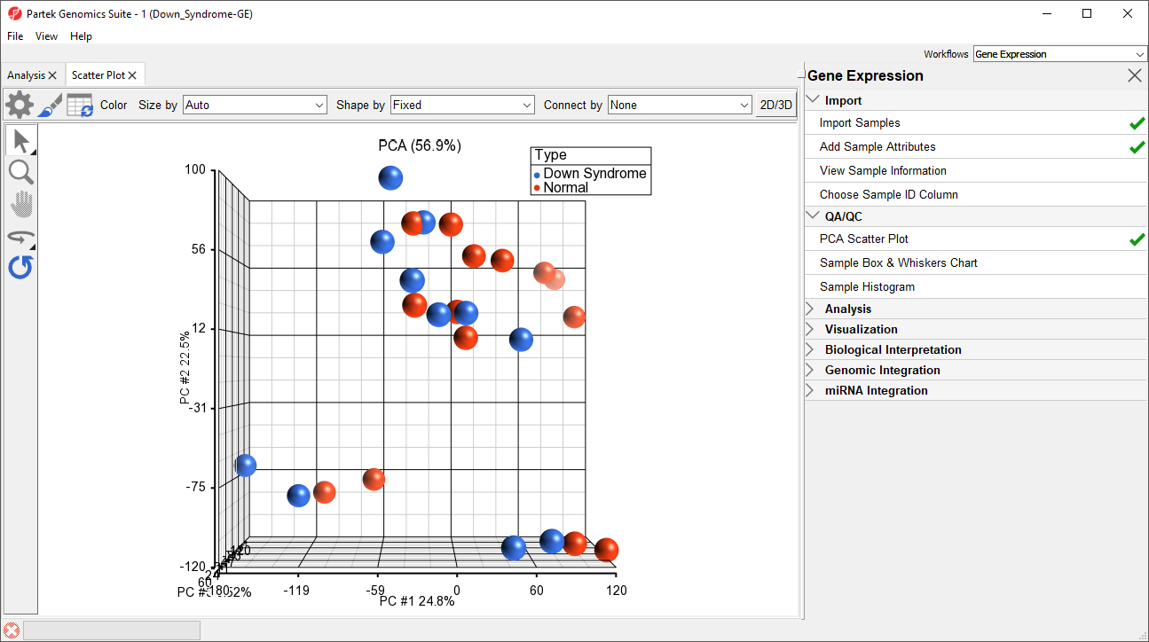
In the scatter plot, each point represents a chip (sample) and corresponds to a row on the top-level spreadsheet. The color of the dot represents the Type of the sample; red represents a normal sample and blue represents a Down syndrome sample. Points that are close together in the plot have similar intensity values across the probe sets on the whole chip, while points that are far apart in the plot are dissimilar
Left-clicking on any point in the scatter plot selects that point. A dash with an identifying row number will appear on the selected PCA plot point. The spreadsheet in the Analysis tab will also jump to the corresponding row.
While pressing the mouse wheel down, drag the mouse to rotate the plot or select the Rotate Mode icon ( ) on the left side of the Scatter Plot tab. With Rotate Mode selected, press the left mouse button and drag to rotate the plot. Rotating the plot allows you to examine the grouping pattern or outliers of the data on the first three principal components (PCs).
Scrolling the mouse wheel up or down while the cursor is on the PCA plot will zoom in and out or select the Zoom Mode icon ( ) on the left side of the Scatter Plot tab.
Selecting the Reset icon ( ) option on the left side of the Scatter Plot tab will return the PCA plot to its original orientation and zoom.
As you can see from rotating the plot, there is no clear separation between Down syndrome and normal samples in this data since the red and blue samples are not separated in space. However, there are other factors that may separate the data.
...
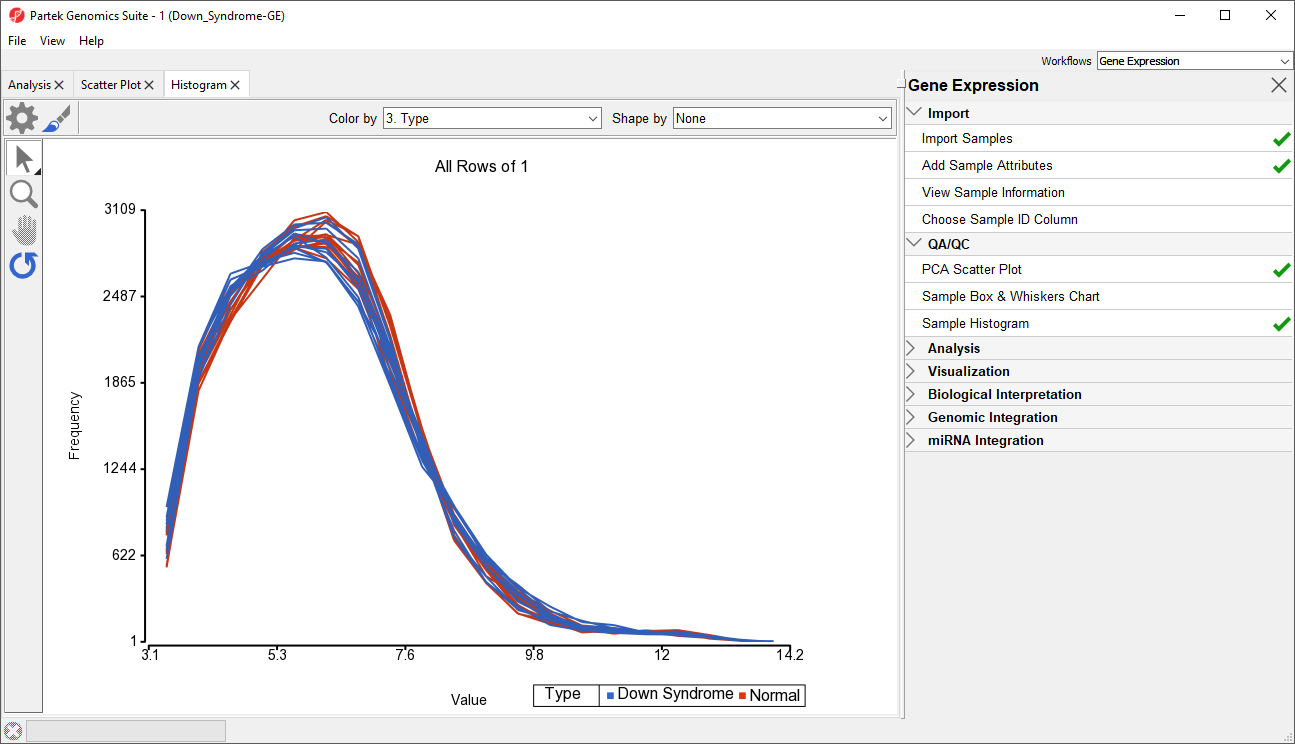
The next step is to draw a histogram to examine the samples.
- Select Plot Sample Histogram in the QA/QC section of the Gene Expression workflow to generate the Histogram tab (Figure 6)
...
| Numbered figure captions | ||||
|---|---|---|---|---|
| ||||
|
...
Overview
Content Tools