Page History
...
| Numbered figure captions | ||||
|---|---|---|---|---|
| ||||
|
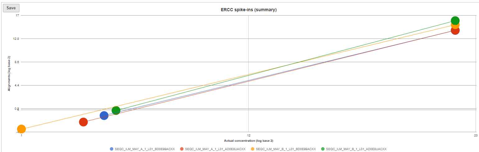
Optionally, you can invoke a principal components analysis plot (View PCA), which is based on RPKM-normalised counts, using the ERCC sequences as the annotation file (not shown).
...
| Numbered figure captions | ||||
|---|---|---|---|---|
| ||||
|
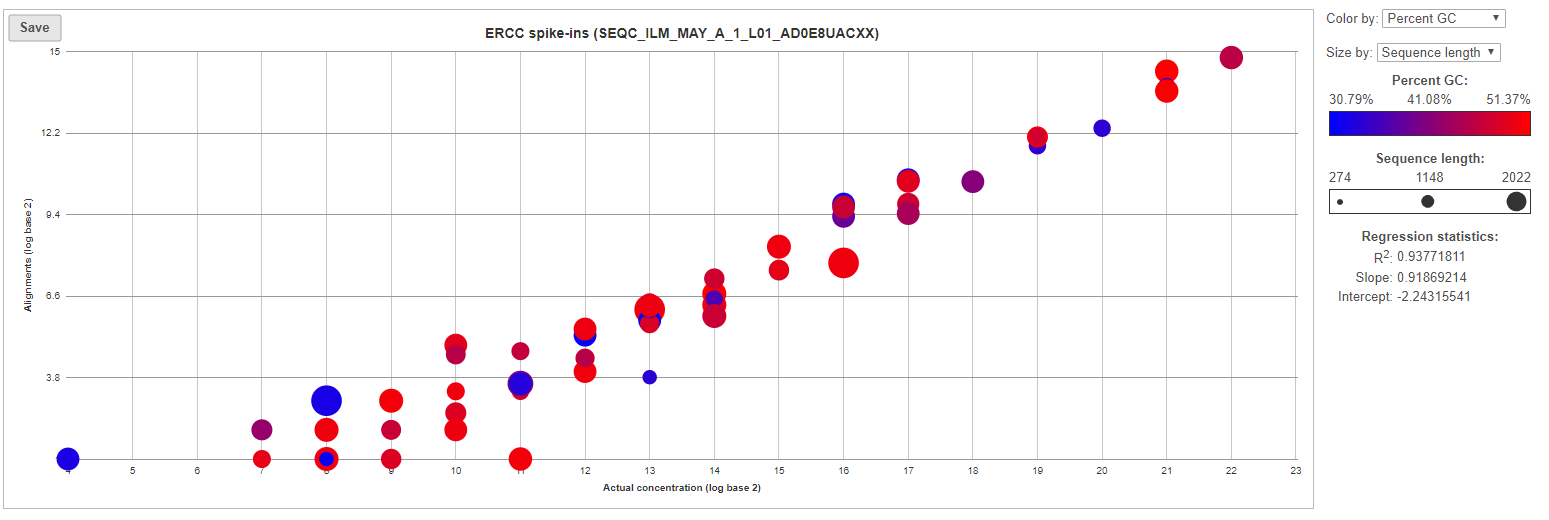
The table (Figure 7) lists individual controls, with their actual concentration, alignment counts, sequence length, and % GC content. The table can be downloaded to the local computer by selecting the Download link.
...
Overview
Content Tools