The Feature distribution plot visualizes the distribution of features in a counts data node.
Running Feature distribution
To run Feature distribution:
- Click a counts data node
- Click the QA/QC section of the toolbox
- Click Feature distribution
A new task node is generated with the Feature distribution report.
Feature distribution plot configuration
The Feature distribution task report plots the distribution of all features (genes or transcripts) in the input data node with one feature per row (Figure 1). Features are ordered by average value in descending order.
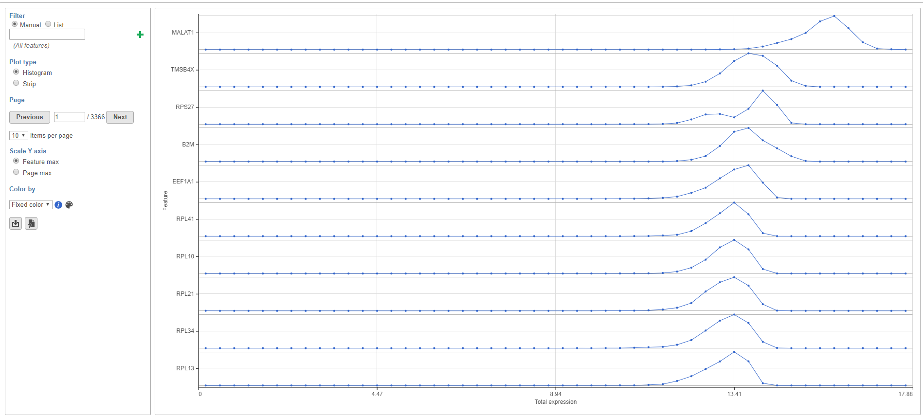
Figure 1. The feature distribution plot shows each feature as a row. Features are ordered by average value in descending order.
The plot can be configured using the panel of the left-hand side of the page.
Filter
Using the filter, you can choose which features are shown in the task report.
The Manual filter lets you type a feature ID (such as a gene symbol) and filter to matching features by clicking  . You can add multiple feature IDs to filter to multiple features (Figure 2).
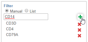
Figure 2. Filtering features on the Feature distribution plot
The List filter lets you filter to the features included in a feature list. To learn more about feature lists in Partek Flow, please see List management.
Plot type
Distributions can be plotted as histograms, with the x-axis being the expression value and the y-axis the frequency, or as a strip plot, where the x-axis is the expression value and the position of each cell/sample is shown as a thin vertical line, or strip, on the plot (Figure 3).
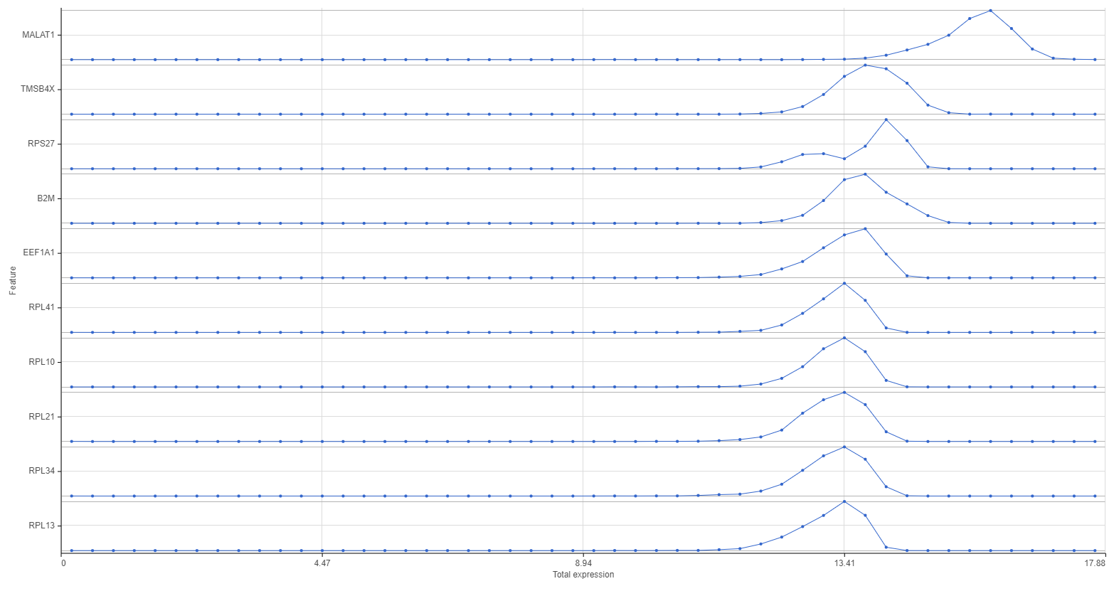
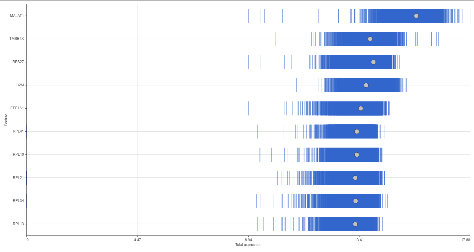
Figure 3. Histogram (left) and Strip (right) plots
To switch between plot types, use the Plot type radio buttons.
Mousing over a dot in the histogram plot gives the range of feature values that are being binned to generate the dot and the number of cells/samples for that bin in a pop-up (Figure 4).
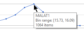 Figure 4. Histogram tooltip
Mousing over a strip shows the sample ID and feature value in a pop-up. If there are multiple cells/samples with the same value, only one strip will be visible for those cells/samples and the mouse-over will indicate how many cells/samples are represented by that one strip (Figure 5).
Figure 4. Histogram tooltip
Mousing over a strip shows the sample ID and feature value in a pop-up. If there are multiple cells/samples with the same value, only one strip will be visible for those cells/samples and the mouse-over will indicate how many cells/samples are represented by that one strip (Figure 5).
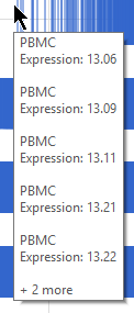 Figure 5. Strip tooltip
Clicking a strip will highlight that cell/sample in all of the plots on the page (Figure 6).
Figure 5. Strip tooltip
Clicking a strip will highlight that cell/sample in all of the plots on the page (Figure 6).
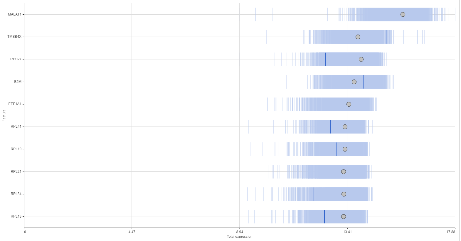 Figure 6. Selecting a on one strip highlights it for all features.
The grey dot in each strip plot shows the median value for that feature. To view the median value, mouse over the dot (Figure 6).
Figure 6. Selecting a on one strip highlights it for all features.
The grey dot in each strip plot shows the median value for that feature. To view the median value, mouse over the dot (Figure 6).
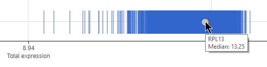 Figure 7. Viewing the median for a feature
Page
To navigate between pages, use the Previous and Next buttons or type the page number in the text field and click Enter on your keyboard.
The number of features that appear in the plot on each page is set by the Items per page drop-down menu (Figure 7). You can choose to show 10, 25, or 50 features per page.
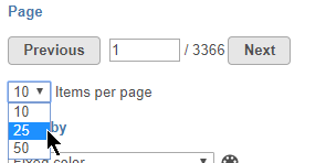 Figure 8. Setting items per page
Scale Y-axis
When Plot type is set to Histogram, you can choose to configure the Y-axis scale using the Scale Y-axis radio buttons. Feature max sets each feature plot y-axis individually. Page max sets the same y-axis range for every feature plot on the page, with the range determined by the feature with the highest frequency value.
Color by
You can add attribute information to the plots using the Color by drop-down menu.
For histogram plots, the histograms will be split and colored by the levels of the selected attribute (Figure 8). You can choose any categorical attribute.
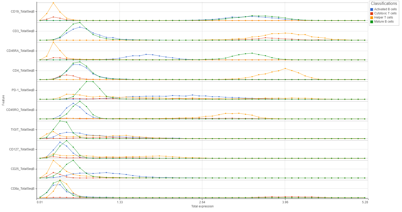 Figure 9. Splitting histograms by an attribute
For strip plots, the sample/cell strips will be colored by the levels or values of the selected attribute (Figure 9). You can choose any categorical or numeric attribute.
Figure 9. Splitting histograms by an attribute
For strip plots, the sample/cell strips will be colored by the levels or values of the selected attribute (Figure 9). You can choose any categorical or numeric attribute.
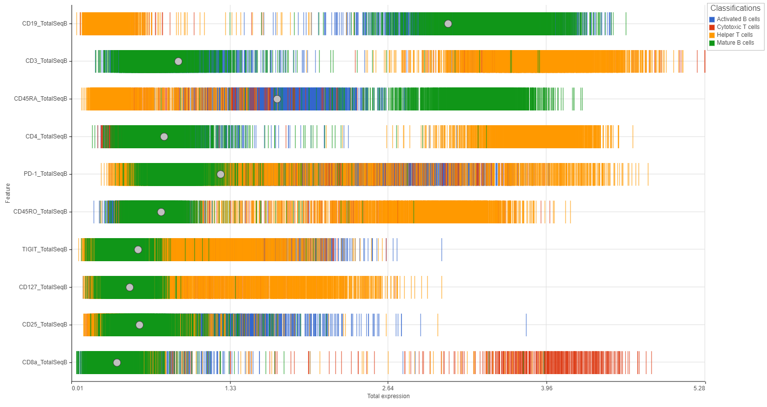
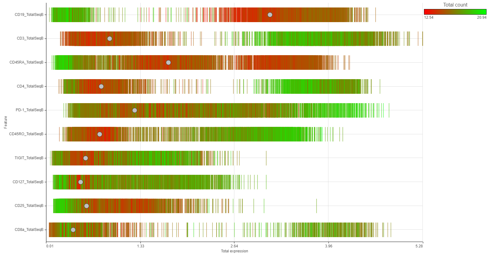
Figure 10. Coloring strips by an attribute. Categorical (left) or Numeric (right) attributes can be chosen.


| Your Rating: |
|
Results: |

|
23 | rates |
Overview
Content Tools