Join us for a webinar: The complexities of spatial multiomics unraveled
May 2
This user guide illustrates:
This user guide assumes the user is familiar with the hierarchy of spreadsheets and analysis in Partek® Genomics Suite®.
Many plots available in Partek Genomics Suite are not discussed in this user guide. A more thorough review of Partek Genomics Suite visualizations can be found in Chapter 6: The Pattern Visualization System of the Partek User's Manual available from Help > User’s Manual in the Partek Genomics Suite main toolbar.
There is no specific data set for this tutorial. You may use one of your own microarray experiments or use a data set from one of our tutorials.
Visualizations are generated using data from a spreadsheet. Some visualizations allow interactive filtering on the plot, but others do not. If you only wish to include certain rows or columns in a visualization, you may need to create a spreadsheet with only the rows or columns of interest by applying a filter and cloning the spreadsheet.
In general, probe(set)/gene intensity values may be visualized from either an ANOVA spreadsheet or a filtered ANOVA spreadsheet. Because intensity data is stored in the parent spreadsheet, the parent and child spreadsheets should be visible in the spreadsheet navigator with the appropriate parent/child relationship (Figure 1).
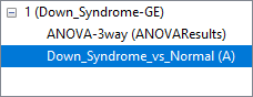
Figure 1. Down_Syndrome-GE is the parent spreadsheet; ANOVAResults and A are child spreadsheets of Down_Syndrome-GE
Additional Assistance
If you need additional assistance, please visit our support page to submit a help ticket or find phone numbers for regional support.


| Your Rating: |
|
Results: |

|
36 | rates |
Overview
Content Tools