Page History
...
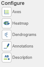
There are plot Configuration/Action options for the Hierarchical clustering / heatmap task which apply to both the heatmap and bubble map in the Data viewer (below): Axes, Heatmap, Dendrograms, Annotations, and Description. Click on the icon to open these configuration options.
Axes 
- This section controls the Content or data source used to draw the values in the heatmap or bubble map and also the ability to transpose the axes. The plot is a color representation of the values in the selected matrix. Most of the data nodes contain only one matrix, so it will just say Matrix for the chosen data node. However, if a data node contains multiple matrices (e.g. descriptive statistics were performed on cluster groups for every gene like mean, standard deviation, percent of cells, etc) each statistic will be in a separate matrix in the output data node. In this case, you can choose which statistic/matrix to display using the drop-down list (this would be the case in a bubble map).
- To change the orientation (switch the columns and rows) of the plot, click on the (
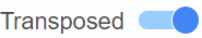 ) toggle switch.
 - Row labels and Column labels can be turned on or off by clicking the relevant toggle switches.
- The label size can be changed by specifying the number of pixels using Max size and Font. If an Ensembl annotation model has been associated with the data, you can choose to display the gene name or the Ensembl ID using the Content option.
...
Overview
Content Tools