Page History
...
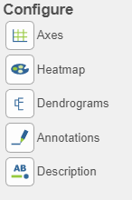
There are plot Configuration/Action options for the Hierarchical clustering / heat map task which apply to both the heatmap and bubble map in the Data viewer (Figure 8below): DataAxes, Heatmap, Dendrograms, Annotations, Axes, Description, and Additional actionsand Descriptions. Click on the icon to open these configuration options.
...
| SubtitleText | Hierarchical clustering / heatmap / bubble map plot controls. |
|---|---|
| AnchorName | Plot controls |

Data 
Axes 
- This section controls the Content or data source used to draw the values in the heatmap or bubble map and also the ability to transpose the axes. The plot is a color representation of the values in the selected matrix. Most of the data nodes contain only one matrix, so it will just say Matrix for the chosen data
...
- node. However, if a data node contains multiple matrices (e.g. descriptive statistics were performed on cluster groups for every gene like mean, standard deviation, percent of cells, etc) each statistic will be in a separate matrix in the output data node. In this case, you can choose which statistic/matrix to display using the drop-down list (this would be the case in a bubble map).
- To change the orientation (switch the columns and rows) of the plot, click on the (
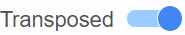 ) toggle switch.
| Numbered figure captions | ||||
|---|---|---|---|---|
| ||||
|

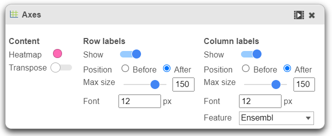
- Row labels and Column labels can be turned on or off by clicking the relevant toggle switches.
- The label size can be changed by specifying the number of pixels using Max size and Font. If an Ensembl annotation model has been associated with the data, you can choose to display the gene name or the Ensembl ID using the Content option.
Heatmap ![]()
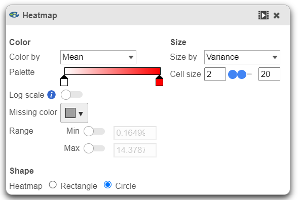
This section is used to configure the color, range, size, and shape of the components in the heatmap (Figure 10).
| Numbered figure captions | ||||
|---|---|---|---|---|
| ||||
|

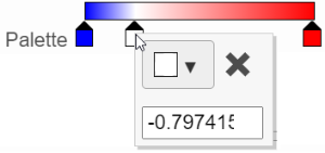
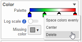
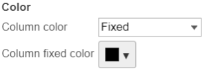
- In the color palette horizontal bar, the left side color represents the lowest value and the right side color represents the highest value in the matrix data. Note that when you zoom in/out the lowest and highest values captured by the color palette may change. By default, there are 3 color stops (
 ): minimum, middle, and maximum color value of the default range calculated on the matrix. Left-click on the middle color stop and drag left or right to change the middle value this color stop represents. If you left-click on the middle color stop once, you can change the color and value this color stop represents (Figure 11). Click on the (
 ) to remove this color stop.
| Numbered figure captions | ||||
|---|---|---|---|---|
| ||||
|
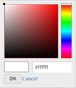
- Click on the color square or the adjacent triangle (
 ) to choose a color to represent the value. This will display a color picker dialog which allows selection of a color, either by clicking or by typing a HEX color code, then clicking OK
...
- .
...
| SubtitleText | Select a color from the color palette |
|---|---|
| AnchorName | choose color |
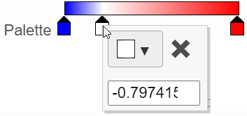
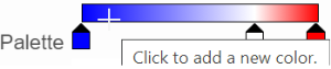
- The min and max color stops cannot be dragged or removed. If you left-click on them, you can choose a different color. When you click on the Palette bar, you can add a new color stop between min and max
...
- . Adding a color stop can be useful when there is an outlier value in the data. You can use a different color to represent different value ranges.
...
| SubtitleText | Add a new color tab between min and max |
|---|---|
| AnchorName | Add color |
- Right-clicking a color stop will reveal a list of options
...
- . Space colors evenly will rearrange the position of the stops so there is an equal distance between all stops. Center will move a stop to the middle of the two adjacent stops. Delete will remove the stop.
...
| SubtitleText | Right-click a color stop to show more options |
|---|---|
| AnchorName | Right-click color stop |
- To change the min and max threshold values represented by the color palette, click on the toggle switch (
 ) in the Range card, and specify the values in the text boxes.
 - In addition to color, you can also use the Size drop-down list to size by a set of values from another matrix stored in the same data node. Most of the data nodes contain only one matrix, so the only options available in the Size drop down will be None or Matrix. In cases where you have multiple matrices, you might want to use the color of the component in the heatmap to represent one type of statistic (like mean of the groups) and the size of the component to represent the information from a different statistic (like std. dev).
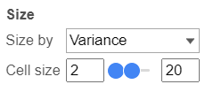
- The shape of the heatmap cell (component) can be configured either as a rectangle or circle by selecting the radio button in the Shape card.
Dendrograms 
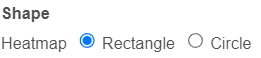
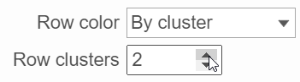
If cluster analysis is performed on samples and/or features, the result will be displayed as dendrograms. By default, the dendrograms are all colored in black (Figure 6).
The color of the dendrograms can be configured (Figure 15).
| Numbered figure captions | ||||
|---|---|---|---|---|
| ||||
|

- Click on the color square or its triangle () to choose a different color for the dendrogram.
- When the By cluster in the Row/Column color drop-down list, the number of clusters needs to be specified
...
- . The top N clusters will be in N different colors.
...
| SubtitleText | Configure the dendrogram color based on number of cluster specified |
|---|---|
| AnchorName | dendrogram color by cluster |
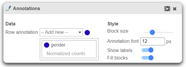
Annotations 
This section allows you to add sample or cell level annotations to the viewer. First, make sure to choose the correct data node which contains the annotation information you would like to use by clicking the circle (![]() ). All project level annotations will be available on all data nodes in the pipeline (Figure 17).
). All project level annotations will be available on all data nodes in the pipeline (Figure 17).
- Choose an attribute from the Row
...
- annotation drop-down list. Multiple attributes can be chosen from the drop-down list and can be reordered by clicking and dragging the groups below the drop-down list. Each attribute is represented as an annotation bar next to the heatmap. Different colors represent the different groups in the attribute.
| Numbered figure captions | ||||
|---|---|---|---|---|
| ||||
|

- The width of the annotation bar can be changed using the Block size slider when the Show labels toggle switch is on.
- The annotation label font size can be changed by specifying the size in pixels.
- The Fill blocks toggle switch adds or removes color from the annotation labels.
Axes 
Axis titles can be turned on or off by clicking the relevant toggle switches. The axis label font size can be changed by specifying the number of pixels. If an Ensembl annotation model has been associated with the data, you can choose to display the gene name or the Ensembl ID using the Col. label content option (Figure 18).
| Numbered figure captions | ||||
|---|---|---|---|---|
| ||||
|

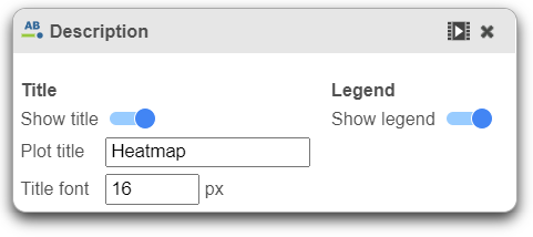
Description 
Description is used to modify the Title and toggle on or off the legend Legend.
In-plot controls
The heatmap has several different mouse modes which modify the way the plot responds to the mouse buttons. The mode buttons are in the upper right corner of the heatmap. Clicking one of these buttons puts the heatmap into that mode.
...
Overview
Content Tools