Page History
...
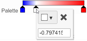
In the color palette horizontal bar, the left side color represents the lowest value and the right side color represents the highest value in the matrix data represented. By default, there are 3 tabs color stops (![]() ): minimum, middle, and maximum color value of the default range calculated on the matrix. Left-click on the middle tab color stop and drag left/right can change the middle the value this tab color stop represents. If you left-click on the middle tab color stop once, you can change the color and value this tab color stop represents (Figure 11). Click on (
): minimum, middle, and maximum color value of the default range calculated on the matrix. Left-click on the middle tab color stop and drag left/right can change the middle the value this tab color stop represents. If you left-click on the middle tab color stop once, you can change the color and value this tab color stop represents (Figure 11). Click on (![]() ) to remove this tabcolor stop.
) to remove this tabcolor stop.
| Numbered figure captions | ||||
|---|---|---|---|---|
| ||||
|
...
| Numbered figure captions | ||||
|---|---|---|---|---|
| ||||
|
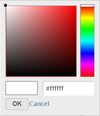
The min and max tabs color stops cannot be dragged or removed. If you left-click on them, you can choose a different color. When you click on the Palette bar, you can add a new color tab stop between min and max (Figure 13). Adding a tab color stop can be useful when there is an outlier value in the data. You can use a different color to represent different value range.
...
Overview
Content Tools