Page History
...
| Numbered figure captions | ||||
|---|---|---|---|---|
| ||||
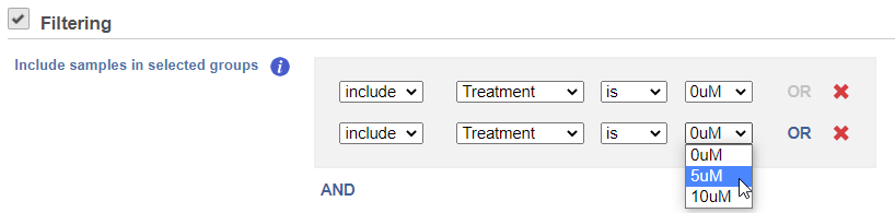
The hierarchical clustering setup dialog (Figure 2) enables you to control the clustering algorithm. Starting from the top, you can choose to Cluster samples, Cluster features (genes/transcripts) or both. By default, if there are less than 3000 samples, the Cluster samples check button is selected, if there are less than 3000 features, the Cluster features check button is selected. Otherwise the check button is de-selected.
...
| Numbered figure captions | ||||
|---|---|---|---|---|
| ||||
|
Heat Map
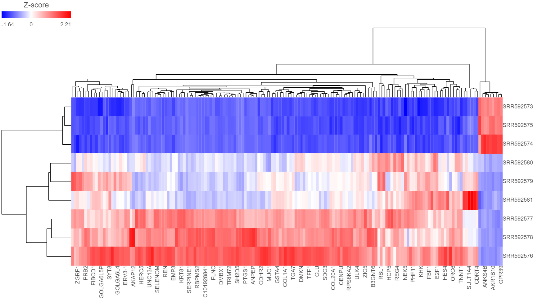
The output of a Hierarchical clustering task is a heat map (Figure 4) with or without dendrogram depends on whether you perform cluster on samples/cells or features. By default, samples are on rows (sample labels are displayed as seen in the Data tab) and features (genes or transcripts, depending on the input data) on columns. Colors are based on standardized expression values (default selection; performed on the fly), Dendrograms show clustering of rows (samples) and columns (variables).
...
| Numbered figure captions | ||||
|---|---|---|---|---|
| ||||
|
Another way to invoke heatmap without performing clustering is in data viewer. When select Heatmap (![]() ) icon in the available plots, data nodes that contains two dimension matrix can be use to draw this type of plot.
) icon in the available plots, data nodes that contains two dimension matrix can be use to draw this type of plot.
Depending on the resolution of your screen and number of samples and variables that need to be displayed, some binning may be involved. If there are more than samples/genes than pixels, they values of neighboring components will be averaged together. When you zoom in to certain level, you will see each cell represent one sample/gene. To zoom, use the mouse wheel to zoom in / out. To move the map around when zoomed in, press down the right button of the mouse and drag the map.
...
| Numbered figure captions | ||||
|---|---|---|---|---|
| ||||
|
Content:
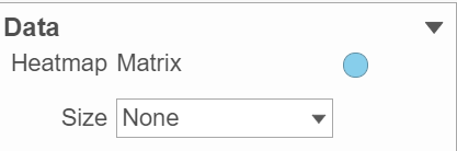
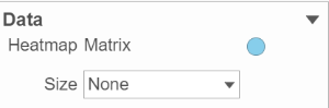
Content contains the value of which matrix data is used to draw heatmap in the plot. Heatmap is a color presentation of the values in the matrix selected. Most of the data nodes contains only one matrix, which you might not need to use Size by configuration to use the same value represent the same information as color by (Figure 6).
| Numbered figure captions | ||||
|---|---|---|---|---|
| ||||
|
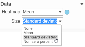
However, if a data node contains multiple matrix information, e.g. if you perform descriptive statistics on cluster groups for every gene like mean, std. dev, percent of detected cells etc, you each stats result will be in a separate matrix in the output data node. You might want to use color of the component in the heatmap to represent one type of stats (like mean of the groups) and size of component to represent a different statistic information (like std. dev) (Figure 7).
| Numbered figure captions | ||||
|---|---|---|---|---|
| ||||
|
Heatmap:
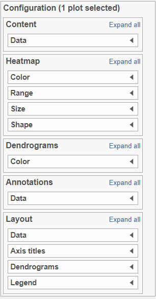
Heatmap section is used to configure the color and shape of the components in the heatmap (Figure 8)
| Numbered figure captions | ||||
|---|---|---|---|---|
| ||||
|

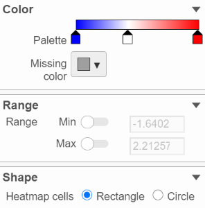
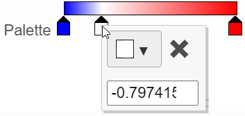
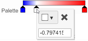
In the color palette horizonal bar, left side color represent low value, right side color represent high value in the matrix data represented. By default, there are 3 tabs (![]() ) present the min, middle and max color value of default range calculated on the matrix. Left click on the middle tab and drag left/right can change the middle the value of this tab represented. When left click on the middle tab and release the mouse, you can change the color and value of this tab represents ((Figure 9). Click on (
) present the min, middle and max color value of default range calculated on the matrix. Left click on the middle tab and drag left/right can change the middle the value of this tab represented. When left click on the middle tab and release the mouse, you can change the color and value of this tab represents ((Figure 9). Click on (![]() ) to remove this tab.
) to remove this tab.
| Numbered figure captions | ||||
|---|---|---|---|---|
| ||||
|
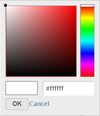
Click on the little triangle next to the color square (![]() ) to choose a color to represent the value by clicking on a color or type in the RGB color of the color, click OK (Figure 10).
) to choose a color to represent the value by clicking on a color or type in the RGB color of the color, click OK (Figure 10).
| Numbered figure captions | ||||
|---|---|---|---|---|
| ||||
|
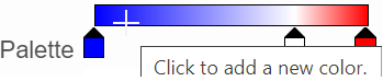
The min and max tabs cannot be dragged or removed, however, when left click on it, you can choose a different color. To change the min and max color value to be represented, use the Range section. When click on the Palette bar, you can add a new color tab between min and max (Figure 11). Adding a tab can be useful when there is outlier value in the data, you can use different color to represent different value range.
| Numbered figure captions | ||||
|---|---|---|---|---|
| ||||
|

To change the min and max value represented, in the Range section, click on the toggle switch(![]() ) to make it blue, and specify the value in the text box.
) to make it blue, and specify the value in the text box.
...
| Numbered figure captions | ||||
|---|---|---|---|---|
| ||||
|
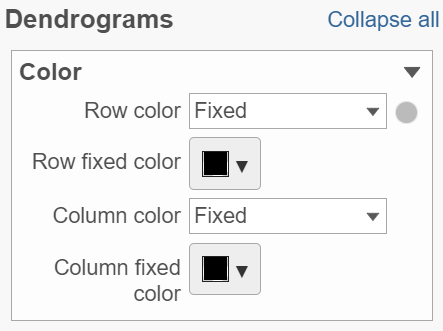

Click on the color square triangle (![]() ) to choose a different color for the dendrogram.
) to choose a different color for the dendrogram.
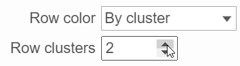
When the By cluster cluster in the Row/Column color drop-down list, the number of clusters needs to be specified (Figure 13). The top N number of clusters will be in N different colors.
| Numbered figure captions | ||||
|---|---|---|---|---|
| ||||
|
Annotations:
Row annotation allow to add sample or cell level annotation to the viewer. First make sure to choose the correct data node which contains the annotation information you would like to use by clicking the circle (![]() ). All project level annotation will be available on all data node in the pipeline (Figure 14).
). All project level annotation will be available on all data node in the pipeline (Figure 14).
...
Overview
Content Tools