Page History
...
Cluster distance metric is used to determine how the distance between two clusters will be calculated.
Single Linkage: the distance between two clusters is determined by the distance of the closest objects in the two clusters.
Complete Linkage: the distance between two clusters is equal to the distance between the two furthest members of those clusters.
Average Linkage: the average distance between all the pairs of objects in the two different clusters is used as the measure of distance between the two clusters.
Centroid method: the distance between two clusters is equal to the distance between the centroids of those clusters.
Ward's method: the distance between two clusters is designed to minimize the size of an error measure based on the sum of squares.
Point distance metric is used to determine the distance between two rows or columns. For a thorough discussionmore detailed information about the equations, we refer you to the distance metrics chapter.
...
| Numbered figure captions | ||||
|---|---|---|---|---|
| ||||
|
...
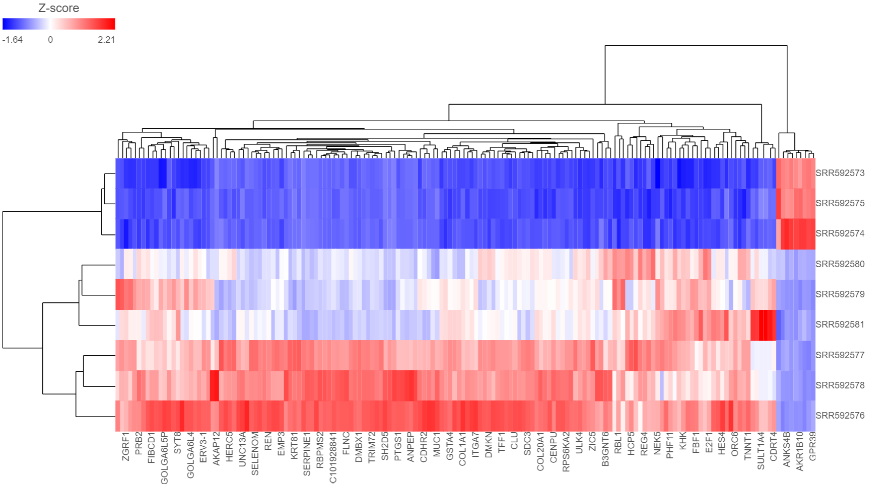
Heat Map
The output of a Hierarchical clustering task is a heat map (Figure 4) with or without dendrogram depends on whether you perform cluster on samples/cells or features. By default, samples are on rows (sample labels are displayed as seen in the Data tab) and features (genes or transcripts, depending on the input data) on columns. Colors are based on standardized expression values (default selection; performed on the fly), with blue indicating low and red indicating high levels of a variable (i.e. low or high expression levels). Dendrograms show clustering of rows (samples) and columns (variables).
...
| Numbered figure captions | ||||
|---|---|---|---|---|
| ||||
|
Another way to invoke heatmap without performing clustering is in data viewer. When select Heatmap (![]() ) icon in the available plots, data nodes that contains two dimension matrix can be use to draw this type of plot.
) icon in the available plots, data nodes that contains two dimension matrix can be use to draw this type of plot.
Depending on the resolution of your screen and number of samples and variables that need to be displayed, some binning may be involved. If there are more than samples/genes than pixels, they will be averaged together. When you zoom in to certain level, you will see each cell represent one sample/gene. To zoom, use the mouse wheel to zoom in / out. To move the map around when zoomed in, press down the right button of the mouse and drag the map.
To transpose the map, i.e. to see samples on columns and genes on rows, select the Transpose view button( ![]() ). To flip rows or columns belonging to the same dendrogram branch, select the flip mode (
). To flip rows or columns belonging to the same dendrogram branch, select the flip mode ( ) button.
When select a cluster by left-clicking & dragging around the dendrogram line in selection mode ( ), the export button (
 will be enabled. Click on it to export the selected features and samples with the normalized values which the heatmap color represents into a text file.
The heat map can be saved as a .svg image by selecting the Save image icon ( ![]() ).The control dialog can be seen on Figure 7. The default filename is Dendrogram view.svg and it is downloaded to the local computer.
).The control dialog can be seen on Figure 7. The default filename is Dendrogram view.svg and it is downloaded to the local computer.
There are 5 sections in the Configuration panel (Figure 5): Content, Heatmap, Dendrograms, Annotations and layout. Click on the triangle (![]() ) to expand the section to configure.
) to expand the section to configure.
...
Overview
Content Tools