Page History
...
The output of a Hierarchical clustering task is a heat map (Figure 4) with or without dendrogram depends on whether you perform cluster on samples/cells or features. By default, samples are on rows (sample labels are displayed as seen in the Data tab) and variables features (genes or transcripts, depending on the input data) on columns. Colors are based on standardized expression values (mean of 0, standard deviation of 1default selection; performed on the fly), with green blue indicating low and red indicating high levels of a variable (i.e. low or high expression levels). Dendrograms show clustering of rows (samples) and columns (variables).
...
| Numbered figure captions | ||||
|---|---|---|---|---|
| ||||
|
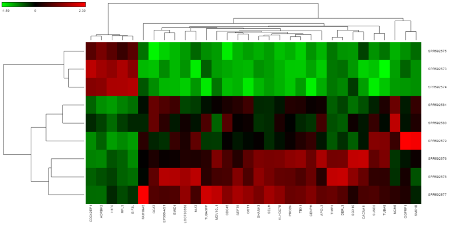
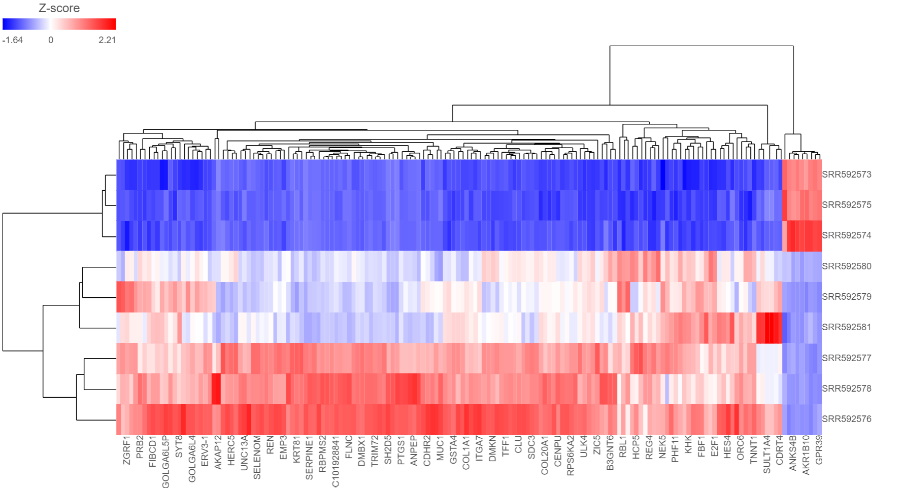
Depending on the resolution of your screen and number of samples and variables that need to be displayed, some binning may be involved. The viewer aims for 200 × 200 heat map cells visible at any given time, i.e. 200 samples and 200 variables (Figure 4 shows an example with nine samples and 32 variables). If there are more than 200 cells in any dimensionsamples/genes than pixels, they will be averaged together. Figure 5 shows clustering of the same nine samples as in Figure 4, but with 419 variables. Note binning of genes in the X-axis.
| Numbered figure captions | ||||
|---|---|---|---|---|
| ||||
|
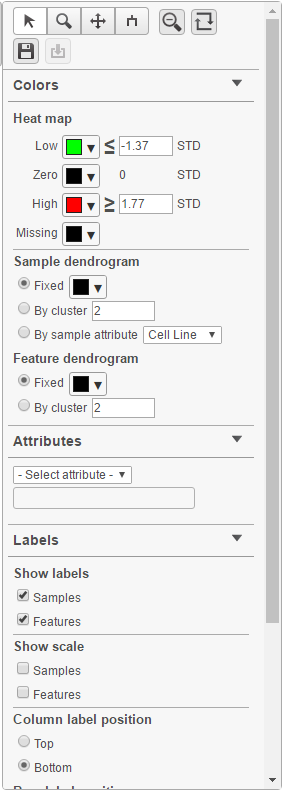
Heat map controls are on the left-hand side (Figure 6). It can be collapsed, if needed, to maximize the space on the canvas, by clicking on the triangle icon ( ).
| Numbered figure captions | ||||
|---|---|---|---|---|
| ||||
|
If the map is large and rows / columns are binned, you can zoom in by selecting the Zoom mode ( ![]() ) and left-click & drag around the region of the map that you are interested in. AlternativelyWhen you zoom in to certain level, you will see each cell represent one sample/gene. To zoom, use the mouse wheel to zoom in / out. To move the map around when zoomed in, switch to the Pan mode (
) and left-click & drag around the region of the map that you are interested in. AlternativelyWhen you zoom in to certain level, you will see each cell represent one sample/gene. To zoom, use the mouse wheel to zoom in / out. To move the map around when zoomed in, switch to the Pan mode ( ![]() ) and drag the map. The Reset zoom (
) and drag the map. The Reset zoom (  ) re-creates the initial enlargement of the heat map. press down the right button of the mouse and drag the map.
To transpose the map, i.e. to see samples on columns and genes on rows, select the Transpose view button( ![]() ). To flip rows or columns belonging to the same dendrogram branch, select the flip mode (
). To flip rows or columns belonging to the same dendrogram branch, select the flip mode ( ) button.
When When select a cluster by left-clicking & dragging around the dendrogram line in selection mode ( ), the export button (
 will be enabled. Click on it to export the selected features and samples with the normalized values which the heatmap color represents into a text file.
The heat map can be saved as a .svg image by selecting the Save image icon ( ![]() ).The control dialog can be seen on Figure 7. The default filename is Dendrogram view.svg and it is downloaded to the local computer.
).The control dialog can be seen on Figure 7. The default filename is Dendrogram view.svg and it is downloaded to the local computer.
There are 5 sections in the Configuration panel (Figure 5): Content, Heatmap, Dendrograms, Annotations and layout. Click on the triangle (![]() ) to expand the section to configure.
) to expand the section to configure.
| Numbered figure captions | ||||
|---|---|---|---|---|
| ||||
| ||||
|
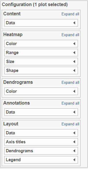
Content:
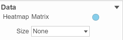
Content contains the value of which matrix data is used to draw heatmap in the plot. Heatmap is a color presentation of the values in the matrix selected. Most of the data nodes contains only one matrix, which you might not need to use Size by configuration to use the same value represent the same information as color by (Figure 6).
| Numbered figure captions | ||||
|---|---|---|---|---|
| ||||
|
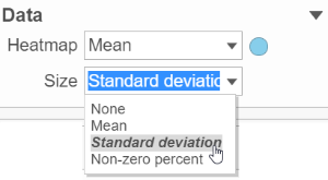
However, if a data node contains multiple matrix information, e.g. if you perform descriptive statistics on cluster groups for every gene like mean, std. dev, percent of detected cells etc, you might want to use color of the component in the heatmap to represent one type of stats (like mean of the groups) and size of component to represent a different statistic information (like std. dev) (Figure 7).
| Numbered figure captions | ||||
|---|---|---|---|---|
| ||||
|
To change a color on the map, click on the arrow head by the color box to get the color mixer (Figure 8). Then pick the color you prefer and select OK. Range of the colors can be changed by typing a different value in the text box to the left of the STD sign (i.e. sandardised).
...
Overview
Content Tools