Page History
...
| Numbered figure captions | ||||
|---|---|---|---|---|
| ||||
|
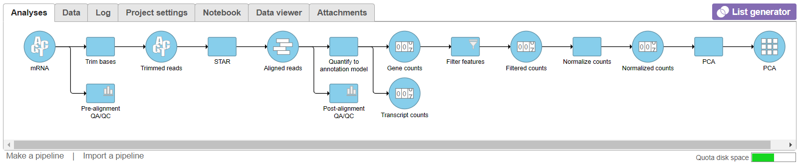
- Double click the PCA data node to open the PCA scatter plot (Figure 2)
| Numbered figure captions | ||||
|---|---|---|---|---|
| ||||
|
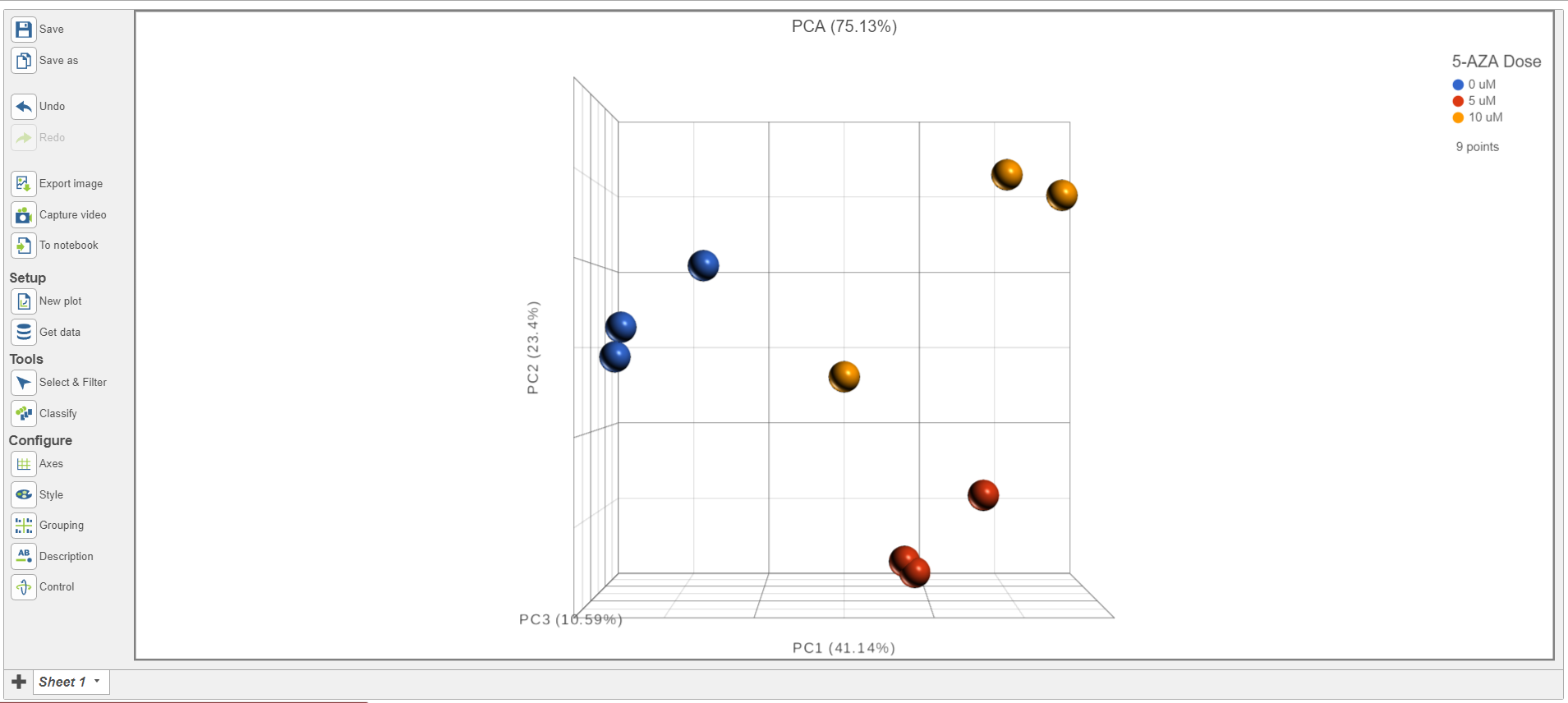
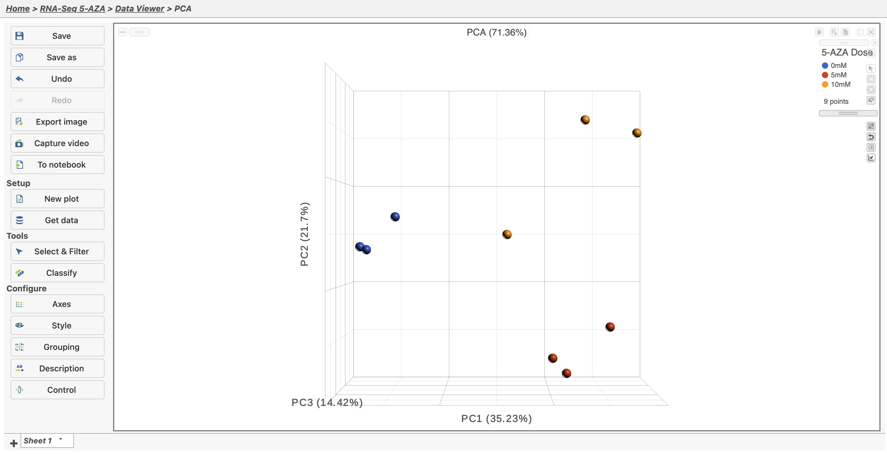
In the Data Viewer, click Style under Configure and set the Color by drop-down to 5-AZA Dose. The scatter plot shows each sample as a sphere, colored by treatment group, in a three dimensional plot. The x, y, and z axes are the first three principal components. The percentage of total variance explained by each is listed next to the axis label. The size of each axis is determined by the variance along that axis. The plot is fully interactive; it can be rotated and points selected.
...
Overview
Content Tools